HDR Compare
Mar 28, 2018 12:26:13 #

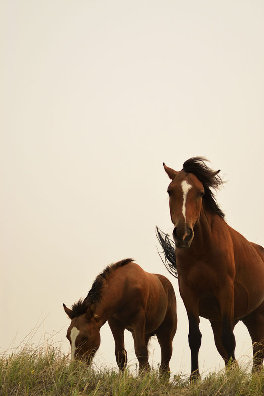
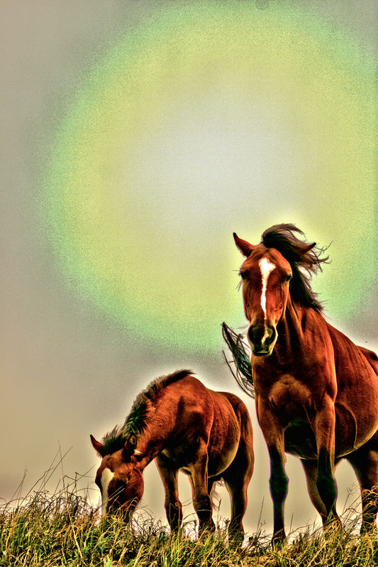
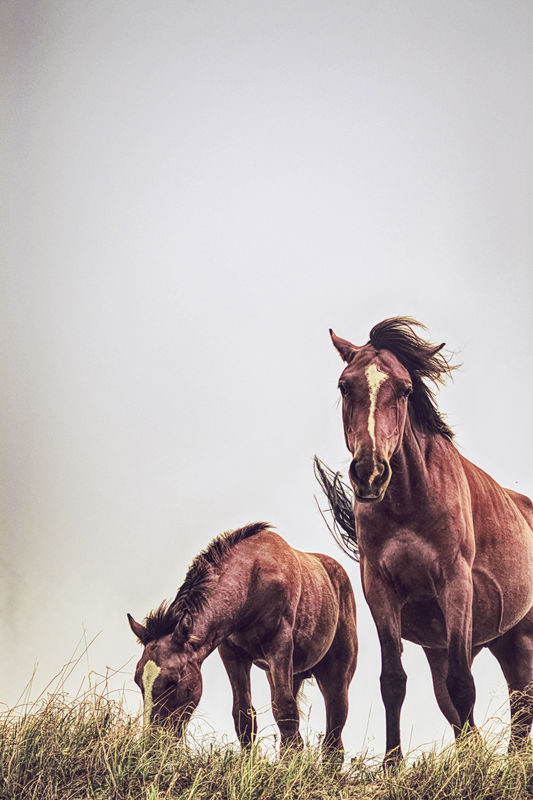
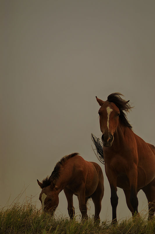
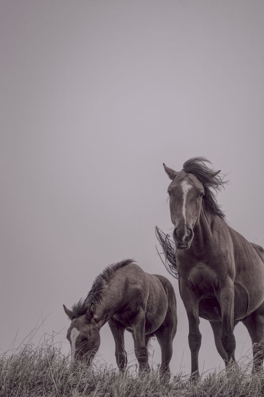
Here are 2 horses in the Teddy Roosevelt National Park, ND, the original and one using Corel PSP, one done with Affinity with its HDR, and one with Affinity and googles NKI, and Affinity HDR using one of James Ristons customization. I don't know where the glowing orb came from in Corel, but it is very obvious in all the options that they show, no extra edits, just saved as jpegs. I just picked one out of the different processes. Affinity did have some that were less "gaudy" but since I wasn't really doing a technical compare I just picked one from each type..
original
(Download)
corel
(Download)
Afffinity
(Download)
Afffinity -NIK
(Download)
Afffinity - James riston custom
(Download)
Mar 28, 2018 12:34:51 #

Mar 28, 2018 12:37:08 #

Your going to get a lot of different opinions and thats good. I personally like the coral example, the orb in the background really helps the picture. Only my opinion. An interesting project.👌👌👌👌
Mar 28, 2018 15:31:28 #

The orb is obviously a Corel 'addition' to the filter set. As is the over greening. Not my favourite of the set. I prefer your affinity choices much more
Mar 28, 2018 16:19:47 #

It's going to be mostly personal opinions you'll be getting. Each one has a different communication about the scene, from gaudy-lively to somber. I would suggest picking the one that most moves you, and then pushing it further in the direction you like if you want a really strong pic.
Mar 28, 2018 21:37:47 #

Mar 29, 2018 06:10:24 #

Mar 29, 2018 08:58:25 #

For me, it's the Corel with the orb & Affinity. When I do HDR I want the image to 'POP', which many purists call overdone. If I want an image properly exposed that's what I do, but that's just me. Nice variety and very well done IMO. 
Mar 31, 2018 02:50:31 #
rdrechsler
Loc: Channel Islands Harbor, CA
You got some really varied effects. I like the Corel the best. Very abstract effect that make the horses look almost surreal. I can see your no stranger to the power of PP.
If you want to reply, then register here. Registration is free and your account is created instantly, so you can post right away.