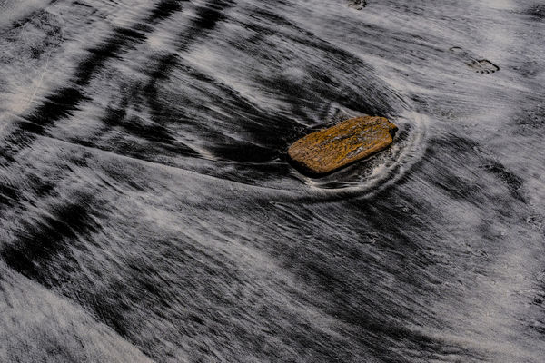
Black Sand Red Rock
Mar 28, 2018 10:03:19 #

Taken on a recent trip to Costa Rica, this is an image I am thinking of printing
Thoughts for improvement?
Thoughts for improvement?
Mar 28, 2018 16:12:35 #

Impossible to say for me without knowing your intent. Is it focusing on how obstruction breaks up flow? Is it how flow conquers any obstacle. It is texture contrast? Is it the ironic "brilliance" of the only color when place in a colorless environment. I see four different focuses possible. There are likely more.
As for your basic question, yes, I do think this is a photo worthy of printing, when it get pushed further into why you like it.
As for your basic question, yes, I do think this is a photo worthy of printing, when it get pushed further into why you like it.
Mar 28, 2018 16:26:05 #
Art, thanks. To be brief it's the contrast in colour and texture combined with the flow of the water. In terms of a pleasing print, I am hoping that the black and the sand tecture pop and that the eye is drawn to the orangish rock
Mar 28, 2018 16:45:43 #
I kinda like this image, but may I make a couple suggestions?
I guess I'll assume that it is OK.
First, I know you took this image the way it is shown here, but I wonder what it would look like if you flipped it? It seems the water(or sand) is flowing right to left. What would it look like with the water(sand) going left to right? Let's remember the people read that way and our natural flow is the same.
Also, while I love the way the water breaks on the brick, but the back itself does not really stand out very much. Maybe a couple of adjustments with Saturation?
Mar 28, 2018 17:18:05 #
Chefneil wrote:
I kinda like this image, but may I make a couple s... (show quote)
thanks for these suggestions
I'll play with it
Mar 28, 2018 17:29:10 #
Mar 28, 2018 18:27:48 #
The more I look at it the more I liked it. So I'm still looking. It would make a decent 20x30 inch print. Because of the grain, I might even look into printing it on metal. If you do print it, you could experiment with which direction you hang it. I think it might look better rotated 180 deg, however, I'm happy now. My natural sense feels the water should go the other way.
I might have preferred more contrast between the wood and water. However, the wood is probably bold enough.
Very good job.
I might have preferred more contrast between the wood and water. However, the wood is probably bold enough.
Very good job.
Mar 29, 2018 07:47:58 #

I like this! The processing does seem to lack something though - the pop that you’re hoping for, I think.
I’d spend some time making more than one version. Adding clarity will help the textures, but gently with the slider! Luminance adjustments might help as well (if you’re using Lightroom it’s easy to achieve). Perhaps up the whites a little.
Experimentation will bring rewards (and the odd disaster!). Overall, it needs to have a brighter look about it.
I like the presence of Friday by the way, he left his mark. There is a strange something in the top left - possibly a long hair has got in on the act - whatever, it needs removing.
Mar 29, 2018 09:47:08 #
thanks everyone!
I like the idea of printing on metal!
(by the way, that line in the upper left isnt a hair, it's in the sand -- but I'll experiment with removing it)
I like the idea of printing on metal!
(by the way, that line in the upper left isnt a hair, it's in the sand -- but I'll experiment with removing it)
Mar 29, 2018 10:42:50 #

Don't you just love black sand? It's so beautiful when the water washes over. Really nice catch on the colourful rock. I'm not sure about the printing on metal. I've not been too happy with B&W on metal. I'm thinking a print on watercolour paper would be nice. or a really flat matte paper with cotton content (or one that looks like it has cotton content). That would intensify the blacks a bit.
Mar 29, 2018 10:50:58 #
AzPicLady wrote:
Don't you just love black sand? It's so beautiful when the water washes over. Really nice catch on the colourful rock. I'm not sure about the printing on metal. I've not been too happy with B&W on metal. I'm thinking a print on watercolour paper would be nice. or a really flat matte paper with cotton content (or one that looks like it has cotton content). That would intensify the blacks a bit.
Can you tell me more about different kinds of paper and their effects?
Mar 29, 2018 10:52:19 #
magnetoman wrote:
I like this! The processing does seem to lack some... (show quote)
Ive played with luminance, have a look at the coloured rock:

Mar 29, 2018 11:09:30 #
RickH wrote:
Can you tell me more about different kinds of paper and their effects?
Well, not a lot. I once purchased a sample box of paper that had two sheets of about 20 different papers. I printed 1 colour shot and one B&W shot on each of them. I really liked B&W shots on the smooth watercolour paper. It reminded me of the cotton paper I used in the darkroom. It gave me really rich black and whites - and your image is basically a B&W with one colour spot. I wasn't fond of B&W on glossy or high-gloss paper, and metal is even higher gloss than that. I still do testing on different papers before I print a "final." It's a matter of personal preference, I think.
Mar 29, 2018 12:18:21 #
AzPicLady wrote:
Well, not a lot. I once purchased a sample box of... (show quote)
many thanks
I dont print myself -- I go to a lab here that is really great and has a range of paper
Mar 29, 2018 22:30:56 #

It's a good concept for an abstract photo. I'm wondering how you metered and what you metered. I'm not asking so much for meter settings, though I'd like to know. I'm asking what you picked in the scene to meter.
Once that is answered, I'll be able to offer a bit more.
--Bob
Once that is answered, I'll be able to offer a bit more.
--Bob
RickH wrote:
Taken on a recent trip to Costa Rica, this is an image I am thinking of printing
Thoughts for improvement?
Thoughts for improvement?
If you want to reply, then register here. Registration is free and your account is created instantly, so you can post right away.