First effort
Mar 23, 2018 15:18:44 #
Chicflat
Loc: Tulsa, Ok,
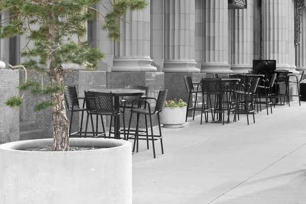
at black and white with spot color. Frankly,I wonder which is prefeable. The first shot was the base; it was taken in the morning facing east. The colors of the hotel are warmed slightly by the rising sun but the they are close. In broad daylight the columns would be slightly whiter. The second was my first try at the spot coloring of the geraniums. It took a lot of effort with the magic wand tool (Elements 13). For the last shot I was really pressed with the selection tools so I made a set of selections of the backgroung; I left the tree unselected Then, I photomerged the tree in color into the second image with only the geranium colored. This is the first time I tried to achieve this effect, partly almost nothing in my files seems to lend itself to it. Just curious about your response.


Mar 23, 2018 16:38:11 #

Mar 23, 2018 19:26:28 #
Chicflat
Loc: Tulsa, Ok,
Thanks. I have always liked it, but I thought it would work in the experiment.
Mar 23, 2018 22:51:06 #
Mar 24, 2018 07:39:36 #

Mar 24, 2018 07:50:48 #

Mar 24, 2018 08:33:07 #
I like b n w, but for this pic, the color works better because they r subtle and soften the "concrete". I would crop out the sign and some of the foreground and see what u think.
Mar 27, 2018 22:30:25 #
First of all, I like your subject and composition very much. The casual setting of the cafe tables against the formal structure of the columns makes an interesting contrast and, for me, is the subject. I find the tree incidental and feel the b&w relegates the tree to a secondary position where it belongs.
My eye is drawn to the chairs and then the columns in all three images. I think this same scene with a few people at the tables and walking by would also make a great street photography image. All of this is just the opinion of one amateur. Nicely done.
My eye is drawn to the chairs and then the columns in all three images. I think this same scene with a few people at the tables and walking by would also make a great street photography image. All of this is just the opinion of one amateur. Nicely done.
Mar 28, 2018 21:10:38 #
Chicflat
Loc: Tulsa, Ok,
I realize that I have been tardy to respond but thanks for looking at the post. to Fourg1b2006, I usually prefer color or BNW, but I did want to try the effect on this one. thanks for looking. To myviewphotos, I tried cropping as you suggested. At first I was fearful that a bad crop would lose some of the shape in the image, that it would distort the lines, or cost me the frame piece at the far end of the image ( which is part of a canopy over the door to the hotel. I tried a few crops to test your suggestion. You were correct; the sign could be cropped out. Thanks. To John Lawrence, I really appreciate your observations. I would like to point out that when I took the shot my first concern in terms of the composition was to place my point of view to get the geranium plant within the gap of chairs; I did not want it cut off and as a result just clutter. That positioning is what brought into play the tree. I didn't mind the tree in that it seemed to me that it balanced canopy grill. Looking at the first BNW conversion didn't work because both plants became mere clutter. In the final image the tree is I agree less obtrusive, and your insight raises the significance of the image personally for me. About the street scene, timing was off for that and I am less certain of my skill there that in BNW where I generally just can't see it yet. To Illinitt, honestly, I was confused. I did not understand the point of your remark; I was not sure how to attach it to either any part of my image ot to the demonstrations of what I was experimenting with. I did go back to see whether you had commented an any of my prior post. If you had I overelooked it. I also looked at some of your posts. In college I learned that an artist or author will have themes the recur throughout his work which mark his ideas and point of view. Sorry. I still did not find anything that helped me to understand any specific point that you were trying yo make. Therefore, unfortunately, I was unable to try to follow the lead you were trying to provide. Maybe next time.
If you want to reply, then register here. Registration is free and your account is created instantly, so you can post right away.