One Image--Three Creations--Which Do You Prefer???
Mar 9, 2018 12:52:34 #
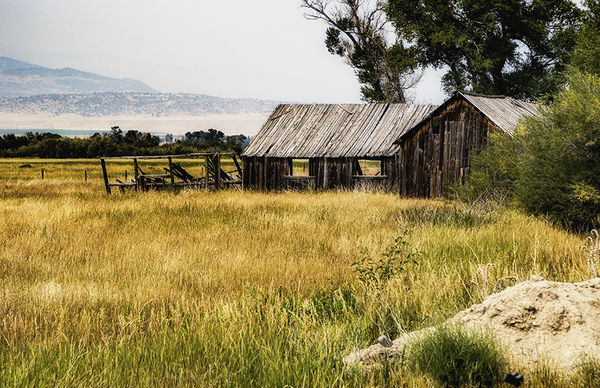
1. Original image with normal PPing.
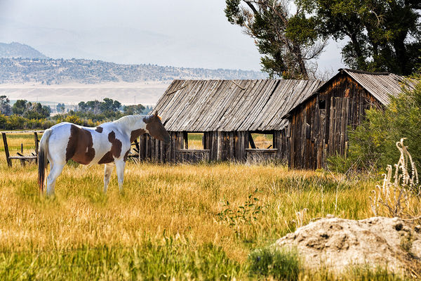
2. Second image with more PPing and adding the horse.
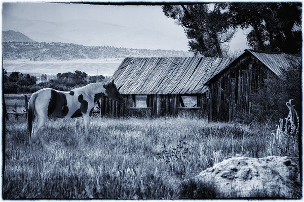
3. Third image in B/W with a blue tint for an old western feel.
Which do you prefer and why?
2. Second image with more PPing and adding the horse.
3. Third image in B/W with a blue tint for an old western feel.
Which do you prefer and why?
Mar 9, 2018 13:01:07 #
Mar 9, 2018 13:02:48 #
Mar 9, 2018 13:10:28 #

Mar 9, 2018 13:24:29 #
I like the original. It doesn’t need the horse. Looks contrived. My inexpert opinion.
Mar 9, 2018 13:32:30 #
BBBruce77
Loc: Eureka, Montana
#1 as the horse feels too large. At least that was my first reaction.
Mar 9, 2018 13:34:13 #
#1. I agree with NMGal that the horse looks contrived. And the foreground detail is better in #1 and, to me anyway, the color in #2 is a bit too harsh.
Mar 9, 2018 13:40:56 #
Mar 9, 2018 13:41:13 #

ImageCreator wrote:
1. Original image with normal PPing.
2. Second image with more PPing and adding the horse.
3. Third image in B/W with a blue tint for an old western feel.
Which do you prefer and why?
2. Second image with more PPing and adding the horse.
3. Third image in B/W with a blue tint for an old western feel.
Which do you prefer and why?
Yes, #1.... a peaceful setting.
Mar 9, 2018 13:47:27 #
SAVH
Loc: La Jolla, CA
#1. I agree with the statements about the horse. I prefer the bucolic scene of #1 and don't think it is necessarily enhanced by adding the horse.
Mar 9, 2018 13:53:29 #

I agree with those who note the horse seems to be out of proportion. On that basis I prefer #1. I honestly can't say I would react the same way if the horse seemed to fit better.
Mar 9, 2018 14:58:43 #

#1 for the very pleasing composition just as it is and beautiful colors.
Mar 9, 2018 15:16:54 #
#1. It looks quiet and serene.
#3. Looks good, however, I would crop out the mountains. They leave two subjects when all you really need is the texture of the building. I would also try it in sepia.
Oh, and dump the horse. The building is enough on its own. Adding the horse creates some confusion for the viewer's eyes. The images are strong enough without the horse. I find the distant mountains do as well, but in a lesser sense. The line of the ridge keeps pulling my eye away from the building.
Mar 9, 2018 16:28:31 #
SAVH wrote:
#1. I agree with the statements about the horse. I prefer the bucolic scene of #1 and don't think it is necessarily enhanced by adding the horse.
Ok, just for argument's sake, what if I hadn't put the horse in the image because the horse was there originally. Should I have taken the horse out?
Mar 9, 2018 17:36:04 #

#1
The horse is distracting if the primary subject is the building.
The horse is distracting if the primary subject is the building.
If you want to reply, then register here. Registration is free and your account is created instantly, so you can post right away.