Two Views from Penns Landing, Philadelphia
Feb 23, 2018 17:04:36 #
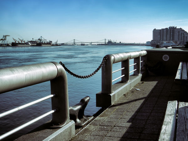
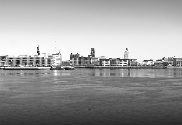
In the first view, I wanted to emphasize the nautical feel of my surroundings. For the second image, I aimed for a slick, clean geometric look.
Feb 23, 2018 18:39:16 #

I think you achieved your goal with #1.
I'm very drawn to the lines and shapes of #2; however I prefer less sky (funny since I'm always being told to crop my own ). The details are very sharp and the toning is restrained and attractive. A bonus that there are some patterns in the water. A crop makes it less static too. As is, the skyline is close to cutting the picture in half.
I'm very drawn to the lines and shapes of #2; however I prefer less sky (funny since I'm always being told to crop my own
). The details are very sharp and the toning is restrained and attractive. A bonus that there are some patterns in the water. A crop makes it less static too. As is, the skyline is close to cutting the picture in half.Feb 23, 2018 19:04:10 #
Feb 23, 2018 19:24:55 #
Linda From Maine wrote:
I think you achieved your goal with #1.
I'm very drawn to the lines and shapes of #2; however I prefer less sky (funny since I'm always being told to crop my own ). The details are very sharp and the toning is restrained and attractive. A bonus that there are some patterns in the water. A crop makes it less static too. As is, the skyline is close to cutting the picture in half.
I'm very drawn to the lines and shapes of #2; however I prefer less sky (funny since I'm always being told to crop my own
). The details are very sharp and the toning is restrained and attractive. A bonus that there are some patterns in the water. A crop makes it less static too. As is, the skyline is close to cutting the picture in half.Hi, Linda!
You may be correct about #2; I will experiment a little with cropping into the sky and see what works. For this image in particular, I think achieving visual balance is a priority... that is why I took the approach of placing the skyline in the center. Perhaps the sky is simply too empty for this kind of balance.
Feb 24, 2018 08:13:22 #

Yep, you got that feeling in #1 without doubt. It does have a rather blue cast to the whole thing though - which may be intentional? #2 needs cropping as Linda suggests I think. Some highlights look a bit burned-out. Love that glassy reflection.
Feb 24, 2018 09:48:45 #
StevenG
Loc: Long Island, NY
rook2c4 wrote:
In the first view, I wanted to emphasize the nautical feel of my surroundings. For the second image, I aimed for a slick, clean geometric look.
I agree that you achieved your goal in the first. As to the second, I also agree it may benefit from cropping; however, I would crop the water rather than the sky. I might also consider replacing the sky with something more dramatic. But, then you may lose the geometric look you are seeking.
Steve
Feb 24, 2018 11:25:29 #

#1 does a good job of channelling the viewer's attention. The problem with #2 is that there are so many eye-catching skyline/waterfront shots out there, an image has to be exceptional to be noticed. A close-up shot of a skyscraper would be geometrical but not very interesting, and this is like a horizontal shot of a skyscraper.
If you could sharpen #1 without aggravating the noise (it's on the verge of being noticeable in the sky), and if you could de-noise it without aggravating the lack of sharpness (most noticeable on the right hand side at the horizon), it would improve the overall look.
If you could sharpen #1 without aggravating the noise (it's on the verge of being noticeable in the sky), and if you could de-noise it without aggravating the lack of sharpness (most noticeable on the right hand side at the horizon), it would improve the overall look.
Feb 24, 2018 15:30:20 #
R.G. wrote:
#1 does a good job of channelling the viewer's att... (show quote)
Thank you for your analysis and very helpful suggestions, R.G.
Feb 24, 2018 15:31:18 #
StevenG wrote:
I agree that you achieved your goal in the first. As to the second, I also agree it may benefit from cropping; however, I would crop the water rather than the sky. I might also consider replacing the sky with something more dramatic. But, then you may lose the geometric look you are seeking.
Steve
Steve
Thanks! I will look into it.
Feb 24, 2018 15:45:28 #
magnetoman wrote:
Yep, you got that feeling in #1 without doubt. It does have a rather blue cast to the whole thing though - which may be intentional? #2 needs cropping as Linda suggests I think. Some highlights look a bit burned-out. Love that glassy reflection.
You are correct, I intentionally pushed image #1 to a dominantly cool, blue/grey tonality to emphasize the feel I wanted.
Feb 24, 2018 18:32:49 #
rook2c4 wrote:
In the first view, I wanted to emphasize the nautical feel of my surroundings. For the second image, I aimed for a slick, clean geometric look.
You picked a wonderful place to photograph and I think you did a nice job of pointing out the nautical and urban nature of that location. You have also inspired me to plan a trip one of these days soon. It is only about an hour from where I live, so I have no excuse. Thanks.
Erich
Feb 24, 2018 21:45:37 #
ebrunner wrote:
You picked a wonderful place to photograph and I think you did a nice job of pointing out the nautical and urban nature of that location. You have also inspired me to plan a trip one of these days soon. It is only about an hour from where I live, so I have no excuse. Thanks.
Erich
Erich
Penns Landing is indeed a great place for photo opportunities... especially weekdays, as there are fewer tourists to get in the way. And across the river in Camden (the riverfront pictured in #2) are some very interesting views worth exploring too.
Feb 25, 2018 06:50:21 #
rook2c4 wrote:
Penns Landing is indeed a great place for photo opportunities... especially weekdays, as there are fewer tourists to get in the way. And across the river in Camden (the riverfront pictured in #2) are some very interesting views worth exploring too.
agreed. I have been to both locations and they are good places to shoot.
Erich
If you want to reply, then register here. Registration is free and your account is created instantly, so you can post right away.