Challenge Series: Stockholm, Sweden - Your Vision to Create Impact.
Feb 15, 2018 15:25:58 #


Feb 16, 2018 06:56:47 #

SoHillGuy wrote:
Nonconformist.
Yep, your image really is nonconformist, SoHillGuy. You went your own way, and I said the interpretation was to be yours. Perhaps you have a dislike of focal points for this image. Hence, no crop. The image does have a certain appeal in its complexity: unusual light sky but very dark reflections on the ice.
Would it appeal to a photo editor? Maybe - maybe not. You get four thumbs for your thinking:


Feb 16, 2018 08:12:02 #

Shakey wrote:
Congratulations on you purchase, Revet. Now you ne... (show quote)
LOL, I agree. I probably used every filter Luminar offers to play around with this photo. I remember when I first got Lightroom and Photoshop, I overbaked all my images but now use more subtle changes. The treatment of this photo is a good example that you need to get away from the image and come back to it later!!!
Thanks for the exercise!!
Feb 17, 2018 07:04:03 #
Feb 17, 2018 11:04:47 #
davefales wrote: back at ya
back at yaDave, you like to comment. However, if you read the preamble at the top of page 1, you'll see a request for members not to comment until they have posted their interpretation of the challenge. The problem is we get members posting comments telling us how to do it but they don't post an image in response to the challenge. This means they can talk the talk but not walk the walk. If you want to comment in future, please meet the challenge and post your interpretation. We would love to welcome you as a participating Challenge member.
Feb 17, 2018 13:36:53 #

Here is my effort for this challenge, which is a challenge. lol Finding it difficult to get a workflow going with so many filters to use and when to use them. So this is a learning experience.

Feb 18, 2018 07:40:29 #
Tatia wrote:
Here is my effort for this challenge, which is a challenge. lol Finding it difficult to get a workflow going with so many filters to use and when to use them. So this is a learning experience.
WOW! Tatia, that is outstanding. The colors are bright and bold. I am impressed with almost everything. However, look at the sky at top left. The sky looks a little odd. This is because of the diagonal bands of color. This is known as banding; it's ugly and to be avoided at all costs. (Why does banding occur? Because you used one or more of your adjustment tools too strongly.) Look at the bottom right of your image and the dirty yellow reflection. There is nothing in your beautiful image which would create that yellow reflection just there (Red maybe). So that is a no-no. If you have reflections, let them reflect something in the image. The technique is to study your image and look for things that are wrong. There is always something that needs tweaking to create a perfect image. OK, you have learned a couple of things. I am delighted to give you five thumbs for an image with impact.
Feb 18, 2018 21:03:56 #
Shakey wrote:
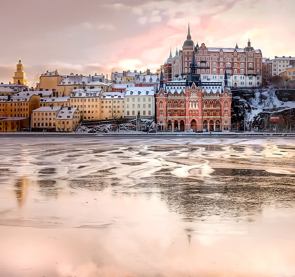
Here's Stockholm, Sweden at sunset. As you can see... (show quote)
Hi Shakey, a little late to the party, again. But, here's my edit.
Mike
Feb 19, 2018 06:38:50 #
SalvageDiver wrote:
Hi Shakey, a little late to the party, again. But, here's my edit.
Mike
Mike
Better late than never, SalvageDiver. Yep, you gave this some thought with the pink clouds and all, but not enough. The snow is white, great. However, the buildings are subdued, almost washed out. You should be aiming for bold bright colors. There is way too much ice, which does nothing to enhance the image. You need to crop most of the bottom of the image. Maybe you rushed it because you were late to meet the challenge. You can do way better than this.
You get three thumbs this time.

If you want to reply, then register here. Registration is free and your account is created instantly, so you can post right away.