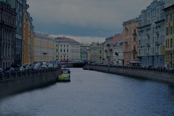
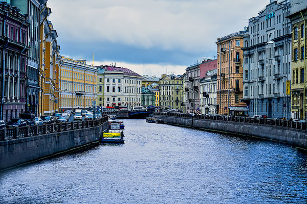
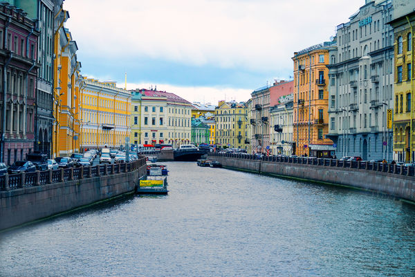
Challenge Series: St. Petersburg Canal, Russia.
Feb 5, 2018 07:59:22 #
We are still in Russia. This is a canal in St. Petersburg. It was a dull overcast day.
Your Challenge is to convert the dull day into a bright colorful image.
If you rush to the Haze Removal tool watch out for halos appearing on the edge of buildings and roofs. Pull back on the slider or use a different adjustment tool.
The lower sky is white, do not allow this area to burn out to bright white with no detail. Do not replace the sky. Improve it. Watchout for noise.
The houses are very colorful, bring out the colors to add impact to the image.
Crop if required.
Context: sell St. Petersburg as a travel destination.
Sorry no RAW file. You'll do fine with the png file.
Feb 5, 2018 14:36:37 #

Feb 5, 2018 16:33:00 #
R.G. wrote:
Welcome to sunny St. Petersburg
It would help those of us who are novices at PP if you gave a brief description of how you achieved your result.
Feb 5, 2018 17:04:01 #
R.G. wrote:
Welcome to sunny St. Petersburg  .
.
-
.-
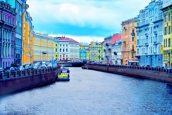
Pretty good, R.G. You got rid of the noise, and the sky and water are under control. I thought that bright water would stall a few but clearly not you.
The houses could be brighter and the colors bolder. I know it's your thing not going too bright and bold. So I'm giving you four thumbs to encourage you to take that last step. I know you are reluctant - just do it.


Feb 6, 2018 05:43:02 #
Here is my take. Minor noise reduction, and adjustments in ACR, then some minor dehaze and sharpening in PS CS6. Gary
Feb 6, 2018 06:57:01 #

Quote:
The houses are very colorful, bring out the colors to add impact to the image.
Feb 6, 2018 07:37:13 #
gwong1 wrote:
Here is my take. Minor noise reduction, and adjustments in ACR, then some minor dehaze and sharpening in PS CS6. Gary
Welcome, Gary. Your image is very good, you have control of most areas: sky, water, and buildings. However, I asked for sunny St. Petersburg. That's where you interpretation fell down. You have a choice of selecting the buildings and brightening them, or use a new layer, masks and paint brush to brighten the buildings.
A very good first image, you get four thumbs.
Feb 6, 2018 07:48:51 #
Oh! dannac. You tried so hard to get that sunny look with no noise. You had control of the sky, water and buildings. Unfortunately you went too far with one one of the adjustment tools. (I think it was the Denoise tool) The tool made your image look painterly. Everything is too soft. Check the canal walls for an obvious example. Pull back on the Denoise slider because it is inclined to soften images. It was a really good effort so you get four thumbs.
Feb 6, 2018 07:56:04 #
Shakey, I have been here a very long time, but normally do not reply to a lot of things that has a long thread of replies. (No sense in repeating what has been said by others.) I hope you like this better, the sky does not lend itself to a Sunny Day IMHO. I hope you like this better, selective D&B in CS6 utilized.
Gary
Gary
Shakey wrote:
Welcome, Gary. Your image is very good, you have c... (show quote)
Feb 6, 2018 08:27:06 #
gwong1 wrote:
Shakey, I have been here a very long time, but normally do not reply to a lot of things that has a long thread of replies. (No sense in repeating what has been said by others.) I hope you like this better, the sky does not lend itself to a Sunny Day IMHO. I hope you like this better, selective D&B in CS6 utilized.
Gary
Gary
You are correct, Gary. The sky, as is, does not lend itself to a sunny day. I'm sure you noticed that the light comes from the right. The buildings on the left are a tad lighter than those on the right. Many editing programs enable the user to introduce light streaming from one side. Some offer sun rays as an option. Maybe we'll see someone take the hint.
Your new image is a tad brighter. I'll give you five thumbs for effort.
Feb 6, 2018 08:32:26 #
rborud
Loc: Minnesota
Shakey wrote:
We are still in Russia. This is a canal in St. Pet... (show quote)
Feb 6, 2018 08:47:00 #
Shakey wrote:
The tool made your image look painterly. Everything is too soft.
Thanks
Feb 6, 2018 08:54:42 #
You have everything under control, rborud. You guys are getting so good. It is a very strong effort but not quite a sunny day. Four thumbs my friend.
Feb 6, 2018 13:48:05 #
PeterBergh wrote:
It would help those of us who are novices at PP if you gave a brief description of how you achieved your result.
Hi Peter. I'm not sure which processes you're curious about so I'll give a quick overview.
The objective was to turn a gloomy day into a sunny day. The main difference between gloomy and sunny is direct sunshine - which is yellow - so one of the first things I did was to shift the white balance well towards yellow (I settled for 15 on the Lighroom WB slider). I also shifted the Tint slider towards magenta a little (+5) to add a touch of warmth to the sunshine.
When an image needs an overall boost, the two obvious things to try are increasing Contrast (or a mixture of Contrast and Clarity) and increasing Saturation (or a mixture of Vibrance and Saturation). In the case of global adjustments (those that are applied to the whole image), there are two possible approaches. One approach is to ramp up the adjustment until parts of the image start to show undesirable effects (overcooking) and then back off slightly. Another approach is to deliberately ramp up the adjustment beyond that point, then mitigate the negative unwanted effects of the over-adjusting, while keeping the positive desirable effects. Typically the negative effects will manifest only in limited areas while much of the image may respond positively to the adjustment.
The advantage of the second method is that you can push adjustments much further than you can with the first method - but you have to be able to mitigate the negative effects of over-pushing.
In the case of saturation, my current approach is to push Vibrance up quite high (60 or so in Lightroom) and then use the HSL tool to mitigate any unwanted effects. Red, orange, yellow and yellow/green are the most prone to becoming garish when ramped up (yellow/green is a common colour for vegetation, including grass). Colours can also become too solid and heavy, and that can happen not just through being over-saturated - it can also happen if they are darkened too much (darkening a colour strengthens it whereas lightening a colour weakens it). The HSL tool can lighten/darken and saturate/desaturate individual colours (it can also tint-shift colours). Once I've gone over the image with the HSL tool I'll return to the main edit to see if it needs any more tweaking. The quickest way to do that is to nudge the Saturation slider in the desired direction.
In the case of contrast, the negative effects of over-pushing can be countered using the Whites, Highlights, Brightness, Shadows and Blacks sliders. Ramping up Contrast or Clarity often results in blacks that are too solid and highlights that are too harsh (or blown). Alternatively, lowering the Whites/Highlights too much or lifting the Blacks/Shadows too much can leave an image looking flat and lacking in contrast. The optimum mixture typically depends on a delicate balance between darkness, brightness and contrast.
Increasing contrast also tends to strengthen colours, so it's a good idea to work on contrast before saturation.
The other steps that I took for the above image included cloning over problem areas that weren't responding well to the usual treatments. I also occasionally use the Adjustments brush and the Split Toning tool to add tints.
I hope this helps. If there is something specific that you want to know, feel free to ask.
Feb 6, 2018 14:45:12 #
Gave it a little try Shakey.
I see some members are interested in how we do some things so I will mention a few. All my edits were in Photoshop. I broke this picture up into 3 primary layers all having their own mask. First one is for the buildings. I used camera raw and decreased highlights, opened shadows, increased whites, increased clarity and saturation. Layer is a duplicate of the improved first layer then reduced saturation and blue. The sky was also a duplicate of layer one and increased whites more, lowered highlights. Added a color correction layer for the sky and increased blue. Sky was not bright enough and couldn't get it so it didn't look so overcast so I added another layer set it for screen and dialed it back for just a slight improvement in whites.
I see some members are interested in how we do some things so I will mention a few. All my edits were in Photoshop. I broke this picture up into 3 primary layers all having their own mask. First one is for the buildings. I used camera raw and decreased highlights, opened shadows, increased whites, increased clarity and saturation. Layer is a duplicate of the improved first layer then reduced saturation and blue. The sky was also a duplicate of layer one and increased whites more, lowered highlights. Added a color correction layer for the sky and increased blue. Sky was not bright enough and couldn't get it so it didn't look so overcast so I added another layer set it for screen and dialed it back for just a slight improvement in whites.
If you want to reply, then register here. Registration is free and your account is created instantly, so you can post right away.