Opinions on these shots please
Jan 25, 2018 14:46:16 #
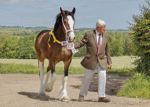
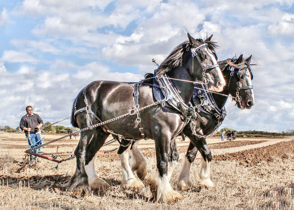
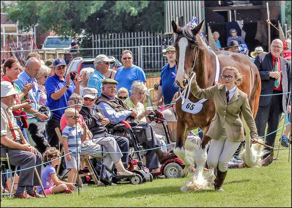
Im thinking of entering two of these in a national (shire horse in general) compertition (something Iv never done before) Iv been dithering over them for the last week or so, so help me out, what two would you chose and any critique would be welcome.
Jan 25, 2018 14:53:35 #

Number two is a beauty but maybe a little too bright. I would crop number three a little and remove some of the crowd but just my two cents.
Jan 25, 2018 14:55:58 #

I would imagine Bigal would be in a better position to judge what might be pertinent to such a competition and what would not. I, being a Minnesotan, could have no basis to craft an opinion.
Jan 25, 2018 14:58:34 #

Jan 25, 2018 15:01:49 #
67skylark27
Loc: Fort Atkinson, WI
They are quite bright, number two is the winner. Number one is quite basic, three is very busy
and the girl gets lost a bit. Run them through Lightroom for some adjustment and you are good
to go.
and the girl gets lost a bit. Run them through Lightroom for some adjustment and you are good
to go.
Jan 25, 2018 15:17:27 #
#2 with #1 a distant second. It shows the power of the horses in their working environment. #3 is just too busy.
Jan 25, 2018 15:53:07 #

Bigal wrote:
Im thinking of entering two of these in a national (shire horse in general) compertition (something Iv never done before) Iv been dithering over them for the last week or so, so help me out, what two would you chose and any critique would be welcome.
So good to see your post Bigal. Even though you are on my buddy list I have missed several of your recent posts. As I have said many times I value your work with these magnificent animals very much. I tend to like the shots that include the handler/plowman with the judges and spectators in the background. You have posted so many shots that I believe would do well in competition I can only wish you luck in your choice.
Regards, Phil
Jan 25, 2018 17:34:15 #

Two would judge. I would go back and reprocess it. Their is a lot of viable noise in it and its a bit over sharpened. Technical score on this version might be harsh. Impact and composition would score well.
Jan 25, 2018 17:35:05 #

I feel the animals' great strength in #2 and love the composition, but wonder if the processing is too distinctive to do well in a competition? You may find some judges love it and some dismiss the image just because of the pp. I can see very little of the horse in #3, so I'd toss that one, but then I, like most others viewing these, likely have completely different "judging" criteria than those in charge of the contest. Best wishes; let us know what happens!
Jan 25, 2018 18:38:11 #
Jan 25, 2018 22:09:12 #
#1, #2 is overcooked and the woman leading the Horse in #3 has her eyes closed.
Jan 25, 2018 22:17:09 #

1 & 2 for competition. The third one is too busy and keeps the horse from popping.
The second is the best composition but needs a little tweaking in tone and exposure,
The first one is nice, except that the guy leading the horse seems to be more interested in something else. It tends to draw my eye in the direction he is looking, away from the horse.
--
The second is the best composition but needs a little tweaking in tone and exposure,
The first one is nice, except that the guy leading the horse seems to be more interested in something else. It tends to draw my eye in the direction he is looking, away from the horse.
--
Jan 26, 2018 06:15:33 #
Number 2 with less light is classic but static, no sense of movement. Number 3 has energy, action, emotion, and the contrast of the girl with the powerful horse makes the image full of life. At the same time the feelings of the crowd show a second story making the image draw the observer in. It could be cropped a bit. Rule of thirds gives it balance.
Jan 26, 2018 06:48:39 #

Jan 26, 2018 07:25:21 #

If you want to reply, then register here. Registration is free and your account is created instantly, so you can post right away.