Samples of my photographs...
Jan 12, 2018 17:29:05 #
I have picked what I consider my best...so far. :) if you want to see a lot more please go to debbieegleston.blogspot.com

Jan 13, 2018 13:21:08 #

#2 is well conceived and well executed, although perhaps the background could benefit from some denoise.
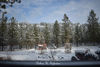
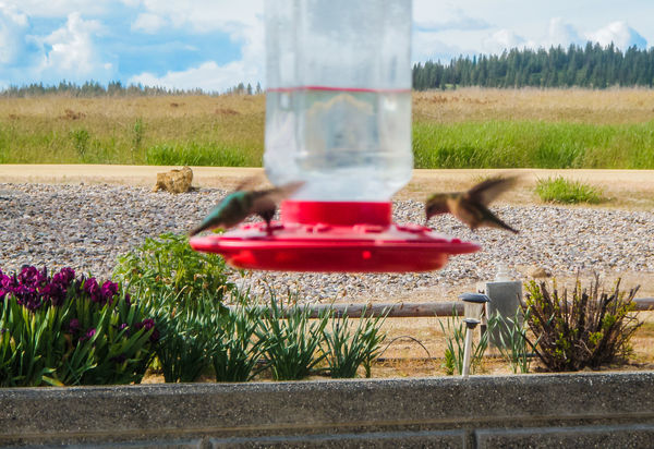
In#1 the birds are a bit small in the frame and the bright sky's a bit of a distraction. If it's possible you should re-shoot with a less distracting background, and zoom in a bit more.
In#1 the birds are a bit small in the frame and the bright sky's a bit of a distraction. If it's possible you should re-shoot with a less distracting background, and zoom in a bit more.
Jan 13, 2018 15:15:14 #
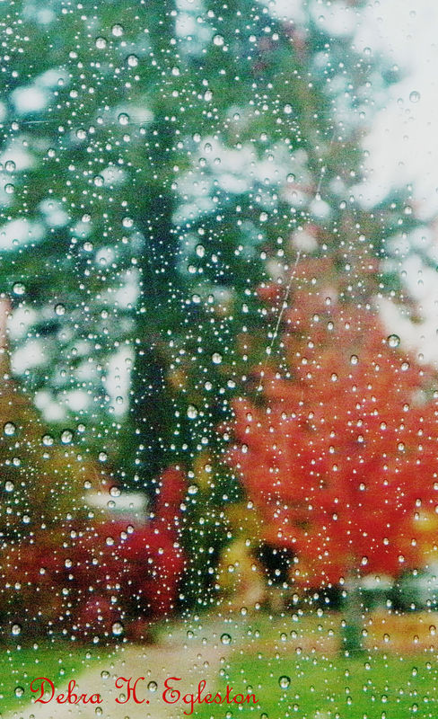
Thank you! I have denoised the fall day photo...what a difference! Such a smoother look. :) I will have to hunt down the original hummingbird photo. It is much darker...interesting..it was the colors in the photo that I loved with the light....
Jan 13, 2018 15:25:20 #

DebbieE wrote:
I have picked what I consider my best...so far. :) if you want to see a lot more please go to debbieegleston.blogspot.com
Hi, Debbie,
Welcome to the FYC Section of UHH. Over time, you will receive responses and (it is hoped) helpful suggestions from photographers ranging in experience from relative beginners to to advanced amateurs, and some highly accom0lished professionals. They will range from gentle suggestions to blunt statements of a perceived problem and by-the-numbers directions on how to overcome the problem. Most will be constructive critiques, so, whether honey-coated or blunt, take them as sincere efforts to help you along your way as a learning photographer.
I did look at the images you posted @ blogspot.
My first suggestion mirrors the comment you received from RG about having more concern to minimize background distractions and give your subject the advantage of a greater share of the image area, or, through careful composition, help it to gain pride-of-place within the overall image.
I did especially like the series of images of mid-ground and distant trees in front of and on top of a sharp rise or cliff face. All of those images were strongly enhNced by the pine boughs and needle clumps in the upper left of each image.
Some had excellent depth of field, but one or two lacked good focus on the more distant features. It is a particularly interesting series illustrating the different lighting conditions you captured of essentially the same scene. A really interesting group of images! If they were mine, a few would be matted and framed and on my walls!
So, get ready for comments that will emphasize the technical aspects of exposure and focus, the aspects of an image that contribute to its visual impact, and various aspects of image composition...the “anatomy” of the image, and the various “rules” that can be followed to improve an image, or, just as often, can be ignored to improve the over-all effect of an image.
I think you’ll quickly catch on to the satisfaction that most here in FYC take in the continuing learning process that photography provides...of which you are obviously already aware!
I look forward to seeing more of your images.
Best regards,
Dave
Jan 13, 2018 15:27:10 #
It might be a good sign that the original of #1 was dark. It might mean that the sky is well exposed. You might find that if you select the sky you can darken it and get it looking much better and less distracting. The camera would have included the bright sky when it chose its exposure level for the shot.
Jan 13, 2018 15:58:58 #
Matted and framed - so maybe that means someone would buy one or two ? I hope...:) anyhow, I am thankful for the insight. I keep hearing a recurring theme of someone liking the original for being 'darker' - which means there is something to learn there for me...anyhow, I found the original photo, was wondering how to post it without cluttering up the board with repeated photo, but would like your perspective. Thank you...and, is there a glossary page for photo 'vocabulary' as I am totally a newbie and do not know one thing about some of these topics :) Thank you again for your help.
Jan 13, 2018 17:09:17 #
DebbieE wrote:
.....anyhow, I found the original photo, was wondering how to post it without cluttering up the board with repeated photo.....
Don't worry about cluttering up the thread. Multiple images are common.
The next response that you post, finish the text, click on [Preview], click on [Choose file], check the (Store original) box and click on [Add Attachment]. Then add text to the image if you want to (it'll appear as a superscript).
If it's OK for us to edit your images for demonstration purposes, say so (the rule in UHH is "No edits unless permission is granted").
Jan 13, 2018 17:23:58 #
Jan 13, 2018 17:28:50 #
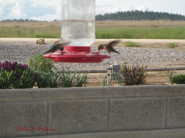
Okay, here are the two re-edited. Permission is granted on these two photos for learning purposes...Thank you...you guys are great!
Jan 13, 2018 18:42:20 #
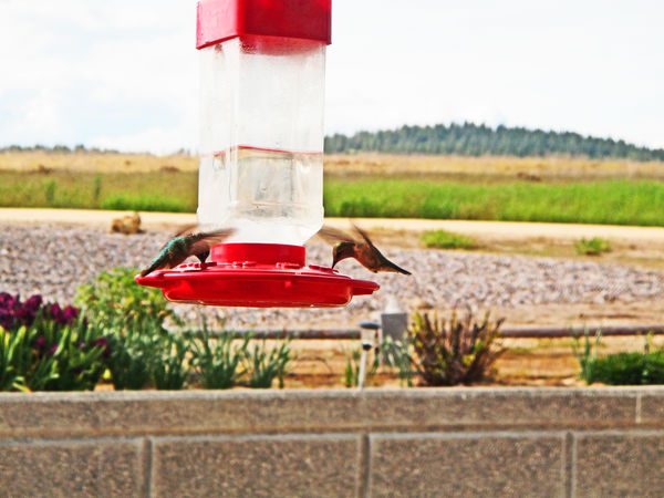
I only have time to work on this one tonight. Apart from general boosting with Contrast, Clarity, Saturation plus sharpening/denoise I lightened the whole picture slightly and darkened the sky and wall to make them less distracting. As suggested, the crop gives the birds more prominence.
The birds were too fast for a shutter speed of 1/250 sec. Perhaps some anti-shake (which I don't have) might help, but even at that they will probably be irretrievably soft. Even if you're happy to have blurred wings, their moving bodies needed a faster shutter speed. Hummers usually get shutter speeds closer to 1/1000 (higher if you want to capture the wings). They're also a bit on the dark side, so selecting them and lightening them or lifting the Shadows would help (I just left them alone).
-
Jan 13, 2018 18:50:56 #
Hmmmm, I like the blue in the sky. I don't like the way the amber hues wash out with the added blue. Weird...but the pic is beautiful....you really brought the variation of colors out. I 'feel' though that it takes away from the overall sharpness of the birds' images but I don't know how or why? with the blue added. Thank you, I appreciate you taking time to improve the photo and give your viewpoint. It is appreciated.
Jan 13, 2018 19:12:26 #
DebbieE wrote:
Hmmmm, I like the blue in the sky. I don't like the way the amber hues wash out with the added blue. Weird...but the pic is beautiful....you really brought the variation of colors out. I 'feel' though that it takes away from the overall sharpness of the birds' images but I don't know how or why? with the blue added. Thank you, I appreciate you taking time to improve the photo and give your viewpoint. It is appreciated.
You're right - I did select the sky, added blue to it and shifted the WB (white balance) towards blue for that selection. Another possibility would have been to just boost the saturation of that selection, which would have kept more of the original yellow in the clouds.
I think my adjustments detracted from the vividness of the birds rather than their sharpness. Lightening them and boosting their saturation (and perhaps contrast) would counteract that.
For the colours my current approach is to ramp up the Vibrance (a Lightroom adjustment) to about 50, then go to the HSL tool to mitigate any extreme effects on any of the individual colours, like for instance the grass turning a neon yellow/green. At the end of the edit, if the colours need more or less boosting, a few tweaks of the Saturation slider will take care of it.
Jan 13, 2018 21:02:05 #
DebbieE wrote:
I have picked what I consider my best...so far. :) if you want to see a lot more please go to debbieegleston.blogspot.com
Welcome to the section. I think by the responses to your photos, you are getting a taste of how the section works. I think your photo of the water drops with the out of focus background is very appealing. I'm looking forward to seeing more of your work. Thanks for posting and stopping by.
Erich
If you want to reply, then register here. Registration is free and your account is created instantly, so you can post right away.