Revisiting Gravenstein Meadow One More Time - With GX680II Film Camera
Dec 21, 2017 18:53:11 #
Laurence68
Loc: Olympic Peninsula, WA
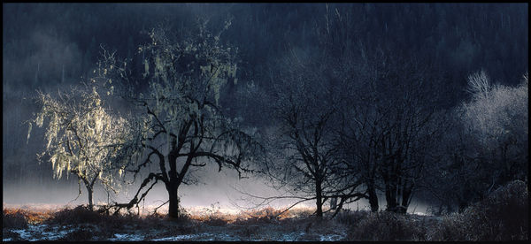
Sorry to be overbearing on posting the same area; however, I wanted to throw in an image from the monstrous GX680II medium format camera.
Totally different perspective here.
Old Bunch Family Homestead, Quinault Valley, Olympic National Park.
This was the next day from the previous images; still sunny, so the sun popped up again through the gap on the high hills across the river for barely 10 minutes of light; we will be beyond the Sosltice soon!
The light up above was way too bright and almost directly into the sun, which was very low on the horizon, touching the hilltops beyond, so I cropped the top portion out of the transparency after scanning.
Exposed for the brightest light (sunny 16, camera has no meter), and opened up 2 stops. This still threw the trees into silhouette, but saved me from having blow-outs on the bright parts while retaining at least a moderate amount of shadow detail.
It's always a compromise.
Fuji GX680II
Fujinon 125/5.6 lens
f:22 1/60th
Fuji Provia film
Dec 21, 2017 19:59:31 #
I think I prefer the first image because the lighting was more dramatic. It appears that you were losing the sun a bit in this image. Still, the frost and the light on the trees is very nice.
Erich
Erich
Dec 21, 2017 21:33:46 #
Laurence68
Loc: Olympic Peninsula, WA
ebrunner wrote:
I think I prefer the first image because the lighting was more dramatic. It appears that you were losing the sun a bit in this image. Still, the frost and the light on the trees is very nice.
Erich
Erich
I agree. Thank you for commenting, and I appreciate your opinion.
Dec 22, 2017 09:07:36 #

It may not have the impact of your first post but it has bucketfuls of drama Laurence.
Again with this one, I love the colours, and the silhouettes, and the shadows, and that dramatic back-drop. Also the crop.
All nicely done including, and controlled by, the exposure used. Super!
Again with this one, I love the colours, and the silhouettes, and the shadows, and that dramatic back-drop. Also the crop.
All nicely done including, and controlled by, the exposure used. Super!
Dec 22, 2017 10:02:55 #

To my eye the light and the shadows look a bit too patchy. The bright patch would possibly work better if the shadows right next to it weren't so deep, and overall I'd say the shadows are too dark and impenetrable. Also the two bright areas separated by dark shadow gives a split look to the composition. If it was mine I'd try cropping in from the right to exclude the bright area on the right and lift the central area of the shadows to reveal more detail.
Dec 22, 2017 10:57:54 #

I like this. And the lit tree at the right hand side is an interesting surprise midst the shadows. I think it's an interest complement to the original one. I can see them as a pair on the wall.
Dec 22, 2017 18:08:15 #
Laurence68
Loc: Olympic Peninsula, WA
Thanks all. I am getting Lightroom (finally), and now will see if I can learn to fix up those shadows a little. Also, will fool around with cropping.
I really appreciate the suggestions!
I really appreciate the suggestions!
If you want to reply, then register here. Registration is free and your account is created instantly, so you can post right away.