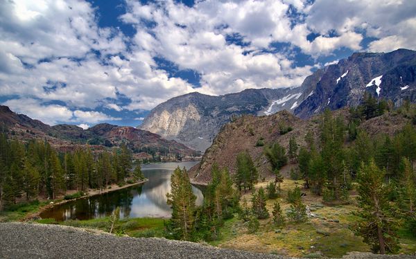
How to make this photo more appealing?
Nov 17, 2017 12:00:43 #

Hello,
I would like to ask you, experts, what would be your approach to processing this photo to make it "pop" without looking fake or too HDR-ish?
Lighting conditions were less than ideal, but not insufficient in my opinion, but even tho I've spent some time modifying things around, it still looks somehow muffled to me.
It very well reflects the reality of the scene when this photo was taken, but somehow it just doesn't stand out...
I would really appreciate if someone would take time go over this with me. It may not be the greatest photo wth some fringing and the angle ot was taken from, but it's tied to a memory that makes it valueable to me.
Thank you!
Nov 17, 2017 12:03:38 #
Uh, short of drastic post processing and the addition of textures, nothing. Your image is practically perfect for a landscape.
Just for kicks, try a black and white conversion.
Just for kicks, try a black and white conversion.
Nov 17, 2017 12:06:42 #
PGHphoto
Loc: Pittsburgh, PA
Paulie wrote:
Hello, br br I would like to ask you, experts, wh... (show quote)
I would suggest to try minor increase in exposure and an increase in contrast as a quick place to experiment without major changes.
Nov 17, 2017 12:09:34 #
rgrenaderphoto wrote:
Uh, short of drastic post processing and the addition of textures, nothing. Your image is practically perfect for a landscape.
Just for kicks, try a black and white conversion.
Just for kicks, try a black and white conversion.
Thank you for your time and advice sir!
I'm not a big fan of over-processed images, but it's probably mostly lack of artistic vision and also inexperience with PP software.
Somehow bigger part of me leans toward reflecting the reality as closely as possible, but I wonder what the addition of textures would do in this case.
Nov 17, 2017 12:13:32 #
PGHphoto wrote:
I would suggest to try minor increase in exposure and an increase in contrast as a quick place to experiment without major changes.
Thank you, I will try to do that when I can.
I think that the polarizer did pretty decent job in this case and I would hate to blow out those clouds, maybe I should leave the sky alone and just select the foreground as a layer to play with? (which is what I tried to accomplish in round one)
Nov 17, 2017 12:15:54 #
I would lighten up the image a little bit and at the same time I would increase the contrast. It is a sun lit landscape so the sun shoud be quite obvious.
Watch carefuly when you are changing both, so you will not overdo.
It is a very good image!
Good Luck!
Watch carefuly when you are changing both, so you will not overdo.
It is a very good image!
Good Luck!
Nov 17, 2017 12:16:34 #

It's a beautiful picture! I'm with you on the over done processing - sometimes it's fun and sometimes it takes away from the natural beauty.
Nov 17, 2017 12:19:19 #
Paul J. Svetlik wrote:
I would lighten up the image a little bit and at the same time I would increase the contrast. It is a sun lit landscape so the sun shoud be quite obvious.
Watch carefuly when you are changing both, so you will not overdo.
It is a very good image!
Good Luck!
Watch carefuly when you are changing both, so you will not overdo.
It is a very good image!
Good Luck!
Thank you for your help!
Yes it's the sunlight I see in some other pictures, yet so far I was unable to achieve any satisfying results with my own images.
Nov 17, 2017 12:57:55 #

Paulie wrote:
Hello, br br I would like to ask you, experts, wh... (show quote)
The first effort should be to crop out the immediate foregrourd. Keep the same aspect ratio but trim off the gravel area at the very bottom of the image. That will also cut the brightest part of the sky in the upper left corner and some of the right edge... none of which contributes in a positive way to the composition.
Then use a curves tool to selectively adjust contrast. You can bring up some areas to make them brighter (without blowing out the clouds) and darken some areas for more contrast to give it "pop".
Then perhaps selectively adjusting for less bluish color in some areas. I personally don't care for added saturation, but many people like that rather than more pastel looking colors. It is your photo, so try it both ways and choose whatever you prefer.
Nov 17, 2017 13:45:55 #
deer2ker wrote:
It's a beautiful picture! I'm with you on the over done processing - sometimes it's fun and sometimes it takes away from the natural beauty.

Nov 17, 2017 13:55:28 #
Apaflo wrote:
The first effort should be to crop out the immedia... (show quote)
Thank you! I appreciate your time and and valuable input.
I will try to follow these steps when I get home and see where it goes from there.
I am aware of the gravel, but somehow I didn't want to cut off too much
These photos were taken during our motorcycle trip so hiking was nearly impossible unless our bikes and all the gear were secure and safe and we had time and energy to change clothes and boots... :) looking at those pics now I wish I could spend more time in places like this and find better spots and angles to take pictures. It's a process of gaining experience..
Nov 17, 2017 14:04:00 #

Paulie wrote:
Hello, br br I would like to ask you, experts, wh... (show quote)
This is a fine image just as it is. Since you asked, here is my treatment.
Nov 17, 2017 15:58:11 #
kpmac wrote:
This is a fine image just as it is. Since you asked, here is my treatment.
thank you!
Nov 17, 2017 16:55:07 #

Paulie wrote:
Hello, br br I would like to ask you, experts, wh... (show quote)
I don't know if I would tinker much with this as it is a fine photo but since you asked............
I also would lighten it a bit and back off the saturation some, then I would crop the sides (2:3 format). Not a lot and more from the right than the left. this will bring the viewer more into the scene. And I would leave that foreground, again to accommodate the viewer so they don't subconsciously feel they might be in danger of falling off an edge.
Nov 17, 2017 17:23:29 #
Apaflo wrote:
The first effort should be to crop out the immedia... (show quote)
I think weare getting closer to what I had in mind. Probably not 100%, but I'm learning a lot today. :-)...
(Download)
If you want to reply, then register here. Registration is free and your account is created instantly, so you can post right away.