A first time Bridal shoot
Jun 25, 2012 23:38:41 #

Jun 26, 2012 00:03:03 #
I really like #2&3. I think #1 is too bright so you are losing detail. Nice photos overall.
Jun 26, 2012 00:51:10 #
I can not comment on the photos because if I tried this, I would fail miserably. You did good, I think. Wait, I just commented. My bad. I will say this; that is one gorgeous dress.
Jun 26, 2012 01:40:28 #

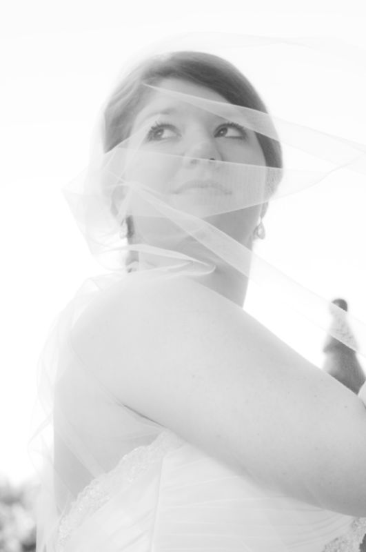
As previously mentioned, #1 is overexposed and consequently, the contrast is flat, It is, however, a good concept. Execution is just a bit off. I think a levels or curves adjustment might help it.
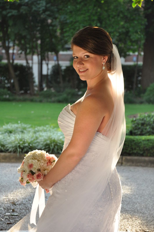
#2 is really nice. The only issue is that her face is the darkest part of the image, Fill flash or reflector would have solved that.
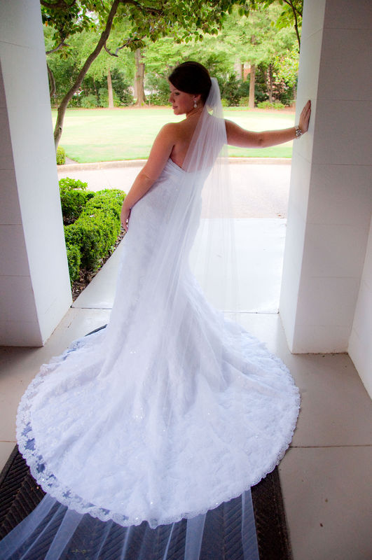
#3 Great concept - good exposure. It looks, however, like the fill is too low. The top of her shoulder is darker than her arm. You cannot help this, but shooting directly into a bare shoulder is not usually the most flattering. Even thin arms take on too much importance - note that her face is less area than all that shoulder/arm.
#2 is really nice. The only issue is that her face is the darkest part of the image, Fill flash or reflector would have solved that.
#3 Great concept - good exposure. It looks, however, like the fill is too low. The top of her shoulder is darker than her arm. You cannot help this, but shooting directly into a bare shoulder is not usually the most flattering. Even thin arms take on too much importance - note that her face is less area than all that shoulder/arm.
Jun 26, 2012 01:57:31 #
CaptainC wrote:
O.K. CaptainC, let us talk about the last photo. First of all, you always say not to have a woman sleeveless. Obviously with wedding dresses, there are a lot of sleeveless and strapless gowns worn on that day. So what should be done about the arms? She is very pretty and in a pretty pose-somewhat. What I mean by this is that we are taught to always turn her body slightly so as to flatter her more and not make her look bigger than she is. In a wedding gown, even a skinny girl could look heavy. How would you improve upon this? Also, her arms look a little bigger than they have to. How does one get around this?As previously mentioned, #1 is overexposed and con... (show quote)
Tom
Oh, and is your house on fire yet?
Jun 26, 2012 06:38:07 #
Jun 26, 2012 07:31:39 #

I like them all.
Maybe if you turn up the contrast and turned down the brightness on # 1 a bit. I also think #1 would look great in sepia.
#2 is beautiful.
Nice pose. If you have a program to darken the sidewalk to her right a bit, I think it would make that side of her stand out more.
#3 I love. If you could brighten up her face a bit, I think it would be awesome.
Great job Deanna!!!
:)
Jun 26, 2012 09:18:48 #
Jun 26, 2012 09:33:01 #
Jun 26, 2012 10:09:25 #

besides the points Captain C made, in #2 the rug/runner bothers me. I would have like to see it removed as I think takes the image from bridal portrait to just a picture. It's all in the details (something I'm still struggling with).
Jun 26, 2012 17:19:21 #
Jun 26, 2012 17:28:53 #
tainkc wrote:
quote=CaptainC As previously mentioned, #1 is ove... (show quote)
First - house not on fire! Biggest concern is our son and family down in Colorado Springs with the Waldo Fire. I think this afternoon there are 13 or 14 separate fires in Colorado.
OK- on to her arms.
You are correct, of course, that this type of dress will often be sleeveless. In this case, she is positioned so her face is looking RIGHT over that shoulder. Had she been turned a bit more to her left, we would get a bit more dress and a little less arm.
However, the best fix in this case might be that veil - if it were positioned over the arm - just like the wind picked it up and blew it across her body, that could have done the trick.
Also- the veil in its present position actually adds weight to her waist as it adds to the fabric of the dress in that area.
Remember too, that I am looking at what could be ideal - sometimes ideal just won't work and we get the best we can. This is certainly a nice image as it is. Isn't there some saying about not letting the perfect be the enemy of good?
Jun 26, 2012 17:39:34 #
deanna_hg wrote:
CaptC- could you give me an idea how to have set up a reflector?
Sure. A white (or even silver) reflector placed over to camera left and positioned a little bit above her head and shoulders would fill that area in nicely and that reflected light would then have some downward direction to it.
What I see now, is the bottom of her nose is brighter than the top. The cheeks just below her eyes are darker than the lower part of her cheeks. Her lower arm is brighter than the upper and the top of her shoulder is dark. This indicates that the light illuminating her face is coming from below. It is a subtle thing, but there is something "wrong" to our brain when a person is not lit from above.
It is a very nice image, but these little details are what separates a nice image from one that is a great image.
Jun 26, 2012 17:48:55 #
CaptainC wrote:
Very true. Thanks for the input. You can tell my amateur status quite readily because no matter how hard I try to get the setting just right, there will always be something stupid in the background such as a chair that I forgot to move or a corner of a bookcase or a half open drape. Simple stuff like that. You see, I did not even think about the veil. Truly the amateur. Again, thank you. quote=tainkc quote=CaptainC As previously mentio... (show quote)
As for the fires, the way it is displayed on the news here is that the Whole of Colorado appears to be in flames with all of those little indicators on the state maps that they show.
Jun 26, 2012 18:43:46 #
CaptC-#1, me in PPing but will go back and give it another go. #2- how to have set up a reflector for her face. #3- reflector in wrong place. Would there have been enough setting reflector up higher then? It didn't seem to reflect but maybe we didn't try it. She was a sweetheart for asking me to do some. She mainly wanted on full length photo for the foyer table.
If you want to reply, then register here. Registration is free and your account is created instantly, so you can post right away.