Would you change the color?
Jul 26, 2017 07:10:30 #
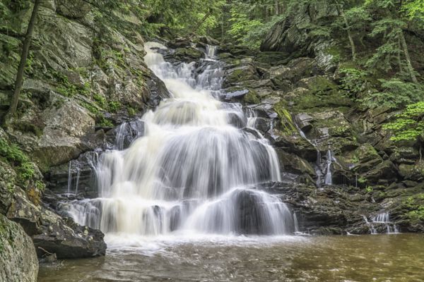
Just curious how most folks would handle the brackish looking water in this shot. If you were going to print this, would you alter the color of the water, or would you leave it precisely as shot in nature? This was hand-held on a cloudy day, so may not be the sharpest focus, but i think it's enough for the question about color. Thanks for any opinions!
Marylea
Marylea

Jul 26, 2017 07:34:09 #

Did you use a polarizer, I think it would have helped. But, it is very nice the way you have it here, I vote no color change.
Jul 26, 2017 07:51:33 #

Very pretty scene! My thought is if you go too far to pristine-white, the image may look odd due to the fact the pool of water in front is brownish and there are no shadows on the rocks.
When I was printing more often, I would do a 4x6 or 5x7 and tack it to a board or set on a shelf, and look at it a few days before proceeding with larger outputs of $$
When I was printing more often, I would do a 4x6 or 5x7 and tack it to a board or set on a shelf, and look at it a few days before proceeding with larger outputs of $$
Jul 26, 2017 07:52:12 #

Not sure of the term brackish.It generally means part salt and part fresh water.
Jul 26, 2017 08:15:47 #

melueth wrote:
Just curious how most folks would handle the brackish looking water in this shot. If you were going to print this, would you alter the color of the water, or would you leave it precisely as shot in nature? This was hand-held on a cloudy day, so may not be the sharpest focus, but i think it's enough for the question about color. Thanks for any opinions!
Marylea
Marylea
I would remove yellow color from the left part of waterfall. I am sorry for attaching my version without your permission. To see my attempt to improve your photo press Download.
Jul 26, 2017 11:47:45 #

I'm used to peat-coloured water so I don't have a problem with it, but you wouldn't have posted if you were completely happy with it yourself. In the HSL section you'll find that yellow is more of a player than orange where the colour of the water is concerned. Tint-shifting yellow towards orange a bit makes the water browner, which may or may not be seen by you as an improvement. In any case, desaturating yellow makes the water whiter. Blue and purple also play their part in the water colour, but apart from lightening or darkening it they can't be used to normalise the water's colour.
My suggestions for adjustments would be to tint-shift yellow towards orange a little, desaturate it and lighten it slightly. You could also try shifting the WB towards blue a notch or two. At the end of the day it's what looks normal to you that matters.
My suggestions for adjustments would be to tint-shift yellow towards orange a little, desaturate it and lighten it slightly. You could also try shifting the WB towards blue a notch or two. At the end of the day it's what looks normal to you that matters.
Jul 26, 2017 13:29:13 #
If you have a Photosphop loug in like Topaz Adjust or whatever the Nix equivalent, it will bring out the hidden colors and reflections in the rocks and water.
Jul 27, 2017 06:51:06 #
Linda From Maine wrote:
Very pretty scene! My thought is if you go too far to pristine-white, the image may look odd due to the fact the pool of water in front is brownish and there are no shadows on the rocks.
When I was printing more often, I would do a 4x6 or 5x7 and tack it to a board or set on a shelf, and look at it a few days before proceeding with larger outputs of $$
When I was printing more often, I would do a 4x6 or 5x7 and tack it to a board or set on a shelf, and look at it a few days before proceeding with larger outputs of $$
Thanks Linda - i really like your idea of the small print testers!
ML
Jul 27, 2017 06:57:38 #
sodapop wrote:
Not sure of the term brackish.It generally means part salt and part fresh water.
Right you are! Down here in FLA, it is usually this color, so that's what brought the term to mind. This was not truly brackish water.
Jul 27, 2017 07:00:18 #
R.G. wrote:
I'm used to peat-coloured water so I don't have a ... (show quote)
Thanks R.G. You're right - i'm not completely happy with it, but it is what it is. I've found all kinds of ways to change it, but then i have to question whether or not i really should. It almost feels deceitful in some weird way . . . but that could just be my Catholic upbringing shining through!


Jul 27, 2017 07:01:12 #
MMC wrote:
I would remove yellow color from the left part of waterfall. I am sorry for attaching my version without your permission. To see my attempt to improve your photo press Download.
MMC - i always appreciate your contributions! Thanks for taking the time!
ML
Jul 27, 2017 08:47:37 #
sodapop wrote:
Not sure of the term brackish.It generally means part salt and part fresh water.
I'm sure he was referring to the color of the water.
Jul 27, 2017 12:47:15 #
lsupremo
Loc: Palm Desert, CA
Linda, having seen some of the great work you have posted, I wonder if you don't print your images what do you do with them?
Jul 27, 2017 13:15:27 #

My vote would be for MMC's treatment. I think the slight dirty/muddy tinge in the water coming over the falls detracts from an otherwise great image. I have no issue with the color of the pool at the bottom.
Jul 27, 2017 14:24:32 #

I agree about the yellow in the water. I would also play with the Highlights and Whites sliders--agreed, you can overdo it, but see how you like a subtle boosting. You can always put them back where they started.
If you want to reply, then register here. Registration is free and your account is created instantly, so you can post right away.