Negative Space
Jun 21, 2012 12:53:04 #
Pw0812151
Loc: St. Petersburg
I love shooting negative space photographs, I think remmants of design class in art school. I am considering entering these 3 and a couple more in a rather big deal juried show. Opinions?
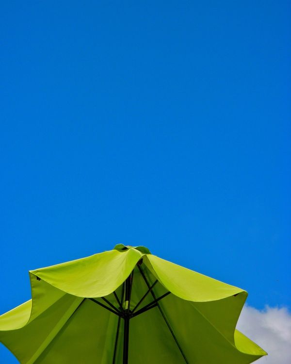
The Green Umbrella
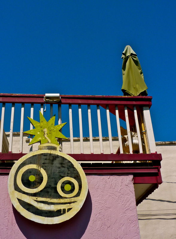
Smiling Face
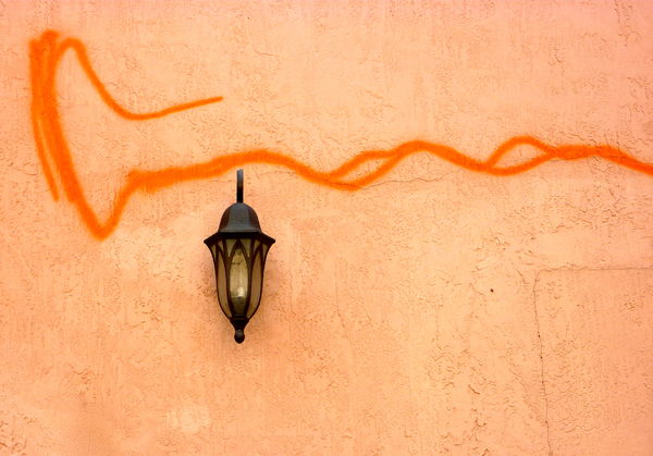
Orange Line
Jun 21, 2012 18:09:32 #
Jun 21, 2012 21:12:32 #

I love the concept and the color. But if you want my opinion, I would also suggest with #1 that you center the umbrella at the bottom, possibly. #2 being as it is a vertical photo, I would straighten it up vertically. #3 the crack on the right side is very distracting to me. I would do some PP and remove it. Very cheerful photos!
Jun 21, 2012 21:21:36 #

Doe wrote:
I love the concept and the color. But if you want my opinion, I would also suggest with #1 that you center the umbrella at the bottom, possibly. #2 being as it is a vertical photo, I would straighten it up vertically. #3 the crack on the right side is very distracting to me. I would do some PP and remove it. Very cheerful photos!
:thumbup:
Jun 22, 2012 05:58:04 #

Jun 22, 2012 07:45:28 #

As a juror, I can tell you that these are good photos. The first one, however, is rather ordinary. The other two have a very dynamic composition and work better for me. Good luck!
Jun 22, 2012 08:00:16 #
Jun 22, 2012 08:31:27 #

Jun 22, 2012 09:17:39 #

Very different, it will take some getting used to for me. Good luck with the cpmpetition.
Jun 22, 2012 10:56:12 #

I agree, different for sure. I like numbers two and three. Good luck in the competition.
Jun 22, 2012 12:22:48 #

Doe wrote:
I love the concept and the color. But if you want my opinion, I would also suggest with #1 that you center the umbrella at the bottom, possibly. #2 being as it is a vertical photo, I would straighten it up vertically. #3 the crack on the right side is very distracting to me. I would do some PP and remove it. Very cheerful photos!
I agree with all of this, but I also feel the the colors in #3 could use a little more saturation and vibrancy --- just me. Otherwise :thumbup: :thumbup: :thumbup:
Jun 22, 2012 16:02:01 #
# three is my favorite.
from sitting in many professional print competitions and learning from these big-time juried judges, I would flip #3 so the the line leads you into the photo, you read from left to right and that vertical line on the left stops you from exploring this wonderful photograph to its fullest. Try it and see if it makes a difference to you! good luck!
from sitting in many professional print competitions and learning from these big-time juried judges, I would flip #3 so the the line leads you into the photo, you read from left to right and that vertical line on the left stops you from exploring this wonderful photograph to its fullest. Try it and see if it makes a difference to you! good luck!
Jun 22, 2012 18:49:22 #

Pw0812151 wrote:
I love shooting negative space photographs, I think remmants of design class in art school. I am considering entering these 3 and a couple more in a rather big deal juried show. Opinions?
Your first image is your money shot. . .if you do one thing to it. You need to crop out the cloud. The cloud adds nothing, it distracts, and its texture kills this image. Do your crop off of the right side, to eliminate the cloud.
The other two I would not bother with.
Jun 23, 2012 02:24:05 #

Jun 23, 2012 03:17:14 #

I love #1 just as is. As I see it, the cloud provides context, making it obvious we're looking at the sky and not a blue wall. Love the colors and composition you have. Your art background was not wasted. :-)
Now that we've given you all this contradictory feedback, you're the ultimate judge. You have to be happy with it, but might not know what's best until you experiment by applying the various suggestions, comparing, and then going with what feels right to you. Your art background was not wasted. :-)
Now that we've given you all this contradictory feedback, you're the ultimate judge. You have to be happy with it, but might not know what's best until you experiment by applying the various suggestions, comparing, and then going with what feels right to you. Your art background was not wasted. :-)
If you want to reply, then register here. Registration is free and your account is created instantly, so you can post right away.