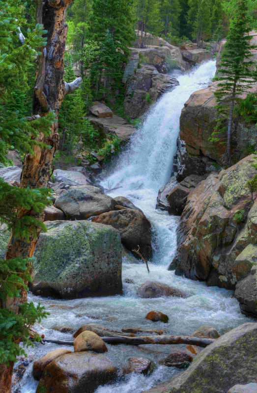
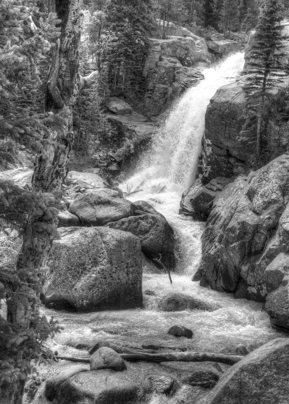
Water Fall. Color or B&W?
Mar 26, 2017 19:38:00 #

Just asking....
Thanks
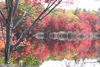
Taken in Rocky Mountain National Park last July
Thanks
Taken in Rocky Mountain National Park last July
Mar 26, 2017 19:42:03 #
photoman022
Loc: Manchester CT USA
I like them both but the B&W looks like a lithograph from the 1860s (or whenever they did lithographs like that). I like the B&W very much.
Mar 26, 2017 19:43:00 #

Mar 26, 2017 19:51:59 #
Mar 26, 2017 20:49:49 #
Thanks. After I had finished and posted these, I noticed how closely the tone of the tree on the left is to the surrounding elements. I'm going to see if I can adjust this for more tonal separation. At this point, I prefer the color version for this reason. Thanks for looking/commenting.
Allen
Allen
Mar 26, 2017 20:51:51 #

Mar 27, 2017 01:10:12 #

I am very drawn to the color version in this instance. The colors are so beautiful - the greens and the water color! I really like the composition of this shot, too.
Mar 27, 2017 09:16:14 #

LoneRangeFinder wrote:
Just asking....
Thanks
Taken in Rocky Mountain National Park last July
Thanks
Taken in Rocky Mountain National Park last July
Both are nice but prefer the color

Mar 27, 2017 09:16:23 #
I like the color one. The B&W needs more contrast. The color one shows the contrasts better. It's also clearer as to the lushness of the area. I think it has more "pop."
Mar 27, 2017 09:23:43 #
LoneRangeFinder wrote:
Just asking....
Thanks
Taken in Rocky Mountain National Park last July
Thanks
Taken in Rocky Mountain National Park last July
I guess I'm the salmon who swims against the current because in spite of possible need for more contrast, I feel since the subject IS the waterfall, my attention is drawn directly to the water in the B&W version more than in the color version. The color is good but a bit distracting from the waterfall itself.
Mar 27, 2017 09:49:49 #
LoneRangeFinder wrote:
Just asking....
Thanks
Taken in Rocky Mountain National Park last July
Thanks
Taken in Rocky Mountain National Park last July
Color.
Mar 27, 2017 09:52:51 #
Mar 27, 2017 10:05:28 #
LoneRangeFinder wrote:
Just asking....
Thanks
Taken in Rocky Mountain National Park last July
Thanks
Taken in Rocky Mountain National Park last July
Color. But what I really like is that it is not "overlySmoothed"- if that's the correct phrase. So you can really see the detail
Mar 27, 2017 10:09:22 #
StevenG
Loc: Long Island, NY
LoneRangeFinder wrote:
Thanks. After I had finished and posted these, I noticed how closely the tone of the tree on the left is to the surrounding elements. I'm going to see if I can adjust this for more tonal separation. At this point, I prefer the color version for this reason. Thanks for looking/commenting.
Allen
Allen
I agree. Would like to see the adjusted version.
Mar 27, 2017 10:30:39 #

LoneRangeFinder wrote:
Just asking....
Thanks
Taken in Rocky Mountain National Park last July
Thanks
Taken in Rocky Mountain National Park last July
The b/w could be nice but you have to separate the tree from the background. Also, the image looks more grainy than the color version. Did you add noise?
If you want to reply, then register here. Registration is free and your account is created instantly, so you can post right away.