Color saturation
Mar 8, 2017 09:24:29 #
I have been a member of a camera club since 1975. Over the last 5 years or so, i have noticed an increase in color saturation of images displayed by members. The over saturating of images is apparently not a passing fad. Seems now it is the norm and if you display what i have always consider natural color, your images are not as well received.. Wondering what others think about this this.
Mar 8, 2017 09:34:30 #
gvarner
Loc: Central Oregon Coast
Not as well received, indeed. We like people's honest opinions, at least some of us do, as a measure of our abilities. Color is a quick way to get the "wow" response even though there isn't much else of value in the photo. It's why I dislike HDR so much. It's easy to overdo and makes a photo look artificial. Sorry for rambling a bit there but it's one of my pet peeves.
Mar 8, 2017 09:50:17 #
It happens here more often than it should too. The wow factor is nice but it should be applied to enhance not to distract from an otherwise ho-hum shot.
The other side of that coin are those who think that because some of us choose not to spend hours oversaturating our work, that we think we are somehow superior. There have been several threads like this where the majority are completely missing the point of why it doesn't happen and it has absolutely NOTHING to do with being better than the rest but so it goes.
The other side of that coin are those who think that because some of us choose not to spend hours oversaturating our work, that we think we are somehow superior. There have been several threads like this where the majority are completely missing the point of why it doesn't happen and it has absolutely NOTHING to do with being better than the rest but so it goes.
Mar 8, 2017 10:07:23 #

I agree. Some photos are so far away from the natural that personally, it gives me pause. It's a valid artistic choice. I like saturated colors, but I often wish that a particular shot hadn't been so far enhanced. It's all subjective, though, and we all get to make our own choices. I hope we don't feel superior based on our choices...
Signed,
Pollyanna
Signed,
Pollyanna
Mar 8, 2017 10:19:49 #

wilfredmike wrote:
I have been a member of a camera club since 1975. Over the last 5 years or so, i have noticed an increase in color saturation of images displayed by members. The over saturating of images is apparently not a passing fad. Seems now it is the norm and if you display what i have always consider natural color, your images are not as well received.. Wondering what others think about this this.
Usually it is not even a 'wow!' factor, very few achieve that. It is more an inability to see the potential capture as an image or even a photograph.
Now that the lab work is done @home by folks who truly have no clue the results are often a mixed bag of OK, good, great and 'eeewwwww'. The real reason? Some folks are good at taking captures that could be easily transformed into an image but lack the knowledge needed when it comes to post processing. This reduces even further the field of 'good photography'.
Ah, there is no 'norm' either, not anymore to be more precise. 'Free for all' and 'equality' is a pervasive concept that is rotting everything*.
___________
* No winner or loser, just 'participants' that all get the 'prize'.
Mar 8, 2017 10:21:59 #

wilfredmike wrote:
I have been a member of a camera club since 1975. Over the last 5 years or so, i have noticed an increase in color saturation of images displayed by members. The over saturating of images is apparently not a passing fad. Seems now it is the norm and if you display what i have always consider natural color, your images are not as well received.. Wondering what others think about this this.
This is something I have been thinking about, too. Learning to use LR and PS, wanting to make my images look better, often found myself over-editing. That included over-saturation. I have seen high levels of saturation that were very well done, but a lot of examples look fake.
Recently I have begun to think in the direction of more natural, more subtle editing. It is VERY difficult to do well! There is a fine balance between over-saturation and faded-looking. I have seen some amazing examples of the more natural techniques and am just starting to experiment with getting those type of results.
gvarner wrote:
Not as well received, indeed. We like people's honest opinions, at least some of us do, as a measure of our abilities. Color is a quick way to get the "wow" response even though there isn't much else of value in the photo. It's why I dislike HDR so much. It's easy to overdo and makes a photo look artificial. Sorry for rambling a bit there but it's one of my pet peeves.
As you said, many people simply want their images to have any immediate impact ("wow") as a way to get praise. HDR is definitely a way to get that kind of response, even when it is overdone. Rather than completely rejecting HDR, I have experimented with it to see what I can do to make the image truly my own. The pre-sets that HDR programs offer run the gamut of boring to interesting to weird, and often are somewhat "off the mark" in my opinion. But when it works, it really is pretty good.
What I do with HDR is choose the pre-set that looks the best to me, then edit that until I am satisfied. OR, I use that preset to give me some ideas for editing a single image in a way that is unique. It has worked very well most of the time. Because of this, using it as a "learning tool", I enjoy looking at what HDR can show me!
But I am still seeking to create images with natural-looking colors, fine detail, and with a "wow" factor...
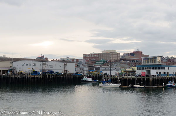
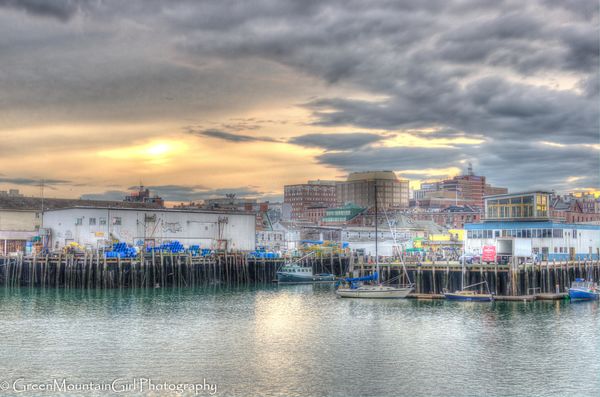
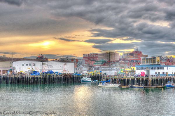
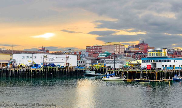
Here are some different versions of one picture, showing how I "use" HDR. It was sunset in Portland, Maine, I was standing on the end of a pier looking back at the city. Colors were beautiful but hard to capture in one photo, so I bracketed.
One of a bracketed series for HDR
HDR as it came out of the program
HDR after further editing
Edited from the ONE image (showed first), no HDR. I like this version best, even though the sky is not as dramatic!
Mar 8, 2017 10:29:11 #
SusanFromVermont wrote:
.../...
A single question: What were you trying to show when you capture this scene?
Mar 8, 2017 11:41:22 #
Rongnongno wrote:
A single question: What were you trying to show when you capture this scene?
Portland's Old Harbor is an interesting mix of work and play with working wharves and restaurants on wharves. There are fishing boats, ferries, warehouses, etc. and then the city itself in the background. I was capturing all of these juxtapositions under the light of the setting sun!
Does this answer your question?
Easier to see all the details when enlarged...
Mar 8, 2017 13:13:52 #

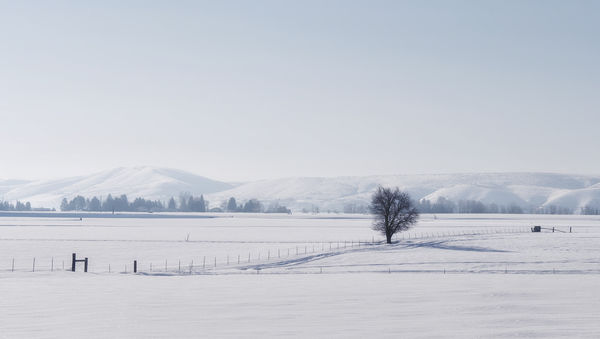
wilfredmike wrote:
I posted a bit to fredmiranda.com. My first few forays through their landscape section I was sooo put off by the ultra-slick and glossy, overly dramatic, over-saturated images. Always going for the huge WOW. (similar on 500px)...if you display what i have always consider natural color, your images are not as well received.. Wondering what others think about this this.
For nature and landscape shots, I've grown much more fond of shooting (and seeing) small, gentle moments that others might overlook.
All a matter of personal opinion and interests, though, and if you read the two articles linked in my signature line, you'll see better where I'm coming from.
I was a member of a large camera club in Arlington, VA around 1990. I entered all their monthly contests, often in both print (b&w) or color slides. But I would not do that today because I wouldn't want to fall into the trap of making my decision on what to submit based on what I thought would please someone else.
Would this one be in contention?

Mar 8, 2017 15:45:04 #
wilfredmike wrote:
I have been a member of a camera club since 1975. Over the last 5 years or so, i have noticed an increase in color saturation of images displayed by members. The over saturating of images is apparently not a passing fad. Seems now it is the norm and if you display what i have always consider natural color, your images are not as well received.. Wondering what others think about this this.
I'm guilty of increasing the saturation in my landscape photos. My reasoning is it adds a little more spice to the shot. I'm also influenced by what I see on the newer HD and UHD TV's where the color and saturation is more brilliant. When I see something with brilliant colors and good contrast, it tends to catch my attention. It may not be realistic for journalistic purposes but more pleasing to the eye for me. It can certainly be overdone too. It's very subjective and personal to your taste.
Mar 8, 2017 16:03:52 #
Mar 8, 2017 16:25:47 #

If the over saturated scenes are more well received there is a reason for that. People like them better in comparison to the dull colors. If you want your scenes to be received better by your club, then jump on the bandwagon. This is similar to when distorted guitars first appeared on the scene in the early 60's. The older generation of recording engineers thought this was a fault. But it was what the record purchasers wanted so by the time Clapton was recording with a distorted sound, there was grafitti saying Clapton was God. His stuff was fairly simple 12 bar blues musically, but the distortion helped make him a star.
Styles change, fat ties, skinny ties, no ties, long hair, short hair, no hair. Whatever is in style is what sells, and what people want.
Styles change, fat ties, skinny ties, no ties, long hair, short hair, no hair. Whatever is in style is what sells, and what people want.
Mar 8, 2017 20:06:28 #
Linda From Maine wrote:
I posted a bit to fredmiranda.com. My first few fo... (show quote)
Yes, Linda, I liked that image the first time you posted it. I remember after graduating from HS, after a 3 year stint as Newspaper and Yearbook photographer, just how liberating it was to just shoot for ME and not the Art Editors from the publications.
This thread reminds me of the reactions to the introduction and subsequent nearly universal publication of those WOW images of purple (almost) Roses and off the charts sunrises and sets shot in Fuji Velvia. DeWitt Jones, the National Geographic Photographer and Outdoor Photographer Columnist used to show at his workshops the same scene shot on Ektachrome, Fuji chrome and Velvia. Mimicking the anti drug message (the one with a fried egg) he'd point to the first images and say, this is your mind seeing this flower. And then project the Velvia image and say "This is your mind on Drugs, or Velvia. The emulsion is an excellent one and well used today, but as with any other emulsion or processing technique like solarization, sandwiching, HDR or spot coloring, it can be over used or over-processed to become a distraction. Or a cliche.
Some of today's cameras have JPEG choices for vivid colors. PP programs are just a slider-notch or two away from absurd. All fine and well because photography, at it's most basic is an abstract art form. That takes the right/wrong out of it by definition. However, mix any art from with people and expectations and preferences arise. And Experts, judges and EDITORS soon follow.
So, to cite another phrase on another topic: If you like your saturation, you can keep your saturation. But if you don't you have many options to make your images look the way YOU want.
Mar 9, 2017 06:22:06 #

wilfredmike wrote:
I have been a member of a camera club since 1975. Over the last 5 years or so, i have noticed an increase in color saturation of images displayed by members. The over saturating of images is apparently not a passing fad. Seems now it is the norm and if you display what i have always consider natural color, your images are not as well received.. Wondering what others think about this this.
Only Five Years? I've been seeing that trend for so long that yes, it does seem normal now. Speaking of Ps CS6, I only saturate (used as a verb) my RAW processor images by 5, rarely 8, and never more than 12 on the slider (not sure if they are % or what). I only go to the higher side of 8 if I am processing the image into B&W. Than by all means I'll push the contrast slider heavy as well. I've seen the trend at nearly all shows.
Mar 9, 2017 06:23:48 #
wilfredmike wrote:
I have been a member of a camera club since 1975. Over the last 5 years or so, i have noticed an increase in color saturation of images displayed by members. The over saturating of images is apparently not a passing fad. Seems now it is the norm and if you display what i have always consider natural color, your images are not as well received.. Wondering what others think about this this.
It's the idea that "more is better." Once a group accepts over-saturation, that becomes a requirement. I'm sure there are other clubs that prefer a more pastel look. I aim for realistic.
If you want to reply, then register here. Registration is free and your account is created instantly, so you can post right away.