Opinion on Black and White Conversion
May 31, 2012 08:43:16 #

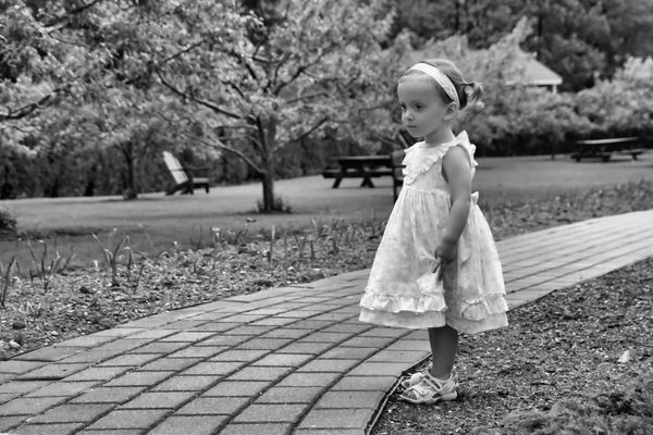
I am trying my hand at B&W conversion...I used to just choose the greyscale option in Corel Paint Shop, but as I've been reading up on it and following some threads here on the Hog I have come to understand that is a no-no. Ooops. :oops:
So I am trying using the effects option to change the image to B&W, I sort of think the eyes are too dark, but when I adjust them to be a bit lighter the rest of the image becomes too light.
Would you mind taking a moment to weigh in for me? Is this B&W conversion "okay" or should I try to adjust more for the eyes, which in turn leaves the rest of the image too gray?
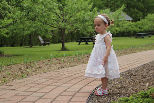
I have attached original so you can see what I was working with. Original image captured with Canon T3i, Sigma 18-250mm, F4.6 / 1/320 / ISO 100. (The model is my granddaughter :-) )
Thanks - Belle
So I am trying using the effects option to change the image to B&W, I sort of think the eyes are too dark, but when I adjust them to be a bit lighter the rest of the image becomes too light.
Would you mind taking a moment to weigh in for me? Is this B&W conversion "okay" or should I try to adjust more for the eyes, which in turn leaves the rest of the image too gray?
I have attached original so you can see what I was working with. Original image captured with Canon T3i, Sigma 18-250mm, F4.6 / 1/320 / ISO 100. (The model is my granddaughter :-) )
Thanks - Belle

May 31, 2012 09:20:35 #

I like the B&W looks good. I am not familiar with the software you use but if you have a dodge tool useing a small brush size and low opacity say 8 you could lighten the eyes without effecting the rest of the photo Tried the dodge tool but didnt like the results so I just seleceted the eyes and adjusted brightness. The dodge tool was tried at 8 but probably needed to be set at 12 and I should have selected a larger brush size. Hope I have helped. I didn't spend alot of time with your photo just wanted to see what would work best for you
Eyes lightened
May 31, 2012 09:22:17 #
ebaribeault wrote:
I like the B&W looks good. I am not familiar with the software you use but if you have a dodge tool useing a small brush size and low opacity say 8 you could lighten the eyes without effecting the rest of the photo
Thank you for the advice! I have not ever tried that, but I've seen it on the menu, so I will give it a shot.
May 31, 2012 09:36:16 #
I'm going to vote for the color image of a really cute kid! The young miss gets lost in the background in B&W but pops out beautifully in the color rendition.
If you want to go B&W, I'd darken the background a bit, lighten up the young lady a touch to provide a boost in contrast between the foreground and back.
If you want to go B&W, I'd darken the background a bit, lighten up the young lady a touch to provide a boost in contrast between the foreground and back.
Jun 1, 2012 07:44:03 #

Really like the B&W, maybe a shallower DOF would have helped the little girl stand out more. We don't need to see the background quite that clear.
Jun 1, 2012 07:45:36 #
ngc1514 wrote:
I'm going to vote for the color image of a really cute kid! The young miss gets lost in the background in B&W but pops out beautifully in the color rendition.
If you want to go B&W, I'd darken the background a bit, lighten up the young lady a touch to provide a boost in contrast between the foreground and back.
If you want to go B&W, I'd darken the background a bit, lighten up the young lady a touch to provide a boost in contrast between the foreground and back.
Thanks - I like the color one too, but my daughter-in-law wanted black and white. :)
I have the color one on my PC as my background.
thanks for the advice, I will keep trying.
Jun 1, 2012 07:46:33 #
rlaugh wrote:
Really like the B&W, maybe a shallower DOF would have helped the little girl stand out more. We don't need to see the background quite that clear.
thanks rlaugh - it's tough to get it all just right - thanks for the input and for taking the time to share your insight, I do appreciate it!
Jun 1, 2012 09:50:59 #
Jun 1, 2012 16:37:46 #
The background is a bit distracting. Perhaps position yourself a little differently to avoid background distractions. Other than that, she's a lovely one!
If you want to reply, then register here. Registration is free and your account is created instantly, so you can post right away.