Check out Commercial and Industrial Photography section of our forum.
Corporate Portraits
Nov 12, 2016 13:43:03 #
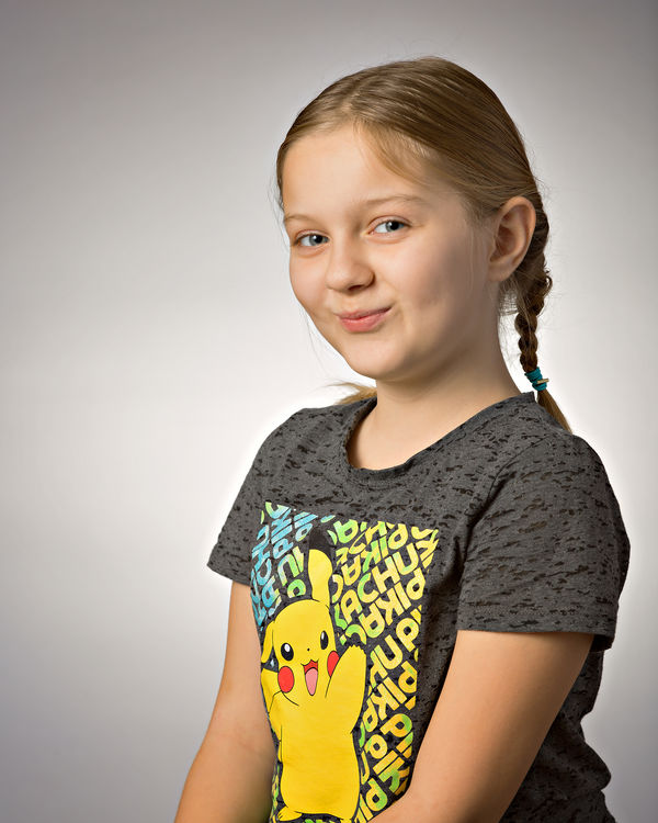
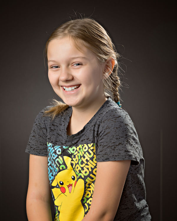
I am doing corporate portraits for the local Senior Centers staff next month. These are the backgrounds I have. Does anyone have a favorite?


Nov 12, 2016 13:51:25 #

Nov 12, 2016 14:14:13 #

That's mine to, 1 and 5. Good shots of your cute model. How much did you pay her to sit still for that long of time and be friendly with the camera. Good ones belong on your wall. Oh BTW 1 and 5.
Check out Wedding Photography section of our forum.
Nov 12, 2016 14:18:14 #
tramsey wrote:
That's mine to, 1 and 5. Good shots of your cute model. How much did you pay her to sit still for that long of time and be friendly with the camera. Good ones belong on your wall. Oh BTW 1 and 5.
She gets to use my laptop to play her games on.
Nov 12, 2016 22:35:43 #

wayne-03 wrote:
I am doing corporate portraits for the local Senior Centers staff next month. These are the backgrounds I have. Does anyone have a favorite?
Three and four are corporate backgrounds, the others are to busy. You can do a lot things with those two, add or take away lighting. Use a colored gel on number three, just to name a few.
https://www.google.com/search?q=corporate+portraits&biw=1024&bih=695&tbm=isch&tbo=u&source=univ&sa=X&sqi=2&ved=0ahUKEwj236rd4KTQAhVB2GMKHeAoBKcQsAQIGg#tbm=isch&q=corporate+headshots
Nov 13, 2016 06:00:58 #

Nov 13, 2016 07:27:49 #

Check out Commercial and Industrial Photography section of our forum.
Nov 13, 2016 08:19:39 #

I agree - 1 and 5. Don't use the one that looks like sky. These are interesting without being distracting.
Nov 13, 2016 08:36:57 #

Nov 13, 2016 08:56:49 #

wayne-03 wrote:
I am doing corporate portraits for the local Senior Centers staff next month. These are the backgrounds I have. Does anyone have a favorite?
I chose number four....
Here's my reason....It has a solid color background to it "black" which makes my eyes be drawn to the subject of the photo, which would be the "human"...Your other backgrounds to me are busy and draw my eyes away from what would be your subject ,again the "human"...If these are going to be corporate photo's than I believe they would want the focus of the photo to be on the main subject, again being the "human".....Just my opinion....Tom
Nov 13, 2016 14:07:38 #
Tom DePuy wrote:
I chose number four.... br Here's my reason....It ... (show quote)
Your opinion is right on.
That's also the reason why the white one works as a corporate background. The background mustn't distract from the theme of the photograph.
Check out Commercial and Industrial Photography section of our forum.
Nov 13, 2016 14:48:23 #
Here is a shot of former CEO of UNISyS I believe. One of the best I have ever seen. Background compliments the subject in my eye.
Nov 13, 2016 15:46:09 #

wayne-03 wrote:
I am doing corporate portraits for the local Senior Centers staff next month. These are the backgrounds I have. Does anyone have a favorite?
Don,
I would go with either 3, 4, or 5. If 3 (white), I would definitely consider making it whiter either using a stronger background light or use two background lights evenly shining on the background, or you can easily make it whiter in post processing. If 4 (black), I would make it a bit darker (blacker) using adjusted camera settings, less light, or in post processing on the background. If 5 (grey), I would be careful not making it the same shade of grey as the outfit being worn by the subject being photographed. I would just caution making sure the subject doesn't blend in with whatever color you choose for the background - make it so there is plenty of contrast, but beware of haloing as well using any background shot.
Remember, white on white and black on black can be very difficult getting proper separation of subject to background. I honestly believe black is best for an executive corporate head shot, especially for men, and white for a female corporate head shot. Using too busy a background with loud colors is probably considered poor taste and unprofessional, in my opinion, as well as most corporate head shots by professionals.
Best Regards,
Tom
Nov 13, 2016 19:13:25 #

Nov 14, 2016 12:36:06 #

3 or 4. You may not know clothes colors before hand and these are the most neutral IMHO.
If you want to reply, then register here. Registration is free and your account is created instantly, so you can post right away.
Check out Travel Photography - Tips and More section of our forum.