A Face only a Mother Could Love - Color vs B&W
Aug 19, 2016 13:24:39 #
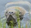
When I posted this a couple of days ago one of the UHHers asked to see it in B&W for comparison. Opinions appreciated. Thank you.


Aug 19, 2016 13:45:03 #

You, as the artist, needs to decide. You'll get a variety of answers, many expressing opposing opinions to others. Confusion will reign supreme. It's up to the artist to determine the most powerful presentation and then present it that way.
--Bob
--Bob
Dr J wrote:
When I posted this a couple of days ago one of the UHHers asked to see it in B&W for comparison. Opinions appreciated. Thank you.
Aug 19, 2016 13:49:59 #

I like the last one the best, although this would also look nice with the bird in color.
Aug 19, 2016 19:59:59 #
Aug 19, 2016 20:15:17 #

Just my personal preference, but I like color but would prefer the sky not quite so vivid.
Aug 19, 2016 21:17:16 #
I agree on the sky. I thought of "desaturating" but did very little in the way of editing this photo.
Aug 20, 2016 12:43:59 #

Personally, I like the color version more - but then I am not generally a proponent of monochrome photos.
The body feathers of a wood stork are bright white, but both of the b/w images changes that to grey. I would like the b/w version much more if you could keep the white and still keep some contrast with the sky. As you have already mentioned, de-saturating the blue sky in the color version would not be a bad thing, but not necessary in my opinion.
BTW, just had a thought. By any chance is your camera or PP software set to 'Vivid'? If so, changing that to 'Standard' or 'Neutral' would likely 'fix' the sky.
Aug 20, 2016 12:47:41 #

Aug 20, 2016 14:02:37 #

Good shot. I prefer the color. Of the two b&w I prefer the first one. The white background in number three is too close to the bird color.
Aug 20, 2016 14:55:11 #
Aug 20, 2016 16:02:07 #
If you want to reply, then register here. Registration is free and your account is created instantly, so you can post right away.