WPC 1617 - People Portraits CRITIQUE
May 8, 2016 20:04:37 #

Barbwire's WPC Entry has been selected for the Photo Critique Forum* to find out what could have done to make it better.
Be nice, but be honest as this may help everyone with their craft. Thank you everyone!
From WPC 1617 - People Portraits RESULTS http://www.uglyhedgehog.com/photo_contest_ratings.jsp?pcnum=219
* If you are new to the Photo Critique Forum please read the Section Rules http://www.uglyhedgehog.com/t-279264-1.html
.
May 8, 2016 21:42:34 #
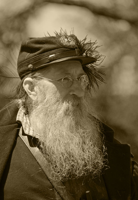
one way to remove glass glare is to take a photo with the subject wearing glasses. have an assistant remove them and take the second picture. As long as your subject remains still you are good to go.
Go into photoshop, the bottom layer is the picture without the glasses. The next layer is the picture with the glasses and the glare.
Then you use the erase tool and erase the glass being carful not to erase the frames.
I am assuming this was a candid shot, but you could pose this and still make it look candid.
May 8, 2016 22:41:52 #
I think I'd have to post process to remove the hair on the front of the jacket and probably put a little bit of dark vignette around the edges, other than that I think it's a really good candid shot!
May 9, 2016 11:55:28 #
I'm an amateur photographer trying to push myself with this forum. I haven't taken a posed portrait ever. This gentleman was on horseback at the time so there was no time to pose anything. I had to laugh when you said assistant.
May 9, 2016 11:57:04 #
May 9, 2016 12:07:17 #

St3v3M wrote:
Barbwire's WPC Entry has been selected for the Photo Critique Forum* to find out what could have done to make it better.
Be nice, but be honest as this may help everyone with their craft. Thank you everyone!
From WPC 1617 - People Portraits RESULTS http://www.uglyhedgehog.com/photo_contest_ratings.jsp?pcnum=219
* If you are new to the Photo Critique Forum please read the Section Rules http://www.uglyhedgehog.com/t-279264-1.html
.
Be nice, but be honest as this may help everyone with their craft. Thank you everyone!
From WPC 1617 - People Portraits RESULTS http://www.uglyhedgehog.com/photo_contest_ratings.jsp?pcnum=219
* If you are new to the Photo Critique Forum please read the Section Rules http://www.uglyhedgehog.com/t-279264-1.html
.
When you cannot move the light, you have to either move the subject or change camera position to create the light you want.
Since the brightest part of an image draws the eye, I find the large area in the sun on the side of his face distracting.
I personally would have taken the trouble to get around on the other side of this fascinating subject so that all of his face showing was in shade. That way I would not have to expose for the sun lit side of the face giving more "pop" and better detail facing the camera.
Because the main facial features are not the centre of attention here, I would not put it in a "portrait" category, but in a candid "snapshot" category.
Just my humble opinion . . . again . . .
May 9, 2016 15:47:07 #
Excellent photo. Use of f5.6 worked well to blur the background. It's a sunny day and the guy is obviously outside, so the sunshine on the side of the face is fine. However overall it feels a little bit washed out. That might give it that old time look, but I prefer the less washed out look. Having his eyes in the shade of the hat helped a lot. He is well in focus so the hairs and other details are plenty sharp.
I'm not as concerned about the glasses and the hairs or lint as others. However, I would crop from the right a little bit to get rid of some distracting detail of the shoulder or jacket flap. Also the top has a little too much unnecessary background in it, so crop some from the top. This also has the effect of moving the eyes to the upper third, which might be more pleasing to some. I wish the jacket in the lower right had something there, but it is what it is. Nothing like working with something in bright sun with shadows, but you got the face correct which is far more important than the jacket in the shadows.
But these are all minor tweaks to a really nice shot.
As for the contest, don't worry about the results. This one is better than many of those that placed ahead of it.
Jerry
May 9, 2016 16:04:42 #

Weddingguy wrote:
When you cannot move the light, you have to either... (show quote)
Once again your humble opinion is spot on. Thank you for offering clear advice that a photographer at any level can understand and use. The eye is drawn to the light ... something to remember every time you look through that viewfinder. It applies to every type of photography. I don't know how many times I've passed up a wildlife shot lately because I knew the light was not on my side. Or .. I shot it anyway just so I could go home and wish that the light had been on my side for the almost awesome shot I got. LOL
May 9, 2016 17:17:29 #
Thanks for the ideas, I went back and re-cropped it to get rid of some of the clutter on the top and it does look better. I'm used to photographing birds/animals, nature, especially with birds I don't crop them tight . They need room to fly.
I agree with the hair, I purposely didn't remove it from his coat. I guess I could have moved around to try and get his face better lit but with all the commotion and people & horses!! I didn't. I'm not used to photographing people period so I was pleased with a top 10 finish. I knew it wouldn't beat out babies and pretty girls and the fact that it was more of a "character study" than a portrait. Thanks for the review!
I agree with the hair, I purposely didn't remove it from his coat. I guess I could have moved around to try and get his face better lit but with all the commotion and people & horses!! I didn't. I'm not used to photographing people period so I was pleased with a top 10 finish. I knew it wouldn't beat out babies and pretty girls and the fact that it was more of a "character study" than a portrait. Thanks for the review!
May 9, 2016 18:36:39 #

St3v3M wrote:
Barbwire's WPC Entry has been selected for the Photo Critique Forum* to find out what could have done to make it better.
Be nice, but be honest as this may help everyone with their craft. Thank you everyone!
From WPC 1617 - People Portraits RESULTS http://www.uglyhedgehog.com/photo_contest_ratings.jsp?pcnum=219
* If you are new to the Photo Critique Forum please read the Section Rules http://www.uglyhedgehog.com/t-279264-1.html
.
Be nice, but be honest as this may help everyone with their craft. Thank you everyone!
From WPC 1617 - People Portraits RESULTS http://www.uglyhedgehog.com/photo_contest_ratings.jsp?pcnum=219
* If you are new to the Photo Critique Forum please read the Section Rules http://www.uglyhedgehog.com/t-279264-1.html
.
Really a nice shot. I wouldn't change a thing. All the hairs, etc. just add to the natural look of the photo. Good work.
If you want to reply, then register here. Registration is free and your account is created instantly, so you can post right away.