WPC 1616 - Ceremony CRITIQUE
Apr 23, 2016 01:57:52 #

smithdar's WPC Entry has been selected for the Photo Critique Forum* to find out what could have done to make it better.
Be nice, but be honest as this may help everyone with their craft. Thank you everyone!
From WPC 1616 - Ceremony RESULTS http://www.uglyhedgehog.com/photo_contest_ratings.jsp?pcnum=218
* If you are new to the Photo Critique Forum please read the Section Rules http://www.uglyhedgehog.com/t-279264-1.html
.
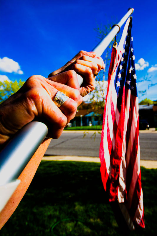
Whether posting "The Colors" at scouts, at school, or at home, it should be done ceremoniously.
(Download)
Apr 23, 2016 23:29:01 #
This photo is a good one for the topic and the position of the subject is from an interesting angle. I really like the perspective.
However it does have a few things that could have been improved (my opinion). The only part of the image that is in focus are the hands. I think that it would be better if both the hands and the flag were in focus (higher f stop). Yes, I know your were trying to blur the background, but the whole main subject needs to be in focus. Also, the image looks over processed (too much saturation). As a minor thing, the tree in the background is a slight distraction. If posed, a slightly different angle to the background might have helped.
Keep taking more photos like this one. You have a good eye for what you were trying to do.
Jerry
Apr 24, 2016 07:40:22 #
lalezo
Loc: Gainesville, FL
Might I suggest the need to have the entire image in focus ... I suggest using a higher ISO, on Aperture Priority, at possibly and f/16.
Lloyd
Lloyd
Apr 24, 2016 09:21:14 #

Apr 24, 2016 09:26:29 #

I like the concept, but totally agree with what has already been said.
Apr 24, 2016 09:48:10 #

The Stars & Stripes looks as if it could do with a sponge & press, so it's probably better out of focus. The problem is in entering the pic as "Ceremony". It would do better as "The Silver Ring"
Apr 24, 2016 18:50:52 #

Just to add to what has already been discussed, I think the image is saturated. Tone done the colors in the sky and correct skin tone in the hands to start.
Don
Don
Apr 25, 2016 18:05:14 #

All the elements are there, the flag, sky, etc., but the composition is lacking a point of interest. The colors are also way over processed. Try again with a different perspective.
Dan
Dan
Apr 29, 2016 01:14:08 #
Hi and thanks. It really is good to get this feedback. In fact I agree with all of it. It will help me to become better at this retirement hobby that I have come to love. I'm not sure what I am supposed to do in return, but look forward helping others if that is what this mean. I'll read the links and try to understand.
Thanks again!
Thanks again!
If you want to reply, then register here. Registration is free and your account is created instantly, so you can post right away.