General Store
Apr 6, 2016 00:04:05 #

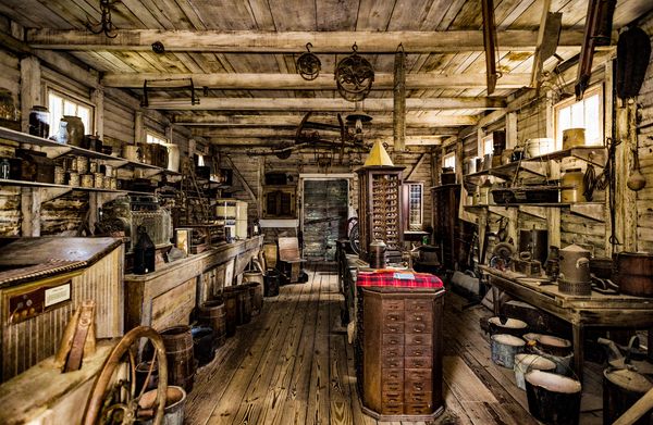
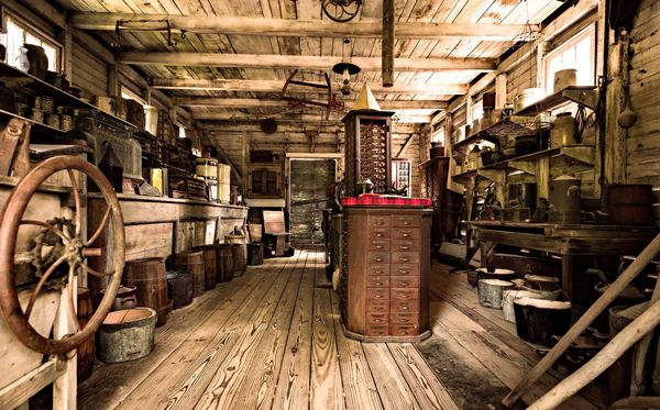
I went to a Rural life museum about a year ago and decided to re-visit some shots that I had not really looked at closely the first time around.
FYC...
FYC...
Apr 6, 2016 01:50:51 #
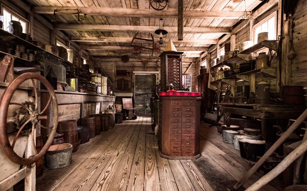
I think the first one is just stunning. Is there a touch of HDR here or did you have very good light to get the detail in what I would have expected to be darker shaded areas?
Regardless, a very nice picture imo.
Regardless, a very nice picture imo.
Apr 6, 2016 08:34:08 #

Apr 6, 2016 10:59:39 #
Frank2013
Loc: San Antonio, TX. & Milwaukee, WI.
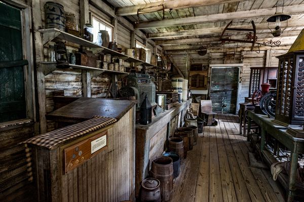
The perspective of #2 does it for me Erik H, consistent processing though out
although #2 seems to have more of a red cast. Well done.
Apr 6, 2016 13:21:01 #

Apr 6, 2016 19:17:16 #
TonyP wrote:
I think the first one is just stunning. Is there a touch of HDR here or did you have very good light to get the detail in what I would have expected to be darker shaded areas?
Regardless, a very nice picture imo.
Regardless, a very nice picture imo.
Thank you Tony. I used just a touch of tone mapping to bring out some of the structure, but dialed it way down and finished it up in Lightroom.
Apr 6, 2016 19:19:58 #
Linda From Maine wrote:
Very appealing series, Erik. Love that pop of red in #1.
Thanks Linda. I had never processed them after I shot them, There were other shots that I took that day that caught my attention at the time. I'm glad I went back and took a second look.
Apr 6, 2016 19:20:32 #
NJFrank wrote:
Very nice series. Good lighting everything is nice and sharp
I appreciate that Frank, thanks for commenting.
Apr 7, 2016 15:55:51 #

Erik_H wrote:
I went to a Rural life museum about a year ago and decided to re-visit some shots that I had not really looked at closely the first time around.
FYC...
FYC...
Erik, of the three, I find 2 to be the most attractive. The colors of 1 are a bit too unrealistic and don't really convey a rustic environment indigenous to these types of shops.
2 has its issues, but they are minimal compared to 1.
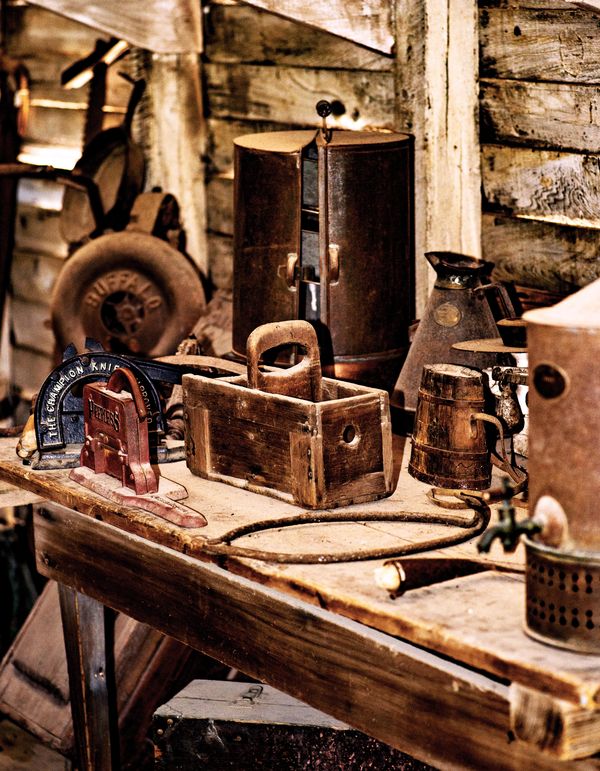
The third leaves me confused as to the actual subject of the photograph. The table top is cluttered and the focus doesn't quickly indicate the main subject of the image. Addtionally, the black line outlining the base of the red thing in the upper left corner is a bit distracting.
--Bob
Apr 7, 2016 18:22:14 #
Frank2013 pointed out the reddish tint in the second shot that I really hadn't noticed (thank you Frank), so I decided to take a bit out. Here is the re-post...
Apr 7, 2016 19:49:38 #
Erik_H wrote:
My favorite is the first, partly because of the higher angle, and mostly because of the trompe-l'il, painterly look of it. One of the things I like most is the overall sepia caste with its striking splashes of color, the red and yellow. :thumbup: :thumbup:I went to a Rural life museum about a year ago and decided to re-visit some shots that I had not really looked at closely the first time around.
FYC...
FYC...
Apr 7, 2016 20:02:41 #
Frank2013
Loc: San Antonio, TX. & Milwaukee, WI.
Erik_H wrote:
I think you've struck a nice balance here Erik. Well done.(thank you Frank), so I decided to take a bit out. Here is the re-post...
Apr 7, 2016 20:55:19 #
Chuck_893 wrote:
My favorite is the first, partly because of the higher angle, and mostly because of the trompe-l'il, painterly look of it. One of the things I like most is the overall sepia caste with its striking splashes of color, the red and yellow. :thumbup: :thumbup:
The first is also my favorite Chuck. The bright red and yellow were the most prominent colors in the room and I didn't have to do anything special to bring them out, just a happy accident. Thanks for the comments.
Apr 7, 2016 20:56:41 #
Frank2013 wrote:
I think you've struck a nice balance here Erik. Well done.
Thank you Frank, I prefer it better than the original and I appreciate the CC.
Apr 7, 2016 21:04:41 #
rmalarz wrote:
Erik, of the three, I find 2 to be the most attrac... (show quote)
Thank you for your comments Bob. I agree that the third doesn't really say much, but I kind of like it for some reason. I had originally desaturated them all a bit and they had a much more realistic look, but then I got into a more colorful mood and went in a different direction with them. Here's another in the set that I left pretty much alone. Let me know if you prefer the more realistic look of this one please.
If you want to reply, then register here. Registration is free and your account is created instantly, so you can post right away.