Upward Bound
Mar 21, 2016 07:41:08 #

Mar 21, 2016 09:14:48 #

Voss wrote:
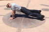
Comments and criticism are welcome.
Although I'm no stickler for conventional composition, far from it, but I do think this would be improved by the figure being positioned bottom left, moving into, and leading the eye diagonally through the frame.
Graham
Mar 21, 2016 12:07:50 #

Voss wrote:
Comments and criticism are welcome.
This image is another great example of why checking the Laws of Gravity before taking a hike is not productive! (Appologies to Edward Weston for paraphrasing rather than an exact quote.)
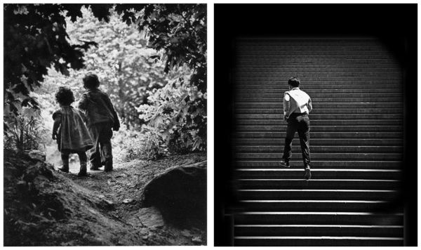
The image just happens to mirror the symbolism layout used by one of the most famous images of the last century. It is very much the same in terms of visual symbol placement as W. Eugene Smith's image known as "A Walk to the Paradise Garden" taken in 1946. Smith added a dramatic vignette, and had the advantage of two very cute little kids. Otherwise, look at all the similarities: they mirrored dark to light, top to bottom, left to right, fine to course.
Mirrored reflection of visual symbols!
http://apaflo.com/misc/uhh/paradise_bound.jpg
http://apaflo.com/misc/uhh/paradise_bound.jpg
The Paradise image has the lighter areas at the top, the Bound image has them at the bottom. Paradise is moving from lower right to upper left, Bound is moving from lower left to upper right. The courser, higher contrast, objects with less fine detail are in the upper part for Paradise and in the lower part for Bound.
There is one very stark exact similarity that binds the two images and is the very symbol, cast in concrete, that makes them interesting: They have the symbol of humanity approaching the exit point, and put more space into what would traditionally be called a negative area behind the direction of movement, making it instead the primary symbol of what the subject is about!
It is the escape from that area that makes the image. And that is exactly the opposite of what the laws of gravity (or the Rules of Composition) would suggest. Follow the rules and get a dull dud, look instead at the image to judge the composition that works and get an image that has universal impact and meaning.
Mar 21, 2016 12:10:41 #
Graham Smith wrote:
Although I'm no stickler for conventional composition, far from it, but I do think this would be improved by the figure being positioned bottom left, moving into, and leading the eye diagonally through the frame.
Graham
Graham
It is unconventional, and Apaflo expressed it more poetically than I can (see above). But essentially, I was metaphorically expressing his leaving us for an unknown future. The empty space behind him represents his (unknown to us) past. The empty space is in a sense, the picture.
Mar 21, 2016 12:13:40 #
Apaflo wrote:
It is the escape from that area that makes the image.
It is the escape from that area that makes the image.
Thank you! I feel I have communicated.
Mar 21, 2016 12:17:45 #
Voss wrote:
It is unconventional, and Apaflo expressed it more poetically than I can (see above). But essentially, I was metaphorically expressing his leaving us for an unknown future. The empty space behind him represents his (unknown to us) past. The empty space is in a sense, the picture.
I have plenty of shots with people "leaving the image" It's something I often employ. My opinion is that this shot would work better with the guy having an uphill task ahead of him.
Mar 21, 2016 12:54:26 #

Graham Smith wrote:
I have plenty of shots with people "leaving the image" It's something I often employ. My opinion is that this shot would work better with the guy having an uphill task ahead of him.
:thumbup:
Mar 21, 2016 14:12:23 #
I agree with Graham...the subject is beginning his upward journey and his challenge would be more effectively emphasized in front of him.
Mar 21, 2016 14:14:01 #
Graham Smith, jaymatt, and Franku, Thanks for your comments. They are always welcome.
Yours is a valid way of looking at it. It emphasizes his future and the trials that await him(a long arduous climb). I wanted to say that his future was unknown (it might be a very happy one), but that the "heavy lifting" was behind him. Perhaps it's just different ways of interpreting an event?
Yours is a valid way of looking at it. It emphasizes his future and the trials that await him(a long arduous climb). I wanted to say that his future was unknown (it might be a very happy one), but that the "heavy lifting" was behind him. Perhaps it's just different ways of interpreting an event?
Mar 21, 2016 14:26:39 #
Voss wrote:
Graham Smith, jaymatt, and Franku, Thanks for your comments. They are always welcome.
Yours is a valid way of looking at it. It emphasizes his future and the trials that await him(a long arduous climb). I wanted to say that his future was unknown (it might be a very happy one), but that the "heavy lifting" was behind him. Perhaps it's just different ways of interpreting an event?
Yours is a valid way of looking at it. It emphasizes his future and the trials that await him(a long arduous climb). I wanted to say that his future was unknown (it might be a very happy one), but that the "heavy lifting" was behind him. Perhaps it's just different ways of interpreting an event?
Your picture is one thing...
What they would like is just a totally different image! One that is pretty much a cliche too unless there is something added to provide more of a "decisive moment" than the exit from the past provides in your version.
Mar 22, 2016 13:50:56 #

Although the children's bodies are pointed out of the frame, their heads are not. Their heads are looking into the frame at the highlighted scene in front of them. Therein lies the difference between these two shots.
Mar 22, 2016 15:48:59 #
Nightski wrote:
Although the children's bodies are pointed out of the frame, their heads are not. Their heads are looking into the frame at the highlighted scene in front of them. Therein lies the difference between these two shots.
The angle for the children is almost exactly the same to the left side as the man is to the right side. Neither can be said to be looking into the frame. The children are looking into an over exposed bright area while the man is looking into a darker area (the images are mirrored). The man is running out of the bright area over exposed area, the children are running out of a darker area.
What you are seeing as "differences" are a mirror image reflecting the opposite of the other image. It is so different that it is exactly the same.
The one "difference" in arrangement of symbols within the two compositions is that Smith used a vignette to locate the children close to the edge of the symbol areas and yet keep them closer to the center of the physical image, while Voss did not vignette the image and instead placed the physical location of the man closer to the top and the side. Same purpose for compositional effect but using a slightly different technique.
Mar 22, 2016 15:59:55 #
No, apaflo .. what I am seeing is two children who have walked through a shaded area ... they have come to an opening .. they ARE looking to the right. The photographer took this shot so that the viewer's eye would go to the place where the children are looking. Please DO NOT tell me what I am seeing. I find that very offensive. I will be the judge of what I am seeing.
Mar 22, 2016 17:59:29 #
Nightski wrote:
No, apaflo .. what I am seeing is two children who have walked through a shaded area ... they have come to an opening .. they ARE looking to the right. The photographer took this shot so that the viewer's eye would go to the place where the children are looking. Please DO NOT tell me what I am seeing. I find that very offensive. I will be the judge of what I am seeing.
I said nothing about what you are seeing the children doing.
I said, and say it again, the children in W. Eugene Smith's "Walk to the Paradise Garden" are moving and to the upper left part of the image, out of the dark area into the bright area. They clearly are not looking to the right, considering they are slightly left of the camera and yet it is the left side of their faces that actually shows.
As for the similarities, here's a different view of the image Voss posted. It has been flipped right to left, vignette added, and the man is sized and positioned similar to Smith's image. What is still a mirror reflection is that Smith's children are going from dark to bright while the man is going from bright to dark. Same effect, just opposites.
Edited to easier see the similarities!
If you want to reply, then register here. Registration is free and your account is created instantly, so you can post right away.