WPC 1610 - Mostly White CRITIQUE
Mar 12, 2016 20:14:40 #

lizzy5553's WPC Entry has been selected for the Photo Critique Forum* to find out what could have done to make it better.
Be nice, but be honest as this may help everyone with their craft. Thank you everyone!
From WPC 1610 - Mostly White RESULTS http://www.uglyhedgehog.com/photo_contest_ratings.jsp?pcnum=212
* If you are new to the Photo Critique Forum please read the Section Rules http://www.uglyhedgehog.com/t-279264-1.html
.
Mar 12, 2016 22:31:06 #

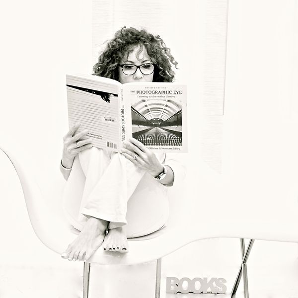
I like it just the way it is. I especially like the toenails. Nice touch. If I would change anything I'd lighten the shadows between the letters in BOOKS and experiment with getting rid of the chair legs forming the X .
Mar 13, 2016 10:21:31 #

I think we'll done . I too like the polished toe nails. The only thing I would have done a little diffently was define the chair arm to define it a little better from the background. BTW good model selection.
Mar 13, 2016 10:24:12 #
First, I like the face having the most contrast (of course.) The photo is great, and interesting with little "extras" to catch attention.
Second, I am not sure what the vertical line is to the right of the model or what it adds. I might think about removing that. If it were removed then a little of the right side of the photo might need cropping. But, maybe not.
Third, I agree about the crossed legs of the chair, at the bottom. If they were not removed, maybe just decreasing the contrast would make them blend in better.
Fourth, I would feel better with the "Books" at the bottom to be moved up slightly so that it is not so close to the edge. These are only small things that could be adjusted.
It is a wonderful, high-key photo.
Mar 13, 2016 11:34:57 #

Thank you so very much for your input! I did struggle with al that is mentioned here but, as I only use IPhoto, I couldn't do much without the photo looking even more washed out than it already does.
I did apply your suggestions and you'll probably agree that it looks like it's missing something. ; How do I upload it so you can see it?
I did apply your suggestions and you'll probably agree that it looks like it's missing something. ; How do I upload it so you can see it?
Mar 13, 2016 11:52:55 #
I think that you did some good changes. Would you mind if I work a little with this since you don't have other programs?
Mar 13, 2016 13:38:12 #

I would not change a thing. A soft pleasing to the eye look.
Good stuff
Good stuff
Mar 13, 2016 13:39:07 #
Mar 13, 2016 15:00:18 #

lizzy5553 wrote:
Thank you so very much for your input! I did struggle with al that is mentioned here but, as I only use IPhoto, I couldn't do much without the photo looking even more washed out than it already does.
I did apply your suggestions and you'll probably agree that it looks like it's missing something. ; How do I upload it so you can see it?
I did apply your suggestions and you'll probably agree that it looks like it's missing something. ; How do I upload it so you can see it?
Izzy I like it. I think it is very good and using only iPhoto.. I'm even more impressed. :)
But your not satisfied with it so.... what is it that bugs you? You say it's missing something. Hmmm. Maybe try a version with a little different crop, move the subject off center, narrow the frame in the frame white border some. Try that and see if those things produce results that feel better to you.
Sometimes when unsatisfied, I put a photo aside for a while go out and do something else and come back later. Or a day or a week later. It gives me a fresh viewpoint.
Mar 13, 2016 15:32:30 #

TheeGambler wrote:
I think that you did some good changes. Would you mind if I work a little with this since you don't have other programs?
Revisions are not allowed in the Critique section but if Izzy is willing she could post it over in postprocessing and give you a chance to work on it there.
Mar 13, 2016 15:34:47 #
I am really liking this. I like that you have left the "S" curve of the chair. I think you could lose that one little black line that comes down on the right, or maybe just lighten it.
Mar 13, 2016 16:20:29 #

I like the high key pose of the subject and would like to have seen her posed in a different setting. Having the toenails of one foot showing so strikingly draws attention from the impact of the subject's concentration on the manual. If it were retaken I would omit the text "Books," also, perhaps a different title would be more appropriate.
Mar 13, 2016 17:20:51 #
Thank you all so much for your input! I did post it on the recommended section Country's Mama.
If you want to reply, then register here. Registration is free and your account is created instantly, so you can post right away.