2016 dog show
Jan 26, 2016 13:12:47 #

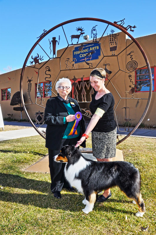
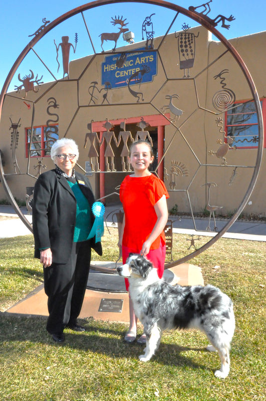
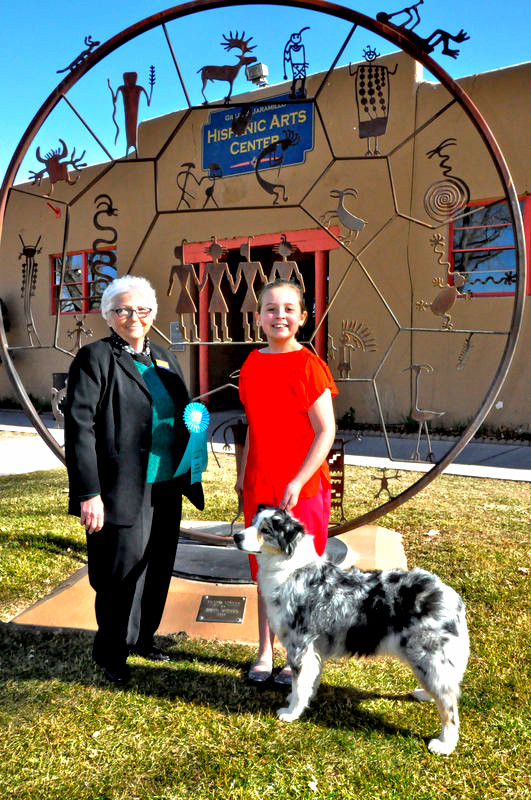
can i get some feedback?what do you think could be improved? thanks.frank
Jan 26, 2016 13:34:52 #

The first pics brings out the colors on the whole scene while the second on looks to bright and not enough color brightess.
Jan 26, 2016 13:37:37 #
Jan 26, 2016 14:00:20 #

Frank the second shot is over exposed a stop or so....can see the reds are doing some strange colors.
Jan 26, 2016 14:08:35 #
yea, go figure, i she had sunburn or something . not sure yet. thank u sir! for your input
Jan 26, 2016 22:03:09 #

frank bruce wrote:
can i get some feedback?what do you think could be improved? thanks.frank
:thumbup:
Jan 26, 2016 22:39:37 #
Jan 27, 2016 07:32:16 #

Without downloads I think the first photo is both sharper and has better exposure.
Jan 27, 2016 11:55:06 #

Jan 27, 2016 12:37:42 #
Jan 27, 2016 15:30:33 #
Jan 27, 2016 15:39:24 #
frank bruce wrote:
can i get some feedback?what do you think could be improved? thanks.frank
Good composition, others have touched on the exposure of number 2, but in my opinion I find the metal artwork or display immediately behind your subjects distracting. Of course it could just be me......
Jan 27, 2016 15:52:21 #
thank u my friend. the 1 thing i don't really care for is the girl looks like she's choking the dog! right? haha
Jan 27, 2016 15:55:38 #
frank bruce wrote:
thank u my friend. the 1 thing i don't really care for is the girl looks like she's choking the dog! right? haha
Oh my gosh, you're right. Oops
If you want to reply, then register here. Registration is free and your account is created instantly, so you can post right away.