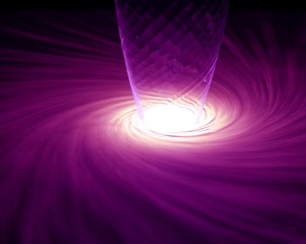
WPC 1603 - Circles CRITIQUE
Jan 23, 2016 01:15:09 #

jkm757's WPC Entry has been selected for the Photo Critique Forum* to find out what could have done to make it better.
Be nice, but be honest as this may help everyone with their craft. Thank you everyone!
From WPC 1603 - Circles RESULTS http://www.uglyhedgehog.com/photo_contest_ratings.jsp?pcnum=205
* If you are new to the Photo Critique Forum please read the Section Rules http://www.uglyhedgehog.com/t-279264-1.html
.
Jan 24, 2016 08:23:39 #
Szalajj
Loc: Salem, NH
While I like the overall effect of the shot, but nothing appears to be in focus.
I know that I often struggle to get clear in focus shots, but I keep working my subject towards that goal.
Depth of field is often the culprit. Too shallow a DOF, and you lose clear focus. Too deep a DOF, and you lose the boken background. Balancing DOF, will often result in outstanding shots.
Practice, practice, practice!
Jan 24, 2016 12:43:00 #

An intriguing shot. It is rather soft, as someone has already mentioned - the glass should be sharper, the swirl can get away with it, indeed it may be preferable soft. If it were mine I turn it through 180 degrees, and, if it's possible to go back to it, I'd try a less intense light source.
Jan 24, 2016 12:45:32 #
I really like the composition and color, so this is a good image from that respect.
In a way, this is sort of a ditto of the other reply. But not just because of the focus issue, which I agree with. This is one of those scenes that should be shot from many different sets of settings.
When I look at the image, I wonder about a lot of little variations would improve it or not. Because it is mostly symmetrical, should the center of the circles be in the center of the image or should it be offset to near one of the "thirds". Playing with the downloaded version, I like placing the circle in the upper right third point. Others might disagree.
Usually it is a bad idea to have this much of an image with saturated pixels. But not knowing what it would look like with a darker exposure, it is hard to say if that would be an improvement or not. It might be better, but might expose something that doesn't help the pattern. The purple might become too dark too. Maybe shooting a sequence of exposures and using HDR to combine them would make it better. (maybe not)
Good start. Since this appears to be staged (you don't need to go a large distance or expect perfect weather to reproduce), I would suggest trying a few dozen variations on this image and see what makes it really pop in terms of capturing the viewer's attention.
Jerry
Jan 24, 2016 20:35:47 #

If you want to reply, then register here. Registration is free and your account is created instantly, so you can post right away.