Ruby Stone Model Pictures 2, 3, 4
Jan 20, 2016 22:57:44 #
Fellow Hogs,
I actually started this topic last night, but it didn't seem to be listed in the Digest, so I am trying again and experimenting to see if it does get listed on the Digest tomorrow (Thursday).
Ruby is back. Here are a couple shots that are totally unlike the one I posted a couple days ago. See what everyone thinks.
Best Regards,
Tom
Ruby Photo 2
Ruby Photo 3
Ruby Photo 4
Jan 20, 2016 23:10:38 #

Jan 21, 2016 06:43:36 #

Nice shots, Tom, not sure if I like the last one with the drops, and I'm not sure why. Overall, well done.
Jan 21, 2016 11:08:58 #

Jan 21, 2016 12:21:14 #

trc wrote:
Fellow Hogs,
I actually started this topic last night, but it didn't seem to be listed in the Digest, so I am trying again and experimenting to see if it does get listed on the Digest tomorrow (Thursday).
Ruby is back. Here are a couple shots that are totally unlike the one I posted a couple days ago. See what everyone thinks.
Best Regards,
Tom
I actually started this topic last night, but it didn't seem to be listed in the Digest, so I am trying again and experimenting to see if it does get listed on the Digest tomorrow (Thursday).
Ruby is back. Here are a couple shots that are totally unlike the one I posted a couple days ago. See what everyone thinks.
Best Regards,
Tom
She is cute . . . but your images are lacking "pop" . . . are way off on color balance, and have broken most all the composition and cropping rules. Too many to list here.
Don't want to be harsh . . . but just don't believe one is helped by saying "good job". That's not how one improves.
Jan 22, 2016 15:20:01 #

Agree with Weddingguy. She blends in too much with the background in the first 2.
I could like the 3rd one, and the water/glass adds interest, but I can't get over the "hunchback look" It is more the pose than the technique in that one for me.
The difference between the third and the first 2 is that she really stands out. That's the "pop" you are looking for. Either brighten her up, or make the background darker, and the color balance isn't really doing any favor.
You do have a beautiful model there, and with a little work in lighting and posing, I think you could really end up with some stellar images.
Jan 22, 2016 20:46:44 #
bkyser wrote:
Agree with Weddingguy. She blends in too much wit... (show quote)
Greetings Bob,
I don't know you personally, like I do several photographers on UHH, however, I have thought previous comments and advice and 'conversations' from and with you to be valuable information that I respect. I appreciate your criticisms about these images. They are direct, but soft and helpful and not condescending.
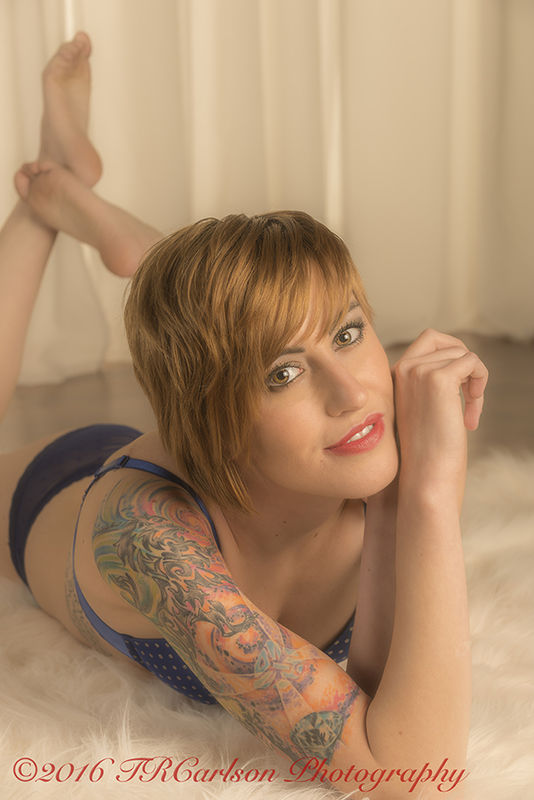
Ruby Photo 2 is one where I purposely tried to make the background and most her body a little on the soft side, but having her eyes come through sharp and more like the main attraction to the image. I, personally prefer contrast between the model and the background, but I did not do that in this photo since I was trying to make it soft and thought contrast would negate that feeling? I do not like the line of the bottom of the curtain, but chose to keep it there for separation from the brown flooring in the back, right or wrong? I thought about selectively blurring out the line or extending the rug in Post since the rug was not very large and I had to use what was available.
One of the problems I saw was the color of the rug and the curtain were way too similar for my taste. I probably should have darkened one or the other in Post,, but just didn't - my mistake, which you and Weddingguy pointed out to me. I was trying to get close in for the shot, but ended up cutting off her camera left leg and elbow. I should have taken a wider shot and then cropped in post much better.
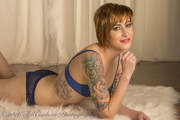
Ruby Photo 3 I had her legs totally in the original shot, but cropped it rather poorly, but thought her long legs extending back to camera left was awkward looking and not very flattering. I also cut off her camera left hand/fingers. I'm sure you may have some suggestions, which would be welcome. Once again, there is the same old problem of the color of the curtain and rug, and the bottom line of the curtain, and lack of contrast! What suggestions might you have?
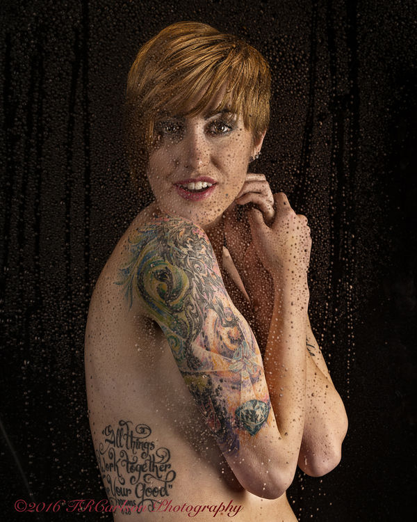
The hunchback pose, in the shot behind the plexiglass, drives me crazy. I didn't notice it until the shoot was over and I saw the images on my computer. Oh well, live and learn, but hopefully a lessen learned and something to watch out for in future shoots. That was a major mistake on my part - ugh!
If you are interested, look at the two bottom images on this Topic. http://www.uglyhedgehog.com/t-362759-1.html#6130632 There is also the first image, as well. Do you think these are better, more contrast, maybe some more pop, and possibly more contrast or better use of the lighting and background? Then again, maybe you don't think these are very good as well? Thank you.
Best Regards,
Tom
Jan 25, 2016 10:56:28 #
trc wrote:
If you are interested, look at the two bottom images on this Topic. http://www.uglyhedgehog.com/t-362759-1.html#6130632 There is also the first image, as well. Do you think these are better, more contrast, maybe some more pop, and possibly more contrast or better use of the lighting and background? Then again, maybe you don't think these are very good as well? Thank you.
Best Regards,
Tom
In that series, I think 2 has the most "pop". One just isn't a flattering look for her (expression) #3 is also pretty good, but the background is still pretty close in tonality to the subject. I like the expression in #2 and #3 though.
Can I ask, have you worked much with feathering the lights? It seems that the lights are pointed directly at her, and not "skimming" across her. I can't say much, as Us old school guys learned it that way, and I still find myself doing it if I'm not careful. As someone else here on UHH says, there is magic in the corners of the light. (I wish I could take credit for that one, but it wasn't me)
Jan 25, 2016 12:12:46 #
bkyser wrote:
In that series, I think 2 has the most "pop&q... (show quote)
Bob,
Yes, I am familiar with feathering, achieving contrast between lights and darks or light hitting and shadows resulting for contrast, and pop. I was not in complete control for this shoot, unfortunately, and much prefer shooting by myself, taking my time, and setting lights up more appropriately. It was a group shoot and quite hurriedly as well. I don't offer those comments as excuses, just fact. I also don't have too much control on the model's facial expressions. I was trying to get her to smile a tad and not be so tense, but it just wasn't in the cards. :(
Did you happen to get a chance or take a look at the two images I added to the bottom of this Topic?
http://www.uglyhedgehog.com/t-362759-1.html#6130632
Sometime in the not too distant future, I will probably be starting a new Topic in The People Photography Forum probably called something like 'Russian Model Shoot', so be aware of looking for it on the Digest page coming sometime in the not too distant future. Of course, I'd welcome & appreciate your comments about any images I may post on that Topic. Thanks very much, Bob.
Best Regards,
Tom
Jan 25, 2016 12:53:13 #
trc wrote:
Bob, br br Yes, I am familiar with feathering, ac... (show quote)
Actually, the 2 from that link are the ones that I thought had more "pop". (which is subjective in my book)
The group shoot is something that I've seen, but never taken part in, but I can tell you one thing that never seems to work for me.... I kind of stay away now from trying to get people to smile. I converse with them, and try to get natural expressions. This is something that is fairly recent for me, but I had someone I really respect share it with me, so even though I don't fall into the same camp as people I respect ;-) , I will share it with you.
People that don't want to smile for photos, won't buy photos of themselves smiling. They may be self conscious of their smile, or they may just like the way they look with a more serious look.
During the conversation during a shoot, if the conversation is really light, and interesting to the subject, even if they aren't giving you a full blown smile, you will get some very expressive, and wonderful natural looks.
Anyway, when you said that about trying to get her to smile, that popped into my mind. Sometimes, mom's want the seniors to smile in their photos, but even if they pester their senior until they do it, the smile is so unnatural, that they end up not liking it anyway.
That is the advice that I'm sharing..... and I hope it helps.
Not sure if Cliff (Captain C) agrees with that as well, but the person giving me that advice is on par with Cliff's talent (in my humble opinion)
Jan 25, 2016 13:41:29 #
bkyser wrote:
Actually, the 2 from that link are the ones that I... (show quote)
Yes, Cliff really likes composites and also takes very good portrait shots, senior shots; smiles or no smiles. I have personally shot with Cliff and he seems to do a great job. He also has taught me many things - too bad I can't remember them all - even a fraction of what he has told me is a plus for me. Cliff is a very enjoyable photographer and person.
Oh, I was wondering if you were referring to those two shots or the original 3 shots specifying #'s 1 & 2. I also try to talk to people and loosen them up/relax them a bit. Sometimes it just doesn't work, so I just keep on shooting and hope for the best!
I shot a woman political candidate for a bill board photo with 2 other candidates. Oh my goodness, talk about pulling teeth! I shot I don't know how many separate photos, and there wasn't a good one in the bunch. I finally settled on one, and then photoshopped the heck out of it and made her look about 10 times better . . . and she was actually quite pleased. I still kept her real looking, but improved her appearance drastically, even without the smile!
Seeing that it went up on a bill board, it had to look 'real' and very presentable. I know the other two candidates (one male and the other female) on the same bill board must have appreciated her picture as well. For whatever reason, the 'other' woman, in charge, basically gave me a tip.
Thanks again for your comments and advice.
Best Regards,
Tom
Jan 25, 2016 15:07:22 #
trc wrote:
Yes, Cliff really likes composites and also takes ... (show quote)
Maybe some day, I'll get a chance to meet cliff in person. I've "talked" to him several times through UHH, but I do know that he's the kind of guy that I would like.
Jan 25, 2016 17:46:25 #
bkyser wrote:
Maybe some day, I'll get a chance to meet cliff in person. I've "talked" to him several times through UHH, but I do know that he's the kind of guy that I would like.
Yes, I don't know who wouldn't like Cliff. He is actually the person who coached me for about 2-3 years in portraiture and was quite patient. He didn't hold back if he had something to say, but he also was quite complimentary as well when it was deserved. He is also full of Nikon D800 camera information and has answered a question or two for me in the past when another photographer who I kind of knew gave me completely wrong information. The solution to my 'problem' was very easy, but it just never dawned on me. I checked what he suggested and the problem was immediately solved. I think he has done that for me at least twice and perhaps three times. Yes,, he is quite a good person both when dealing with photography and otherwise, I dare say.
I have a shot from a shoot yesterday afternoon that I have processed - one of many that are still not developed. I'm just not sure if it is ready to present to photographers on UHH and whether I'd be crucified on the photographic quality of the shot - Hmmm? The composition is slightly different, but one I'm sure you have shot and are familiar with and has been done many times before by many people.
It, too, was a small group shoot and the genre and lighting was pretty much decided for me, but I had fun and got a chance to practice, practice, and practice. I plan on posting some shots, that is the one's I am allowed to post on UHH, in fact, they are some I previously mentioned to you.
Yes, the model was nude for a lot of the poses, and I had to ask her if she could cover up a bit so I would be able to upload some to UHH. I look at women without clothes as just another shoot. I concentrate on lighting, shadows, composition, and such and try to learn and progress as much as possible. In fact, that seems to be the general consensus among the photographers that participate for the shoot. We had both men and women photographers and they all seemed to enjoy the activity.
Best Regards,
Tom
Jan 26, 2016 10:45:24 #
I hear you about being crucified sometimes here on UHH. There is one particular Hogger that seems to bask in the glory of doing that to people.
My theory is always to point out the good, and what "may be" a way that I would do something, but always understand that my way is NOT the only way. I learned old school portraiture from an old school portraitist, so.... all the new things I learn on UHH, are a Godsend to me.
I know there are times that I see something that is absolutely against the way that I was taught....but I like it :-)
If I ever cross a line where something "seems" to be mean, I hope the poster will set me straight. That isn't in my nature, but sometimes typing words, doesn't sound the same in someone else's head, that it sounded in my head when I typed it.
I look forward to more posts. Since I'm taking a short respite from Wedding shoots (because of health issues with my business partner), I'm starting to work more on my portrait work, and hopefully it will translate well when I get back to my first love (weddings)
Jan 26, 2016 15:23:47 #

Hi, first I want to say that I read through the comments and I think sometimes you just have to remember to learn from the critiiques and also remember that you don't have to agree with everything everyone has said, because sometime it is personal opinion.
I really like the first image a lot. I am not bothered by the colors of the background and rug being similar, actually I think it is soft and does not take away from your subject, which is nice. Her leg being cut off is a little bit bothersome but I still think it is a nice image and this happens to everyone sometimes! How much pop you want to give it in post processing is really your own personal choice and taste and won't please everyone.
The second photograph is nice but you may want to try cropping it above her waist or around her waist and see how that looks.
The last photo I am going to refer to from a perspective that may differ from some on this site. I know a lot of times technical skills and perfect pose, hand position, head tilt, etc gets critiqued here and that is great for a professional portrait photographer who needs to understand the rules. Actually, everyone should really have an understanding of the rules. However, I have been delving more into fine art photography lately, studying some beautiful photographs of wonderful photographers and of course photo rules may apply much of the time, many do not. I feel like this photo had such potential in becoming more of a fine art photo. It is well lit and her facial expression is pretty (not crazy about the curve in her back too) but having her in the water is such a great concept- a story telling concept. So what is her story? I feel - for me- that that is what is missing. She is a pretty girl posing in the shower...but I am not getting a story. She has such cool tatoos, she is naked, ...but what? What did you want this photo to say? This is really not a critique in a negative way so I really hope you don't take it that way, just something to think about. I feel like this situation could lend itself to some pretty amazing story telling, lots of emotion, etc.
And I say this all as a fellow photographer who is learning and growing each day too! :)
I really did enjoy this set of images.
If you want to reply, then register here. Registration is free and your account is created instantly, so you can post right away.