WPC 1602 - Weather CRITIQUE
Jan 16, 2016 02:57:37 #

E. Crichton's WPC Entry has been selected for the Photo Critique Forum* to find out what could have done to make it better.
Be nice, but be honest as this may help everyone with their craft. Thank you everyone!
From WPC 1602 - Weather RESULTS http://www.uglyhedgehog.com/photo_contest_ratings.jsp?pcnum=204
* If you are new to the Photo Critique Forum please read the Section Rules http://www.uglyhedgehog.com/t-279264-1.html
.
Jan 16, 2016 09:49:52 #

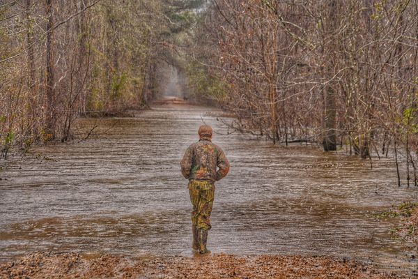
This is a nice photo, and it certainly conveys the mood of the flood. My first thought is that the person perhaps blends too much into the photo. I'd like to see him with clothes that contrast a little more with the surroundings.
Jan 16, 2016 13:12:38 #

Very well composed, but the light was not with you this day. The subject sort of melts into the landscape.
Jan 16, 2016 13:21:04 #

I don't mind that he kind of blends into the background, but what bothers me is the halo around him. Looks like maybe you tried to dodge him to make him stand out.
I do like the composition. Straight on up that road that he can't walk on because of the flood, but it leads your eye into the photo.
I do like the composition. Straight on up that road that he can't walk on because of the flood, but it leads your eye into the photo.
Jan 16, 2016 13:24:25 #

This is a powerful image for me - unique and very interesting. If it had been shot in sunlight, would have conveyed an entirely different mood.
The message for me is that man will never tame nature and we must learn to live with what she gives us. He is resigned to that by his body language, trudging and somewhat defeated. For me sunshine would have given a more hopeful mood - that the worst was over.
I like your center position of him, too - again gives me the sense of his lone insignificance surrounded by the power of nature.
Technically, I can see areas around the man where youve tried to lighten, so maybe a bit of re-do on that.
Jan 16, 2016 14:18:08 #
I did not mean that it should have been taken in sunlight. There are many types of light. Perhaps the light was right? I see the lightening you are talking about Linda. Perhaps the photo would be better without that .. What I am seeing is that the light is the same everywhere. The photo is flat. Perhaps that was done in post and not at the time of capture. I would never recommend taking a forested shot is full sun. It's much too contrasty.
Jan 16, 2016 16:08:20 #
Nightski wrote:
... I would never recommend taking a forested shot is full sun. It's much too contrasty.
I think it depends on the situation, and what interests the photographer. I posted one forest shot that Brent Harder suggested would benefit from HDR, but it was that high contrast and dramatic light that I was most attracted to :)
Jan 17, 2016 14:34:26 #

I agree with Country's Mama, the faint halo bothers me. You might try increasing the contrast instead. I think that the person and even the background might be improved. Good luck.
Jan 19, 2016 15:57:03 #
I like the photo. I like it a lot. The composition is good. It conveys the mood of the scene. The lighting is probably about correct for what was real. I don't have a problem with the clothes of the subject being similar to the surrounding. It is a camo style outfit. The area around the subject is strange, sort of a halo, sort of blurred some. It feels like there was an attempt to sharpen a slightly out of focus image.
For this type of contest where decisions are based on a a second or two per image, it isn't likely to win much because there is not much that quickly grabs the viewer's attention. People generally like an image like this, but it doesn't get picked at the top. It feels a little bit dull (all mid tone colors and brightness). A little more contrast might help, and I feel that it could be made a little bit darker if you want it to stand out more. But then changes like this might violate your feeling of what the image looked like when you took it.
Personally, I would use a light touch approach to adjusting anything in this image and not worry about how it does in any contest.
Jerry
Jan 19, 2016 19:11:57 #
jim hill
Loc: Springfield, IL
St3v3M wrote:
E. Crichton's WPC Entry has been selected for the Photo Critique Forum* to find out what could have done to make it better.
Be nice, but be honest as this may help everyone with their craft. Thank you everyone!
From WPC 1602 - Weather RESULTS http://www.uglyhedgehog.com/photo_contest_ratings.jsp?pcnum=204
* If you are new to the Photo Critique Forum please read the Section Rules http://www.uglyhedgehog.com/t-279264-1.html
.
Be nice, but be honest as this may help everyone with their craft. Thank you everyone!
From WPC 1602 - Weather RESULTS http://www.uglyhedgehog.com/photo_contest_ratings.jsp?pcnum=204
* If you are new to the Photo Critique Forum please read the Section Rules http://www.uglyhedgehog.com/t-279264-1.html
.
Because of the different textures and other points this seems to be a composite. It may not be but that's beside the point.
The haloing around the figure is also quite soft in addition to being brighter. It's seems a blur tool might have been used to take care of some problem ot other. That's also not the point.
The photograph isn't really all that bad. It's quite intriguing. It does need more contrast. The sides might be brought in to give more importance to the man. I think this is a case of less is more. The photograph says too much about the setting. I should be cropped to a point of interest.
I do like the pool of light in the distance and what is going one there. If the entire piece could be brought down a couple of notches in tonality and then a little dodging applied in the area of the distant point of interest it might be better.
Just a couple of things I would do IIWM, which it ain't.
If you want to reply, then register here. Registration is free and your account is created instantly, so you can post right away.