Dark and Moody
Jan 11, 2016 08:31:51 #

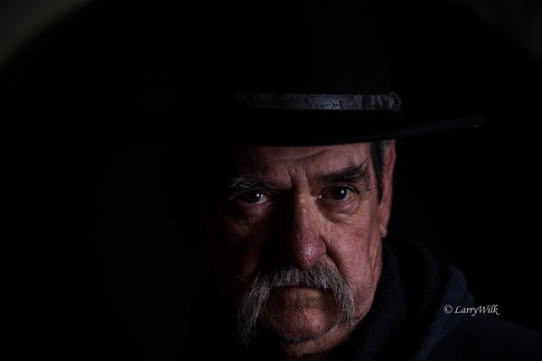
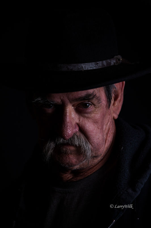
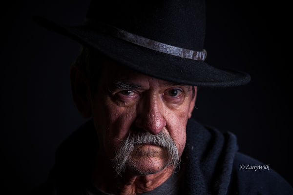
Wife and I playing around last night trying to capture a dark and moody sequence. Any C and C welcome.
Jan 11, 2016 13:43:36 #

I like the series. #1 appears to have a bit too much hat and not enough base for me. Both 1 and 2 could use a little more light on the face.
#3 is the best of the group for me. I do like horizontal portraits from time to time. Although I might have removed a bit of the left side in this one. Very nice, Larry.:thumbup:
#3 is the best of the group for me. I do like horizontal portraits from time to time. Although I might have removed a bit of the left side in this one. Very nice, Larry.:thumbup:
Jan 12, 2016 11:39:53 #
# 1 for me. Very well done. I like the composition. And it shows his personality quite well although I don't see dark and moody. I see a stubborn and maybe cranky old character.
Jan 12, 2016 15:48:10 #
Rick36203 wrote:
I like the series. #1 appears to have a bit too much hat and not enough base for me. Both 1 and 2 could use a little more light on the face.
#3 is the best of the group for me. I do like horizontal portraits from time to time. Although I might have removed a bit of the left side in this one. Very nice, Larry.:thumbup:
#3 is the best of the group for me. I do like horizontal portraits from time to time. Although I might have removed a bit of the left side in this one. Very nice, Larry.:thumbup:
Thanks for the suggestions. I will give them a try.
Jan 12, 2016 15:48:59 #
Yooper 2 wrote:
# 1 for me. Very well done. I like the composition. And it shows his personality quite well although I don't see dark and moody. I see a stubborn and maybe cranky old character.
Thanks. I am all of the above!
Jan 12, 2016 15:54:07 #
If you want to reply, then register here. Registration is free and your account is created instantly, so you can post right away.