The Art of Knowing When to Stop
Nov 17, 2015 06:47:28 #

It's every photo editor's conundrum - when to stop messing with an image and upload it.
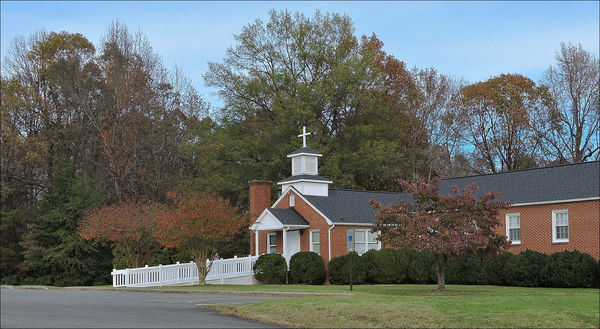
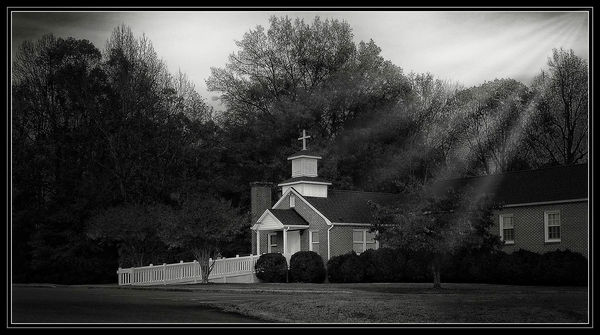
This was a continuing project of mine where I take a scene that is not particularly notable and see if I can make something out of it that is a bit more exciting. I liked this simple church for several reasons ...... it had a nice open view to the front porch, it was staged against a beautiful backdrop of trees, and the white cross, steeple and steps created nice contrast against a darker background.
I had it in mind from the very beginning that I wanted to convert this to a high contrast monochrome image with a touch of drama. I've included several iterations to show the steps along the path.
As in some of my prior topics in this forum, I am interested if any others of you have experienced this phenomenon. If so, please feel free to add some examples of your own - preferably showing at least two images of the same subject. And then, a question for you ..... of the photos below, where would YOU have stopped?
Please view the downloads for best results.
Color Original - fairly bland
(Download)
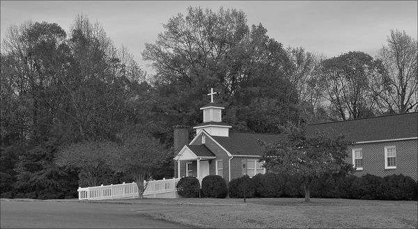
Desaturated - the beginnings of b&w, but still not very exciting
(Download)
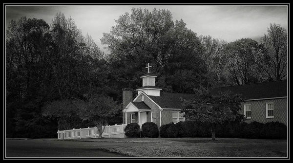
Nice contrast, dramatic skies - could probably have stopped here
(Download)
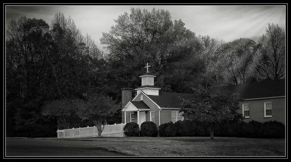
Same as the one above but with an extra element thrown in
(Download)
Same idea, stronger contrast - perhaps overcooked(?)
(Download)
Nov 17, 2015 07:06:35 #

Wow, I love this study Bob and you've probably already figured it out knowing my proclivity for drama that the last one is my favorite (not overcooked at all in my opinion) Loved these Bob. :thumbup:
Nov 17, 2015 07:14:42 #
jwt wrote:
Thanks Jim. Yep, I had a pretty strong inkling which image you would pick. Watch out ..... you're becoming predictable.Wow, I love this study Bob and you've probably already figured it out knowing my proclivity for drama that the last one is my favorite (not overcooked at all in my opinion) Loved these Bob. :thumbup:
Nov 17, 2015 07:30:49 #

Really interesting question Bob. And you are right knowing when to stop is an art, an art that frequently fails me. Sometimes I only realise I have passed that point by setting the pic aside for a few days and then going back to it with fresh eyes. As for where to stop on your pic I can't quite give you a straight answer. As a matter of personal taste I really don't like the inclusion of the pseudo light rays, to my eyes they look like an effect i.e. they stand out as being added even if I hadn't seen the shot before they were added, they look unnatural in that scene. But I like the further contrast development that you arrive at in final pic. So I guess my answer is, the final pic is where I would have stopped but without the pseudo light rays.
I hope that makes sense.
Peter
I hope that makes sense.
Peter
Nov 17, 2015 07:37:23 #

Knowing when to quit is what happens after you've attended the University of Experience and taken a lot of classes in 'Not Knowing When to Quit."
The one before the last would be my choice here, and a nice one it is, Bob.
The one before the last would be my choice here, and a nice one it is, Bob.
Nov 17, 2015 07:43:14 #
Bob Yankle wrote:
Thanks Jim. Yep, I had a pretty strong inkling which image you would pick. Watch out ..... you're becoming predictable.
:oops: I gotta change that quick..LOL :thumbup:
Nov 17, 2015 07:47:33 #
conkerwood wrote:
You've made a most excellent point Peter. I, too, have noticed that I change my mind after I've left an image alone for a few days. And I have to say, the change is usually for the better. I guess it's a matter of being too close to what you're working on.Really interesting question Bob. And you are right... (show quote)
And then there's this. I find after I've uploaded an image to the UHH Server, they are a few shades darker when rendered across the net then they are in Photoshop. I have uploaded photos, saw what they looked like online, then immediately deleted them. I then open the photo in PS, add some brightness and a touch of contrast, save the new image, and then upload them anew, hoping I can get all that done within the 60 minutes allotted to making changes in a topic.
Nov 17, 2015 07:54:38 #
Treepusher wrote:
Thanks Randy. This reminds me of my days as a database developer - back then we used to say "A software program is NEVER done. Sometimes we just stop working on it."Knowing when to quit is what happens after you've attended the University of Experience and taken a lot of classes in 'Not Knowing When to Quit."
The one before the last would be my choice here, and a nice one it is, Bob.
The one before the last would be my choice here, and a nice one it is, Bob.
Nov 17, 2015 07:54:59 #
jwt wrote:
:oops: I gotta change that quick..LOL :thumbup:
:-D :-D :-D
Nov 17, 2015 08:01:35 #
I've learned it's best to delete images which fail to impress right out of the camera. One can improve the images with editing, but one cannot turn them into great images.
You've done a recommendable job here, no doubt. But in the end, it's still just "lipstick on a pig".
You've done a recommendable job here, no doubt. But in the end, it's still just "lipstick on a pig".
Nov 17, 2015 08:07:25 #
rook2c4 wrote:
Thanks rook. How about sharing one of your impressive images straight out of camera?I've learned it's best to delete images which fail to impress right out of the camera. One can improve the images with editing, but one cannot turn them into great images.
You've done a recommendable job here, no doubt. But in the end, it's still just "lipstick on a pig".
You've done a recommendable job here, no doubt. But in the end, it's still just "lipstick on a pig".
Nov 17, 2015 08:08:18 #

IMHO it just keeps getting better and better. Don't see it as overcooked at all. AsI've said before Bob, I'm not a real B&W fan but you're turning me.
-Doc
-Doc
Nov 17, 2015 08:08:30 #

I find this disturbing on so many levels.
I am always amazed by those who have an idea in their head that requires lots of PP and then they some how achieve it.
I just cant do that.
If I took that image I would have deleted it for lack of imagination to what could be accomplished with it.
I think the second to last one is the best...the whites are just a wee bit brighter than the last one. And I don't know how you did it but I like the way you added the light rays..I LIKE THAT YOU THOUGHT OF IT.
As far as when to stop? Only you can answer that for what it is you wish to convey. It is my firm belief that in most things there is room for improvement. I know I sure have a long way to go.....:-)
Nov 17, 2015 08:11:44 #
docshark wrote:
Thanks Doc. For me, b&w only gets interesting when you have a fairly large range between the blackest blacks and the whitest whites. But then they must be artfully placed.IMHO it just keeps getting better and better. Don't see it as overcooked at all. AsI've said before Bob, I'm not a real B&W fan but you're turning me.
-Doc
-Doc
Nov 17, 2015 08:21:22 #
RiverNan wrote:
The image I had in mind RiverNan was the third one from the top. There is a subtle vignette effect where the church front is in very sharp relief, with bright whites, and then the light tapers off toward the edges. I actually applied a painting effect from Topaz Simplify to the whole image, blending the opacity of the layer to fall somewhere between realistic and artistic, but then masked the cross, steeple, church front and stairs so they showed up in sharp relief.I find this disturbing on so many levels. br br I... (show quote)
I later added the sunray effect because I'd seen it in another photo and thought it might work here, too. Even those light beams serve to highlight the church front and the lawn, though in reality, because of the angle, it would probably have cast dark shadows over those areas from the building blocking its rays.
If you want to reply, then register here. Registration is free and your account is created instantly, so you can post right away.