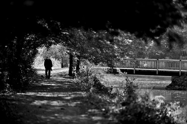
WPC 1545 - Paths* CRITIQUE
Nov 17, 2015 06:46:59 #

[b]Sdubois/b]'s WPC Entry has been selected for the Photo Critique Forum* to find out what could have done to make it better.
Be nice, but be honest as this may help everyone with their craft. Thank you everyone!
From WPC 1545 - Paths* RESULTS http://www.uglyhedgehog.com/photo_contest_ratings.jsp?pcnum=195
* If you are new to the Photo Critique Forum please read the Section Rules http://www.uglyhedgehog.com/t-279264-1.html
.
Nov 18, 2015 01:43:15 #
It is a very good composition and the shades of BW work well. However there is a lot of the image that is very dark. I would crop quite a bit from the top and left sides, maybe remove 75% of the heavy black. Then depending on the desire to move the man and path back into the photo more or keep a photo aspect ratio, you might crop half the bridge on the right.
Jerry
Jerry
Nov 18, 2015 09:48:42 #
Interesting composition... a little cluttered though. However the subject is "Paths" and maybe the author is depicting two paths. If that's the case, then the following comments are off base. If a man and dog on a pleasant, sun-dappled path is the photographer's intent, then, I'll proceed.
I'd crop out the entire right half- the handrail/fence is distracting and adds nothing to the image, clone out that odd appendage on the man, and also the rails where they encroach into the light area encircling the man & dog. If the dog was a little brighter, it'd give the man something to look at. OK, the man is probably looking at the dog but to the viewer of the image, the dog is just about lost. Nobody likes a lost dog. A little texture in the image's upper portion- anything to break up the all black shadow areas- might entertain the eye a little better- that includes the man figure, too. Applying a green filter will lighten the foliage and allow some texture to present itself- give it a shot.
There's texture in the image's bottom third but, its out of focus and not very interesting... I'd crop it out for those reasons alone but, additionally, I have difficulty establishing a spatial relationship between the black trees and the dappled ground: aerial perspective: dark objects precede, light objects recede. The dark tree canopy, to me, seems physically, more distant than the dappled foreground but that doesn't fit with the visual perspective and presents the viewer with an uncomfortable disposition. Maybe it's just me.
Otherwise, its an interesting image and evokes pleasant emotions- a very nice day, warm sun, cool shadows, the smell of leaves and a puppy! But, the best part is that the photographer is actually out and about taking pictures... that's what we're supposed to do.
Nov 18, 2015 09:49:58 #
CanadaNorm
Loc: Ontario Canada
I would crop out all the bridge on the right leaving the two trees, and a bit off the left. A portrait format with the man, and the path would be a very strong and focused image.
Nov 18, 2015 10:47:22 #

I'm always so opposite from everyone else. My first reaction is that I really like the scene, and the fact that he's walking toward the light is very symbolic. Also the inclusion of the bridge, or a second direction is very symbolic. However, I think the overall image is too dark. Could the trees be lightened up a bit - just enough to show detail perhaps? There's a lot of detail here that can't be seen because of the darkness. Or is the darkness also symbolic and therefore shouldn't be changed?
Nov 18, 2015 11:41:18 #
jim hill
Loc: Springfield, IL
CanadaNorm wrote:
I would crop out all the bridge on the right leaving the two trees, and a bit off the left. A portrait format with the man, and the path would be a very strong and focused image.
Agree! Great suggestion.
Nov 18, 2015 12:15:31 #

I did a quick and dirty 'enhance' using PS Express app on the iPad Air 2. The top and left side darkness had no detail except around the fringes - bokeh leaves. There was a general lightening elsewhere. The only thing that became clearer was the dog at the man's left leg. The blob at the man's right side appeared to be something he was carrying. Of course, the PS Express enhance engine isn't very sophisticated, so another full Photoshop tool might fibd more detail, but it might not be much. The so-called enhanced image did not show much sharpness, but that might be a plus considering the 'mood' of the image. The photographer might have had a message in mind.
Nov 18, 2015 13:38:18 #

As I have said, critiques are very subjective. Every person brings their own view of something and I am afraid I am going to have a different view. One of the things I like the most about this pic, besides the wonderful compostion is the dark area. It creates a story of walking through the dark to get to the light. It creates a feeling of privacy for this man and his dog . They seem to be in a world of their own, enjoying the stroll. I do agree that it could be cropped a little on the right, just enough to eliminate the blurry leaves, but no more than that. The light area to the right is important. It gives the viewer an escape from the dark without having to pass by the man and his dog. I like that.
Nov 18, 2015 14:05:39 #

I think this photo would have been vastly improved if it had been taken a few seconds earlier before the man and dog got into the deep shadow. He is actually walking from the light into the darkness and it would have been nice to be able to see some detail of his clothing etc. I like the bridge being there - it gives the notion of an alternative path and our dog walker has taken "the road less travelled". The high contrast is unfortunate but some effort should be made to lighten the dark part and tease some detail out of the trees. My suggestion for cropping would depend on how successful the brightening is. Generally, I think cropping should be based on giving the man and dog more real estate and eliminating some the the unnecessary dark foliage.
Nov 18, 2015 15:45:18 #
The subject was "Paths" so although the crop suggestons are quite valid I feel that Sdubois's crop choice is appropriate. On my screen, it is too dark and shows little detail save for the bridge railing. Like the overall composition. Call me old fashioned, but I would prefer more focus in the foreground, which has the appearance of being blurred a bit too much in post.
Nov 23, 2015 12:10:42 #
one of my favorites. Very nice composition and I like the contrast. I like the man's posture (looks as if he is having a conversation with his four legged friend). I like the darkness he walks through and the circle of light behind him. I think the bridge to the right fits wonderfully with the overhanging tree branches.
Perhaps the only change I'd consider might be knocking off 10 or 15 percent from the right so that the entire top is dark and the blurred leaves on top aren't there.
Also I have mixed feelings about the bush front right. Part of me wants the POV lower, so that we are looking through the bush to see river and bridge. Part of me wants it gone, but am fearful that if gone, the river takes too much of a command and competes with the walkers and their circle of light.
Very nice!
If you want to reply, then register here. Registration is free and your account is created instantly, so you can post right away.