Which to give as a gift?
Oct 17, 2015 10:30:17 #
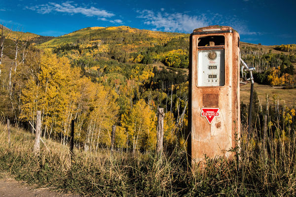
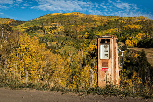
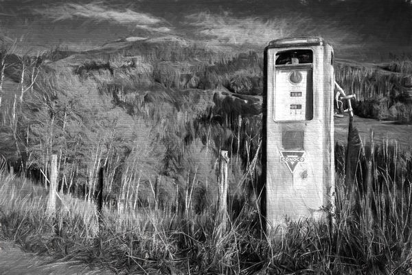
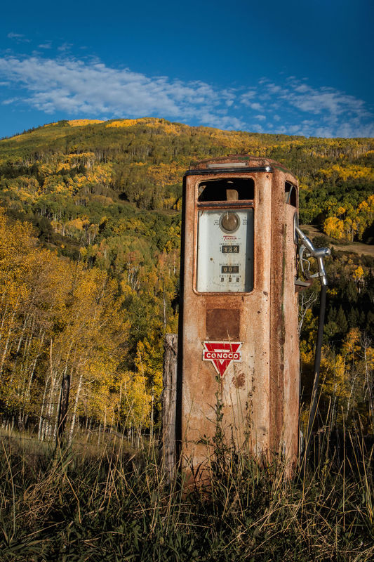
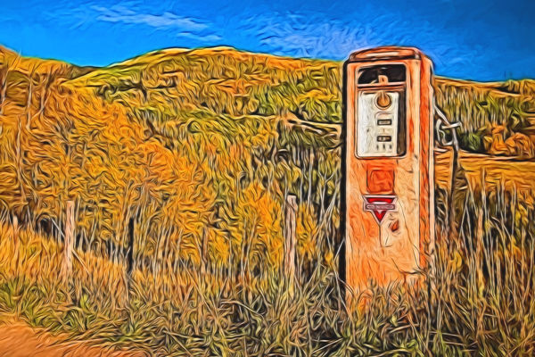
Ok, I'm asking for help one more time. A friend of mine was an accountant for Conoco Phillips for lots of years before retiring. I saw this old pump and thought of him, which do you think would look best on a canvas for him?
P.S. Notice the price of gas, I'll buy gas here all day long!
P.S. Notice the price of gas, I'll buy gas here all day long!
1
(Download)
2
(Download)
3
(Download)
4
(Download)
5
(Download)
6
(Download)
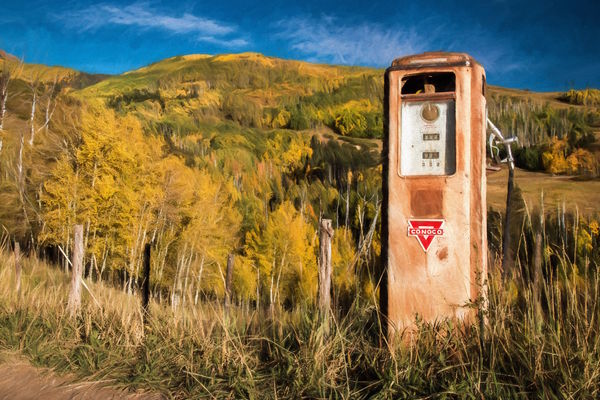
A painting for fun
(Download)
Oct 17, 2015 10:31:28 #

Photolady2014 wrote:
Ok, I'm asking for help one more time. A friend of mine was an accountant for Conoco Phillips for lots of years before retiring. I saw this old pump and thought of him, which do you think would look best on a canvas for him?
Choose #1
Oct 17, 2015 10:38:31 #
djb663
Loc: Massachusetts
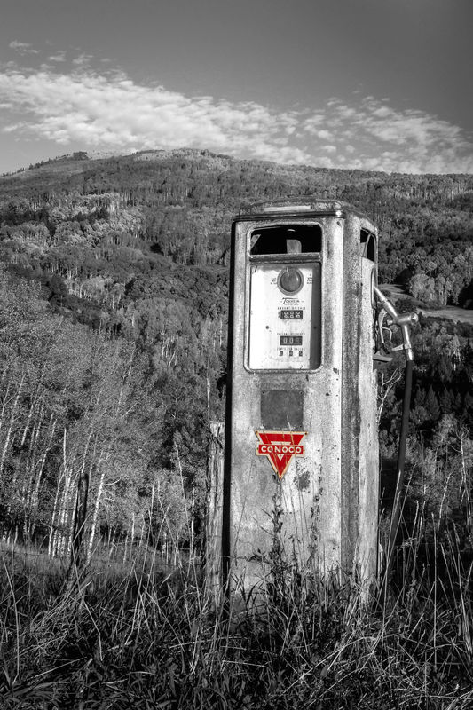
I prefer number 3. The black and white adds to the nostalgia and nostalgia is I believe what you are going for.
Oct 17, 2015 10:38:49 #

I like most of them. 50/50 on whether 4 or 6. 4 is dramatic 6 has nice variation in terrain. Very nice work.
Oct 17, 2015 10:39:55 #

My choice is #1 too Photolady, the pump must have been
taken down in the 50s or so.
taken down in the 50s or so.
Oct 17, 2015 10:40:05 #

Oct 17, 2015 10:47:56 #
Heather Iles
Loc: UK, Somerset
I would say No.1. The subject is the gas station/pump.
What about the rule of thirds and have a bit more sky in the photo.
He would be proud that you have been to the trouble of giving him a picture for his wall. A very kind thought indeed.
What about the rule of thirds and have a bit more sky in the photo.
He would be proud that you have been to the trouble of giving him a picture for his wall. A very kind thought indeed.
Oct 17, 2015 10:54:34 #

Photolady2014 wrote:
Ok, I'm asking for help one more time. A friend of mine was an accountant for Conoco Phillips for lots of years before retiring. I saw this old pump and thought of him, which do you think would look best on a canvas for him?
P.S. Notice the price of gas, I'll buy gas here all day long!
P.S. Notice the price of gas, I'll buy gas here all day long!
Number1
Oct 17, 2015 10:54:41 #

Oct 17, 2015 10:56:46 #

Personally, I go by the rule of "vertical subject, vertical crop". So in this case, since you are trying to showcase the gaspump, I would prefer #4 or #5, and show less of the landscape.
The nostalgia of the b&w in #5 says it all!
Very nice of you to come up with this set of images for your friend!
Thanks for sharing!
The nostalgia of the b&w in #5 says it all!
Very nice of you to come up with this set of images for your friend!
Thanks for sharing!
Oct 17, 2015 10:57:47 #

Oct 17, 2015 11:02:26 #
I would use #4 or #5. The idea is to showcase the pump, not the weeds and scenery around the pump. Certainly you do need to include enough of the area around the pump; which you have done.
Oct 17, 2015 11:12:25 #

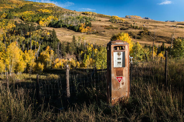
I really think #2 captures the pump and environment the best. You see the terrain, the lonely road and the colors are perfect. The crop feels more pleasing too.
The pump is where you focus your attention, but in this version you have captured a lonelier feeling, lost....as in deed it is for many reasons.
#6 looks like the area around the pump is burned, which it apparently is not, and the darkness takes away from the overall feeling you are trying to capture.
The others feel too close up and the pump is not absolutely vertical, which diverts ones attention.
Speaking of vertical, #2 should be straightened a little so that the pump is absolutely vertical but don't lose any of the road. Maybe you could add a little more road to accent the loneliness.
Oct 17, 2015 11:30:42 #
Oct 17, 2015 11:31:46 #
djb663 wrote:
I prefer number 3. The black and white adds to the nostalgia and nostalgia is I believe what you are going for.
That would be one of the reasons to go B&W. Thanks for your thoughts.
If you want to reply, then register here. Registration is free and your account is created instantly, so you can post right away.