Check out Photo Critique Section section of our forum.
opinions please on portrait photo
Apr 9, 2012 07:20:22 #
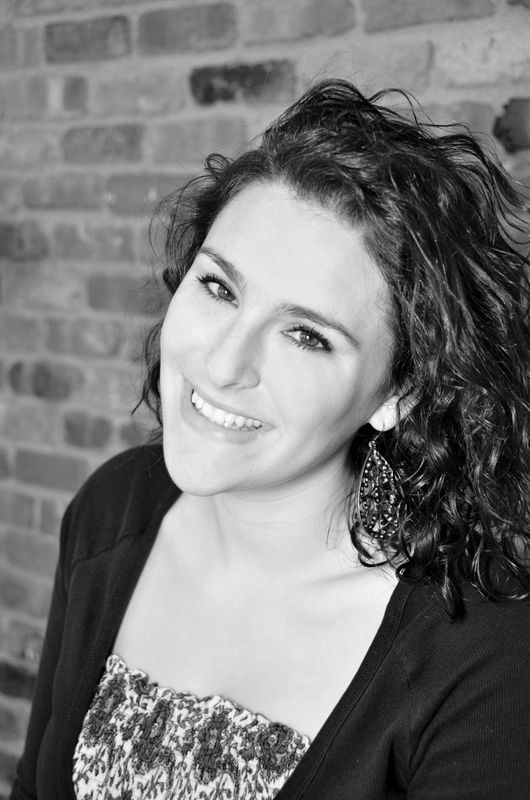
for all you experts out there in portrait photography any opinions or tips would be appreciated. Took these shots yesterday of my daughter. Trying to get the hang of using my flash.
Thanks
Thanks


Apr 9, 2012 08:46:19 #

Apr 9, 2012 08:50:54 #

I think the 3rd one is the best from a lighting standpoint. The first 2 look blown out to me.
Check out Astronomical Photography Forum section of our forum.
Apr 9, 2012 09:31:44 #
Apr 9, 2012 09:34:20 #
Hammster wrote:
I think the 3rd one is the best from a lighting standpoint. The first 2 look blown out to me.
The first one was a bit blown out which is why I converted it to black and white but even though its bright I really like it. I used a white board to bounce my flash off of, still trying to work out all the various settings.
Thanks
Apr 9, 2012 09:49:47 #
#1 is a little to blown for me.
#3 is more a grey/black conversation and looks a little muddy.
I really like #2.
#3 is more a grey/black conversation and looks a little muddy.
I really like #2.
Apr 9, 2012 09:55:01 #
MWAC wrote:
#1 is a little to blown for me.
#3 is more a grey/black conversation and looks a little muddy.
I really like #2.
#3 is more a grey/black conversation and looks a little muddy.
I really like #2.
I agree, but what do you mean by grey/black conversation ?
does it need to be brighter?
Check out Sports Photography section of our forum.
Apr 9, 2012 09:58:58 #
MWAC wrote:
#1 is a little to blown for me.
#3 is more a grey/black conversation and looks a little muddy.
I really like #2.
#3 is more a grey/black conversation and looks a little muddy.
I really like #2.
Ps I think your photos on flickr are really great.
Apr 9, 2012 10:00:21 #
Emm5 wrote:
Ps I think your photos on flickr are really great.
MWAC wrote:
#1 is a little to blown for me.
#3 is more a grey/black conversation and looks a little muddy.
I really like #2.
#3 is more a grey/black conversation and looks a little muddy.
I really like #2.
Ps I think your photos on flickr are really great.
by grey/black conversation, I mean there is no real white in your black/white. As a result it looks muddy. If you look at #3 and compair it to number #2, you'll see that number two isn't as crispy/clean. It's more grey.
Thanks for the complement.
Apr 9, 2012 10:02:36 #
MWAC wrote:
by grey/black conversation, I mean there is no real white in your black/white. As a result it looks muddy. If you look at #3 and compair it to number #2, you'll see that number two isn't as crispy/clean. It's more grey.
Thanks for the complement.
Emm5 wrote:
Ps I think your photos on flickr are really great.
MWAC wrote:
#1 is a little to blown for me.
#3 is more a grey/black conversation and looks a little muddy.
I really like #2.
#3 is more a grey/black conversation and looks a little muddy.
I really like #2.
Ps I think your photos on flickr are really great.
by grey/black conversation, I mean there is no real white in your black/white. As a result it looks muddy. If you look at #3 and compair it to number #2, you'll see that number two isn't as crispy/clean. It's more grey.
Thanks for the complement.
Got it thanks I went and brightened it up looks much better.
Apr 9, 2012 10:42:38 #
no problem. I really like the pose in #3, just the conversation wasn't working. I'm sure once it was brightened up it looks great.
Check out Travel Photography - Tips and More section of our forum.
Apr 9, 2012 10:44:48 #

#1, #2, #3 are soft...too soft. The eyes HAVE to be sharp.
all three don't "pop" for me...they seem like they are pretty low contrast.
Also, the main thing is that the lighting is flat...it needs to show a bit of shape in her face.
It seems like the light source was "on axis" or close to it.
It should be more to the side in my opinion...the catch lights in her eyes should be at 10pm or 2pm.
Apr 9, 2012 20:29:33 #
rpavich wrote:
#1, #2, #3 are soft...too soft. The eyes HAVE to be sharp.
all three don't "pop" for me...they seem like they are pretty low contrast.
Also, the main thing is that the lighting is flat...it needs to show a bit of shape in her face.
It seems like the light source was "on axis" or close to it.
It should be more to the side in my opinion...the catch lights in her eyes should be at 10pm or 2pm.
all three don't "pop" for me...they seem like they are pretty low contrast.
Also, the main thing is that the lighting is flat...it needs to show a bit of shape in her face.
It seems like the light source was "on axis" or close to it.
It should be more to the side in my opinion...the catch lights in her eyes should be at 10pm or 2pm.
Thanks for your input.
Apr 9, 2012 20:34:00 #
njfisher
Loc: SW Missouri
I agree with the previous assessments, but my first reaction? She is having fun! That is obvious and what comes across despite the recommended technical changes. What a nice job of capturing this young lady having pure old-fashioned fun.
Apr 9, 2012 20:58:30 #
If you want to reply, then register here. Registration is free and your account is created instantly, so you can post right away.
Check out The Pampered Pets Corner section of our forum.