WPC 1537 - In Service* CRITIQUE
Sep 18, 2015 23:51:51 #

jgordon's WPC Entry has been selected for the Photo Critique Forum* to find out what could have done to make it better.
Be nice, but be honest as this may help everyone with their craft. Thank you everyone!
From WPC 1537 - In Service* RESULTS http://www.uglyhedgehog.com/photo_contest_ratings.jsp?pcnum=187
* If you are new to the Photo Critique Forum please read the Section Rules http://www.uglyhedgehog.com/t-279264-1.html
.
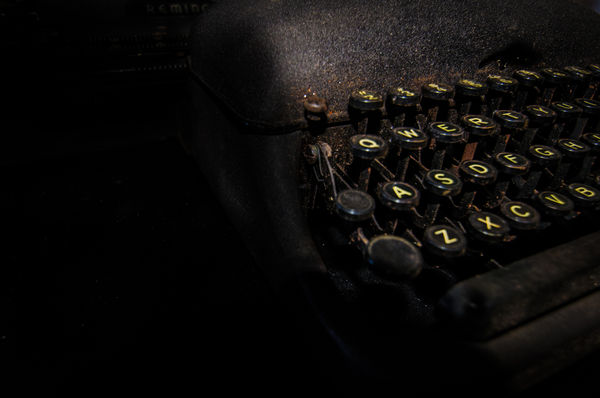
According to family lore, Uncle Saul carried his small manual typewriter throughout his service in WWII. He came home from the war and became a journalist. Now in his 90s, he still types with two fingers but now on a computer keyboard with enlarged keys.
(Download)
Sep 19, 2015 01:28:03 #
lighthouse
Loc: No Fixed Abode
I am really struggling with this image.
I see a half and half image that looks unbalanced.
Normally half and half looks boring, and I would not accuse this image of that, but it definitely has an uneasy feel about it.
For me the negative space is just too large.
For it to even go close to working for me, I would want the parts of the image that draw your eye, to also be the parts of the image that are in focus, but thats not the case here.
The only parts that look in focus to me are the U & the I key, but the eye is drawn to the Q,W & A.
The right side of the image looks cut off.
Maybe its "close" as a rule breaker, but I'm afraid I just don't get it.
I wonder why it placed so highly in the contest.
I'm guessing people voted on the words and not the image, or they voted on the thumbnail and didn't enlarge it.
I think taken more conventionally it could be a great image.
Sep 19, 2015 08:39:33 #
I agree with this critique. I struggled with this image as well. Wanted to like it because indeed the subject of a typewriter in service during war times offered a unique perspective for this challenge. Please take this again and try to apply the thoughtful suggestions lighthouse recommended.
lighthouse wrote:
I am really struggling with this image. br I see ... (show quote)
Sep 19, 2015 10:19:17 #
Wow! I love the idea and the general approach, but it doesn't all come together for me. For sure it needs to lose some of the negative space on the left. Maybe as much as 90% of it. Then the focus issue. It bothers me that the Keys on the left aren't sharp, but too much sharpness throughout would surely ruin the effect. I'm thinking shooting it tack sharp and then using a radial filter to selectively add a slight blur/diffusion would work better. In any case I'd like to see the shot explored more extensively.
Sep 19, 2015 11:32:41 #

For once I totally agree with everything that has been already said. Nothing to add.
Sep 23, 2015 12:17:52 #
love the lighting. And the abstract shapes (though there is no question that this is a keyboard). And love the color of it also, the rust balanced against the yellow letters and the dark metals. Love how it glows. For me, the composition would have been more of a look from the left side with sharp focus on the near keys and the far keys fading away. My eye wants to follow the keys and they are irritated that they didn't get to see more of them.
Sep 23, 2015 13:26:45 #
and I have to add... I keep coming back to this image. Something about it that I like. I don't know if it the "cut in half" tension or the chiaroscuro aspects of it - but it certainly made me go out to Ebay to check out old typewriters!!
Sep 23, 2015 18:43:49 #

I am a little slow to the party. I think a crop of about half of the black on the left would do wonders for this. I don't mind the shallow DOF and I like the grain. It gives it a timeless feel.
If you want to reply, then register here. Registration is free and your account is created instantly, so you can post right away.