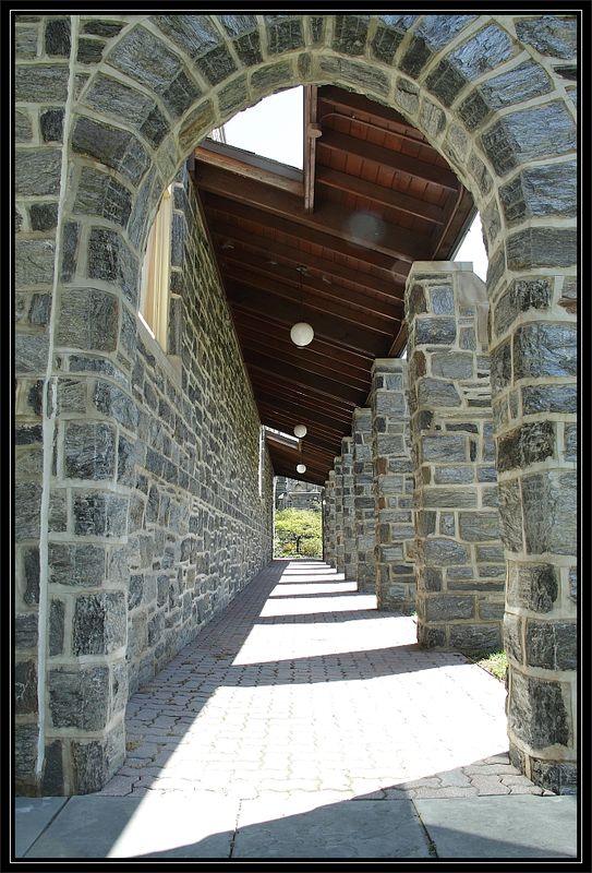
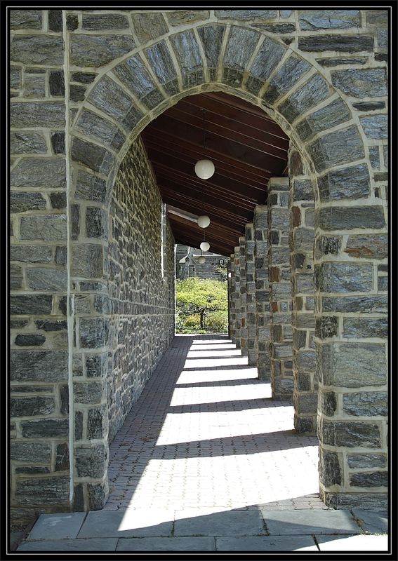
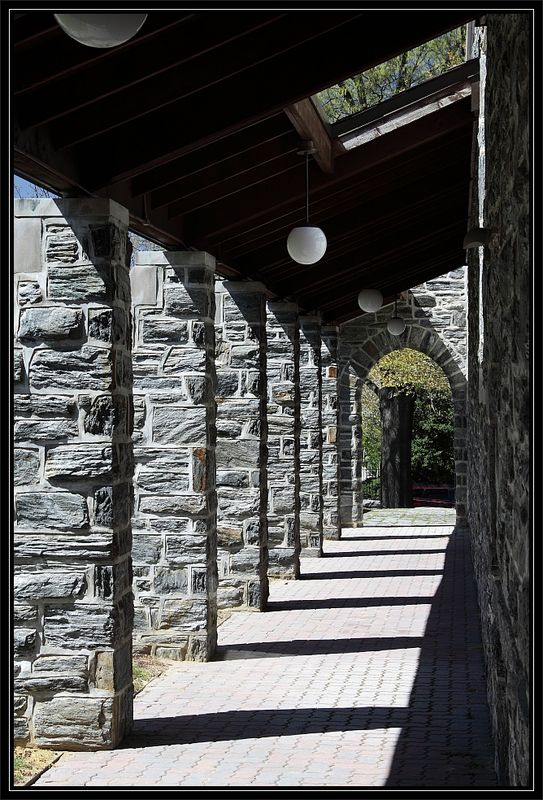
Archway & Perspective
Apr 3, 2012 18:44:05 #

Not sure which of these two works best. Thoughts?
Westminster Presbyterian Church, Wilmington DE.
Westminster Presbyterian Church, Wilmington DE.
Arches 1
Arches 2
Apr 3, 2012 18:45:50 #

Apr 3, 2012 18:48:50 #

Apr 3, 2012 18:54:51 #
Apr 3, 2012 19:04:43 #

JimH wrote:
Could have been one BUT......./...Thoughts?.../...
Glare in the lens and crop too tight (arch on top, light on bottom).
Wide angle distortion is too pronounced, kind of makes you sea sick after a while
Also...
The lower point of view is half 'hearted'.
Considering these four elements, #2, by default, more than choice.
#2 hides the window as well as the skylight. This makes the viewer wonder where the light at the bottom of the pillar comes from...
Apr 3, 2012 19:17:47 #
Apr 3, 2012 19:25:25 #

JimH wrote:
Not sure which of these two works best. Thoughts?
Westminster Presbyterian Church, Wilmington DE.
Westminster Presbyterian Church, Wilmington DE.
The second works better for me. The first one the highlights are a little to blown out. Which as you know distracting.
good to hear from you again. Hope all is well,
Rach
Apr 3, 2012 19:44:43 #

Apr 3, 2012 20:07:52 #

Apr 3, 2012 20:11:07 #
Apr 3, 2012 20:21:43 #
Interesting - I'm pretty much in favor of #2 as well, I was curious to see if anyone liked #1, and if so why. I have to admit I didn't even notice the damn lens flare until EW pointed it out. Thank you all for the comments. I just liked the combination of the geometric light and dark shapes, and the perspective. We've all seen millions of these kinds of shots, I don't think I did anything especially creative.
Here's another view of a different chunk of the portico or whatever it's called. There are actually two parts, with a zig-zag in the middle.
Bottom shot shows the whole wing.
Here's another view of a different chunk of the portico or whatever it's called. There are actually two parts, with a zig-zag in the middle.
Bottom shot shows the whole wing.
Archway

Apr 3, 2012 20:24:25 #
Apr 3, 2012 20:28:08 #

Number 2 as its more centered and your looking in, plus you have the top of the arch, more balanced with sides. I like architecture centered. Also the first photo you look to be aiming up and not in.
JimH wrote:
Not sure which of these two works best. Thoughts?
Westminster Presbyterian Church, Wilmington DE.
Westminster Presbyterian Church, Wilmington DE.
Apr 3, 2012 20:53:32 #

JimH wrote:
Not sure which of these two works best. Thoughts?
Westminster Presbyterian Church, Wilmington DE.
Westminster Presbyterian Church, Wilmington DE.
I like #1 best. I like the prespective of the roof, the way it gives a feeling of greater height.
Apr 3, 2012 21:16:38 #

I like #2 also. The lighting is more pleasing, plus there is a clearer view of what is outside at the other end.
If you want to reply, then register here. Registration is free and your account is created instantly, so you can post right away.