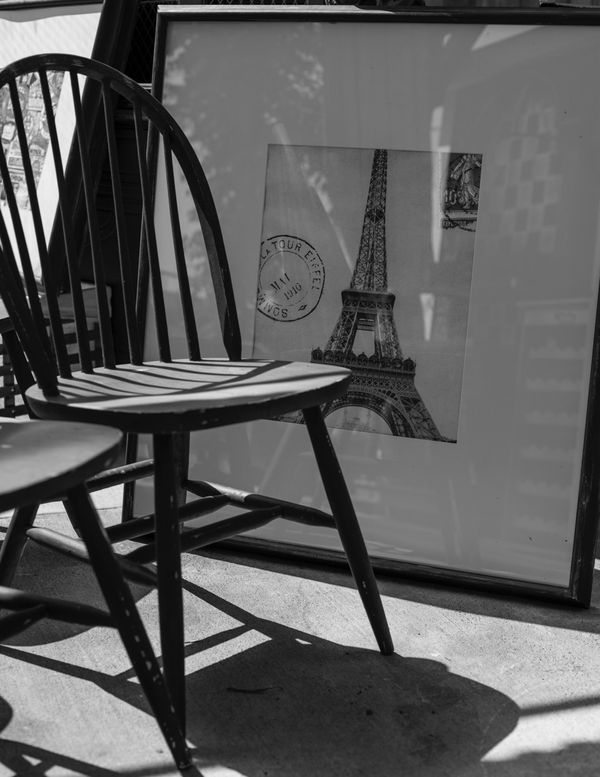
Eiffel chair in B&W
Aug 14, 2015 00:42:37 #
lightened it a tad too, forgot to ask for C&C again........what think you?
Aug 14, 2015 11:14:13 #
I like the idea of the strong shadows and the chair rails and how they relate to the tower. I don't like how the chair seat intersects with the tower (like a telephone pole or a tree behind a person kind of thing). If a flow from chair to tower was intended, it didn't work for me.
I like the idea of this very much. I think the reflections and shadows add a lot but the composition isn't working for me. My two cents worth about that.
I like the idea of this very much. I think the reflections and shadows add a lot but the composition isn't working for me. My two cents worth about that.
Aug 14, 2015 14:06:37 #
pfrancke wrote:
I like the idea of the strong shadows and the chair rails and how they relate to the tower. I don't like how the chair seat intersects with the tower (like a telephone pole or a tree behind a person kind of thing). If a flow from chair to tower was intended, it didn't work for me.
I like the idea of this very much. I think the reflections and shadows add a lot but the composition isn't working for me. My two cents worth about that.
I like the idea of this very much. I think the reflections and shadows add a lot but the composition isn't working for me. My two cents worth about that.
thanks for the input
Aug 14, 2015 17:05:39 #
Get rid of the second chair. I like the idea but there are too many subjects in this photo
Aug 14, 2015 18:14:33 #

I like the idea too, but as threedeers points out, there is too much in the frame. What did you want the viewer to take away from this image, Bob?
Aug 15, 2015 09:43:13 #

napabob wrote:
lightened it a tad too, forgot to ask for C&C again........what think you?
I enjoy looking at this photo. I like all the different lines and angles, and the dissonant circle in the photo within the photo. I like that the shadow of the chair looks almost like a tower, and that the epitome of towers is pictured nearby. I like the second chair because it adds to the design.
The whole idea - photo-within-a-photo and shadows emulating an icon - is, I think, nicely done. And, I love that it is in black-and-white with no distractions.
Aug 15, 2015 12:39:59 #
Crop suggestion:
Top:Crop to about 2" above the chair.
Left - crop to the edge of the picture frame so it's not visible.
Bottom:Crop to bottom of picture frame so it's not visible.
Left:crop to the edge of the picture frame so it's not visible.
This gives the dusty old chair more drama, it eliminates the distractions of the picture frame coming in and out of the frame, it makes the reflections in the glass of the picture more noticeable, and most importantly it showcases the the subject. I am guessing the subject is a trip to Paris. I am guessing the story is that not many people from this laid back, lazy afternoon, town take that trip. This could be a travel agency that doesn't get much business. Whether it is or not, is not the point. It's just a story the veiwer could obtain from this image if it is framed in a different way.
Aug 15, 2015 16:07:06 #

Nightski wrote:
Crop suggestion: br Top:Crop to about 2" abov... (show quote)
I really like that suggestion for a crop. It does place the emphasis more on the shapes formed by the reflection and shadow.
Aug 16, 2015 00:05:01 #
Nightski wrote:
Crop suggestion: br Top:Crop to about 2" abov... (show quote)
I''ll give it a go.......... :-)..........on a new thread
If you want to reply, then register here. Registration is free and your account is created instantly, so you can post right away.