WPC 1529 - Wood* CRITIQUE
Jul 24, 2015 22:19:51 #

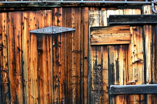
Don Craig's WPC Entry has been selected for the Photo Critique Forum* to find out what could have done to make it better.
Be nice, but be honest as this may help everyone with their craft. Thank you everyone!
From WPC 1529 -Wood* RESULTS http://www.uglyhedgehog.com/photo_contest_ratings.jsp?pcnum=179
* If you are new to the Photo Critique Forum please read the Section Rules http://www.uglyhedgehog.com/t-279264-1.html
.
Jul 24, 2015 23:21:18 #
Yes, I would like to hear comments, pro and con.
This was shot with a D5200 on tripod, remote release. Aperture priority, F13, 1/40 sec, ISO 800. Late afternoon sun filtered through overcast. No particular logic behind those settings, I liked the light and took the shot.
This was shot with a D5200 on tripod, remote release. Aperture priority, F13, 1/40 sec, ISO 800. Late afternoon sun filtered through overcast. No particular logic behind those settings, I liked the light and took the shot.
Jul 25, 2015 01:22:00 #
lighthouse
Loc: No Fixed Abode
This is a beautiful image.
At first I thought it was a little muddy in the darks, but upon looking at the download, it all looks acceptable. Must just be the way the UHH sized image is presented.
I give it a strong thumbs up but mark it down on two points.
I find the metal strip along the top edge to be a distraction to the feel of the image.
To me it views as being tilted slightly down to the left.
I want the horizontal elements to be level.
That will be easier to achieve with the metal strip removed.
Jul 25, 2015 06:30:44 #
Thanks lighthouse. That metal strip was controversial in my mind also, I decided to leave it as a baseline. It's a slide rail for a door that is part of a small barn on my property. It's settled over the decades in crooked directions.
Thanks for your input and thanks for looking!
Thanks for your input and thanks for looking!
Jul 25, 2015 09:54:58 #

Hi, Don!
I'm pretty new to photography, so please take my comments with a grain of salt. These are my reactions, as if I had seen your image in a museum.
For a barn that's over 100 years old, I don't find the colors of the wood credible.
I like the iron piece on the top because the stippling is a nice pattern contrast to the verticals and horizontals.
The other thing that I want to mention about the image is something that took me a long time to figure out. We recently had an image of contrasts in wood. The photographer had an interesting composition on one side, with a natural divider, on the other side of which was a simpler, blander composition. And the image worked because of the contrast, not because the elements competed against each other, as I think they do in this image.
I wonder what you would think about the image with the left side cropped to just to the left of the middle of the hinge. Since our imaginations can extend the hinge, I wonder if the photo would be more "balanced" with the right side of the hinge as a sort of arrow pointing to the right side of the photo.
I also feel that, from a compositional perspective, I'd like to see the image more narrow, emphasizing the panorama aspect of the image. The iron bar on top gives the image a strong horizontal basis. I would delete the bottom right horizontal piece of wood, keeping two links of the chain with a hint of a third. Again, our imaginations can extend the chain.
And, because my mind works in mysterious ways, I find the hardware and design on the barn more interesting than the light. Sometimes people find that black-and-white works with contrasty light conditions. Did you try that?
So, these are the various things I would play around with, if the photo were mine, just to see what appealed to me. Of course, these comments represent my own view, and I would never suggest that you change your vision for someone else's. If you play with some of these suggestions, I'd love to hear what you think.
Jul 25, 2015 14:05:35 #
The light color of the rail is a distraction to me, so I would crop the top and the right side a bit. Also, I'd like to see what a B/W interpretation would look like. Excellent capture--lots of possibilities here!
Also, how about a vertical with the above crops plus using only the right side (i.e., chain, but no hinge)?
Also, how about a vertical with the above crops plus using only the right side (i.e., chain, but no hinge)?
Jul 25, 2015 19:53:02 #
Don Craig wrote:
Thank you Ediesaul and Wthomson. Composition is an important thing for me so I appreciate your comments.
In fact, if YOU would like to download the image and play with the composition and post it back, that would be okay with me...if its okay with the moderators.
In fact, if YOU would like to download the image and play with the composition and post it back, that would be okay with me...if its okay with the moderators.
I played with the image quickly. I'm sure someone else could do a much better job. Will post as "Don Craig's Barn by Edie."
Jul 25, 2015 22:25:48 #
ediesaul wrote:
I played with the image quickly. I'm sure someone else could do a much better job. Will post as "Don Craig's Barn by Edie."
Cool, I look forward to seeing it :thumbup:
Jul 25, 2015 23:05:25 #

ediesaul wrote:
I played with the image quickly. I'm sure someone else could do a much better job. Will post as "Don Craig's Barn by Edie."
I thought the original was a little bit too strong on a sharp image with too weak an emphasis on the concept. The color was all that toned down the sharpness and provided at least somewhat of a concept.
By making it BW, your version loses the concept. At least it's gone for me.
I would guess that to do that in BW would require a wider angle of view, giving more context. That may or may not have helped the color original too, but I suspect that it was framed as it was just to emphasize color over context!
Different strokes for different folks...
Jul 26, 2015 10:15:24 #
Apaflo wrote:
I thought the original was a little bit too strong... (show quote)
Apaflo, thanks for looking and thanks for your comments; a point of view I hadn't really considered. I put out the BW because a couple of others expressed interest on what it might look like.
If you want to reply, then register here. Registration is free and your account is created instantly, so you can post right away.