SeriousCritiquesRequested
Jun 24, 2015 10:04:14 #

V X III=XV ("Takes a Lickin' but Keeps on Tichyn")
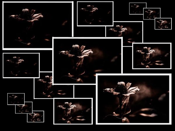
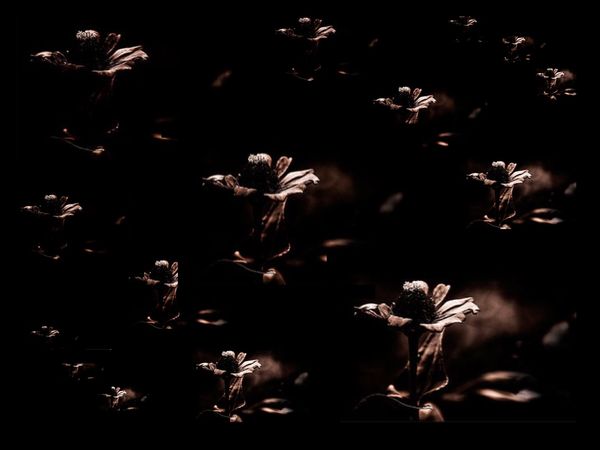
This is a suggested variant of Billy's "into the Light" triptych. Rather than post it as a"Redux" and risk crossing that "hazy" undefined line associated with composites and who-knows-what-else and risk it being deleted without a link to where it might be seen, Billy agreed that it seems most efficient to post it here, throwing it, as it were, upon the "mercy of the court of considered public opinion".
C&C requested
Dave in SD
Jun 24, 2015 10:11:29 #
donrent
Loc: Punta Gorda , Fl
My eyes keep going from pic to pic trying to decide which is best=== confusing !
Jun 24, 2015 10:18:18 #
Too many borders and too bright for a dark subject. Our eyes are "drawn to the light", making the flower(s) a footnote.
Jun 24, 2015 10:24:49 #
Uuglypher wrote:
V X III=XV ("Takes a Lickin' but Keeps on Tic... (show quote)
Flower is either very heavily cropped or just out of focus. As above I find all the white frames distracting.
Jun 24, 2015 10:24:59 #
donrent wrote:
My eyes keep going from pic to pic trying to decide which is best=== confusing !
Hi, Don,
Thanks for looking.
The original triptych is rendered in a combined total of five sets of three for two purposes:
1. To determine, perhaps, if less-is-more...or if more-is-less, and
2. To permit use of a title that I've been looking for a chance to use for many years...in fact...ever since the late 1960s when the standard Timex Watch commercial's catch line was "Takes a Likkin', but keeps on Tickin' "
Dave
Jun 24, 2015 10:28:25 #

The composition has an interesting pattern of frames and sizes. The quality of the enlarged image has suffered, and the progression of the less detailed image to the more detailed images appears out of order.
Jun 24, 2015 10:31:04 #
Uuglypher wrote:
V X III=XV ("Takes a Lickin' but Keeps on Tic... (show quote)
Images are competing. No focus point.
Jun 24, 2015 10:37:10 #

Jun 24, 2015 10:40:20 #

nice concept. I think the borders are too overwhelming. What if you used very narrow strokes around the images and color matched them to the flower?
Jun 24, 2015 11:06:55 #

I like the idea of #1. The balance and geometry is pleasing and it would be interesting wall art for certain types of rooms: an office, perhaps.
Unfortunately, I don't care for the subject. Seems too dark and there is too much out of focus.
Unfortunately, I don't care for the subject. Seems too dark and there is too much out of focus.
Jun 24, 2015 18:23:40 #

As the creator of the original not sure No 1 works and suits the concept. Too much conflicting contrast between the white borders and the subject. It might actually be worth an experiment doing it again with one image only and a brighter subject ala a proper screen type triptych
Jun 25, 2015 12:22:41 #

Jun 25, 2015 15:55:03 #

For me, the precise placement of the frames, their balanced repetition-vertically, horizontally, diagonally; or similarly, of the frameless images-----smacks of wallpaper. You are light years better than this. Bob
If you want to reply, then register here. Registration is free and your account is created instantly, so you can post right away.