Did I over-do it?
Jun 20, 2015 07:15:31 #
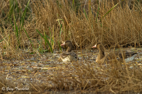
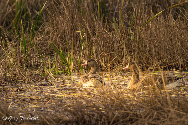
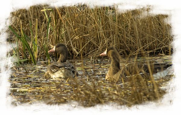
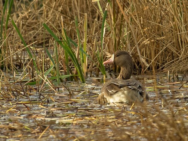
I shot these two images last year and as I was reviewing them I thought I saw some potential. I went to work on it with LR5 and this is the result. I'm not sure whether I went too far or maybe the image wasn't worth the effort. This was just an exercise in seeing what could be done with a bland and so so image. What do you think?? Please be honest and forthwith in your answers, so we may all gain from this discussion.
Jun 20, 2015 07:24:51 #
Gary Truchelut wrote:
I shot these two images last year and as I was reviewing them I thought I saw some potential. I went to work on it with LR5 and this is the result. I'm not sure whether I went too far or maybe the image wasn't worth the effort. This was just an exercise in seeing what could be done with a bland and so so image. What do you think?? Please be honest and forthwith in your answers, so we may all gain from this discussion.
OK, you asked for honesty. The original reminds me of a couple of shots I took yesterday at the rookery I was exploring/shooting. The shots were of 2 black crowned night herons on the water right at the shore line against a background of dry looking reeds and grasses. They were not keepers even when enhanced. Just no contrast. I think your shot is akin to mine that just did not make the cut. At least "film is cheap" as my husband is so fond of telling me!
I DO happen to like geese, however, and I usually wind up shooting them no matter what.
Jun 20, 2015 07:33:19 #
There is not much difference to my eye... The contrast between subject and background is minimal. That makes this image bland to me. Not much you could do with it, either. You might try to minimize the background, maybe blur it in PS. Otherwise, it was a nice try! :thumbup:
Jun 20, 2015 08:04:45 #
I like the first one. To me it shows the natural way animals blend into their surroundings. You might add some 'punch' in lightroom. or in the 'tone curve' go with strong contrast in the 'point curve'
Jun 20, 2015 08:09:55 #
I too like the first one. I might try cropping it tighter to accentuate the birds more. It is a well exposed ,sharp shot though. In fact I might crop it enough to remove the OOF bird on the right leaving the center bird looking to the left. Bob
Jun 20, 2015 08:14:38 #
Jun 20, 2015 08:23:34 #
I like your original shot better than the first one. It's just too monochrome in its color to get a lot of difference going. Your enhancements didn't improve the shot very much. I agree that cropping to make the birds more prominent might work, but I kinda think the way jim quist does, it shows them in their natural habitat and they don't even seem aware of your presence, so I think the original is the better of the two you have posted here.
Jun 20, 2015 08:42:02 #
Too busy and too much distracting foliage that takes away from the subject. The birds are largely obscured and get lost on the"junk."
Jun 20, 2015 09:28:39 #

Gary
I agree that the ducks are blended into the background and there is very little color differential. I took your unedited shot and played with it a bit. It is not a raw file so I was limited. I did crop it and increased the clarity and intensified the colors a bit. With you permission I will post it for your consideration
I agree that the ducks are blended into the background and there is very little color differential. I took your unedited shot and played with it a bit. It is not a raw file so I was limited. I did crop it and increased the clarity and intensified the colors a bit. With you permission I will post it for your consideration
Gary Truchelut wrote:
I shot these two images last year and as I was reviewing them I thought I saw some potential. I went to work on it with LR5 and this is the result. I'm not sure whether I went too far or maybe the image wasn't worth the effort. This was just an exercise in seeing what could be done with a bland and so so image. What do you think?? Please be honest and forthwith in your answers, so we may all gain from this discussion.
Jun 20, 2015 16:57:41 #
absolutely go ahead thats what this thread is all about
mper812 wrote:
Gary
I agree that the ducks are blended into the background and there is very little color differential. I took your unedited shot and played with it a bit. It is not a raw file so I was limited. I did crop it and increased the clarity and intensified the colors a bit. With you permission I will post it for your consideration
I agree that the ducks are blended into the background and there is very little color differential. I took your unedited shot and played with it a bit. It is not a raw file so I was limited. I did crop it and increased the clarity and intensified the colors a bit. With you permission I will post it for your consideration
Jun 20, 2015 16:59:18 #
Jun 20, 2015 17:00:45 #
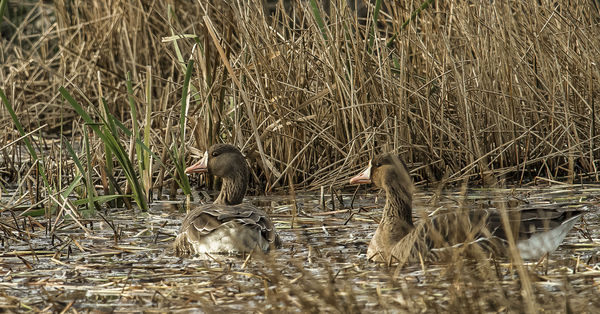
here is my attempt at cropping your image. I also added a vignette to help bring your eyes to the beautiful ducks
Gary Truchelut wrote:
absolutely go ahead thats what this thread is all about
Jun 20, 2015 17:02:35 #
Gary Truchelut wrote:
I shot these two images last year and as I was reviewing them I thought I saw some potential. I went to work on it with LR5 and this is the result. I'm not sure whether I went too far or maybe the image wasn't worth the effort. This was just an exercise in seeing what could be done with a bland and so so image. What do you think?? Please be honest and forthwith in your answers, so we may all gain from this discussion.
Original for me :thumbup:
Jun 20, 2015 23:21:56 #
OK, I took a try. Two versions, same PP, different crops.
LR6 reduce highlights, open shadows, increase clarity, slight desaturation of whole picture, desat yellow, increase saturation of orange and green a little, then take it to NIK Viveza and add structure.
two crops, #1 keeps all of both birds, #2 cuts off part of tale of right hand bird to put it's neck at the lower right 1/3 intersection and the left hand bird now looks into the left 1/3 of the frame with the green.
My idea, as to a vignette like mper812, matter of personal choice.
The image is starting to degrade, but starting from the original, esp if it is RAW should keep the IQ high. It was a good sharp high IQ shot to begine with.
Jun 21, 2015 06:36:09 #
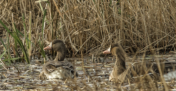
I hope you dont mind- heres my hand at it. Since the bird on the right is slightly soft I choose to concentrate on the other one and draw the attention to him, making the focus point bigger , in such a busy back ground. Nothing has changed except the crop. Everything remains fairly natural just the focus point shifts. Does it work any better- not sure. lol! Bob
If you want to reply, then register here. Registration is free and your account is created instantly, so you can post right away.