WPC 1524 - Refracted Light CRITIQUE
Jun 20, 2015 01:38:31 #

jcjr8's WPC Entry has been selected for the Photo Critique Forum* to find out what could have done to make it better.
Be nice, but be honest as this may help everyone with their craft. Thank you everyone!
From WPC 1524 - Refracted Light RESULTS http://www.uglyhedgehog.com/photo_contest_ratings.jsp?pcnum=174
* If you are new to the Photo Critique Forum please read the Section Rules http://www.uglyhedgehog.com/t-279264-1.html
.
Jun 20, 2015 08:16:00 #

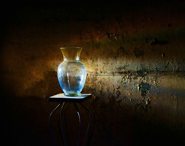
I love this! We usually don't think of something with more subtle light for refracted exercises - see top 4 entries to the challenge :)
I think it's wonderfully effective, and so interesting with the peeling paint and the shape of the vase and stand. I also love the composition as far as how much negative space was given.
I think it's wonderfully effective, and so interesting with the peeling paint and the shape of the vase and stand. I also love the composition as far as how much negative space was given.
Jun 20, 2015 09:42:34 #
Linda From Maine wrote:
I love this! We usually don't think of something with more subtle light for refracted exercises - see top 4 entries to the challenge :)
I think it's wonderfully effective, and so interesting with the peeling paint and the shape of the vase and stand. I also love the composition as far as how much negative space was given.
I think it's wonderfully effective, and so interesting with the peeling paint and the shape of the vase and stand. I also love the composition as far as how much negative space was given.
Linda - I really appreciate your kind words. My main motivation for taking photos is the hope that I can share and someone will enjoy a scene that I'm enjoying. You have fulfilled that purpose for this photo. Thank you for taking the time to share your thoughts.
Jun 20, 2015 16:28:54 #

When you download and zoom in a bit, the details are a little soft. That might just be the resolution of the posted image. When I saw this image this morning, the image is pleasing but my first reaction was to be closer or to crop closer taking away from of the left and top to place the vase slightly closer to the left margin when viewed.
Jun 20, 2015 17:47:48 #
CHG_CANON wrote:
When you download and zoom in a bit, the details are a little soft. That might just be the resolution of the posted image. When I saw this image this morning, the image is pleasing but my first reaction was to be closer or to crop closer taking away from of the left and top to place the vase slightly closer to the left margin when viewed.
CHG - Thank you for your input. I intentionally left this image a little soft as it seemed to me to add to the overall mood of the scene. The same goes for cropping, I liked how the image fades into the darkness. Just a preference is all. I do appreciate you taking the time to offer you thoughts they were great suggestions. Thanks.
Jun 21, 2015 05:49:29 #

I like how you shot this with the light fall off and shadows. It adds dimension and this gives it the appearance of something I am viewing in real time and not just a photograph. Well done.
Jun 21, 2015 11:19:23 #
waltchilds wrote:
I like how you shot this with the light fall off and shadows. It adds dimension and this gives it the appearance of something I am viewing in real time and not just a photograph. Well done.
Thank you Walt. I'm glad you like and really appreciate the comments.
Jun 21, 2015 12:34:30 #

St3v3M wrote:
jcjr8's WPC Entry has been selected for the Photo Critique Forum* to find out what could have done to make it better.
Be nice, but be honest as this may help everyone with their craft. Thank you everyone!
From WPC 1524 - Refracted Light RESULTS http://www.uglyhedgehog.com/photo_contest_ratings.jsp?pcnum=174
* If you are new to the Photo Critique Forum please read the Section Rules http://www.uglyhedgehog.com/t-279264-1.html
.
Be nice, but be honest as this may help everyone with their craft. Thank you everyone!
From WPC 1524 - Refracted Light RESULTS http://www.uglyhedgehog.com/photo_contest_ratings.jsp?pcnum=174
* If you are new to the Photo Critique Forum please read the Section Rules http://www.uglyhedgehog.com/t-279264-1.html
.
excellent exposure and focus!
My only suggestion is to place the base higher so its cener-of-mass is higher than the horizontal midline.
Dave
Jun 21, 2015 14:43:16 #
Jun 21, 2015 14:45:31 #
Uuglypher wrote:
excellent exposure and focus!
My only suggestion is to place the base higher so its cener-of-mass is higher than the horizontal midline.
Dave
My only suggestion is to place the base higher so its cener-of-mass is higher than the horizontal midline.
Dave
Thank you for your input Dave. That's a good point and I'll keep in in mind.
If you want to reply, then register here. Registration is free and your account is created instantly, so you can post right away.