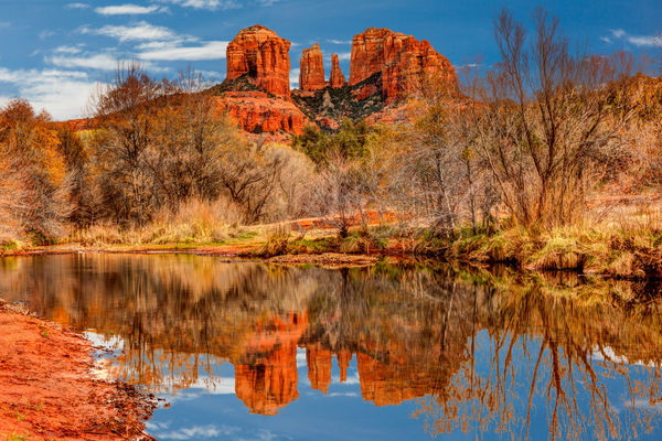
Cathedral Rock
May 19, 2015 08:38:30 #

This one needed some pp help. I have some issues with it and would appreciate some fresh eyes and opinions, as I think I've fiddled with it for too long to be objective.
For some reason it shows up here much redder than it appears on my monitor. That isn't my concern.
(Download)
May 19, 2015 08:50:01 #

If you would like to tone down the colors in the photo, use your Vibrancy slider and move it to the left. You may have to post several examples before you get the coloration you're looking for. You are discovering, as the rest of us, that the way an image is "rendered" from an Internet server may look radically different than your computer monitor. In most cases, however, the images are darker, and less distinct than on your monitor.
May 19, 2015 09:10:04 #
Very nice picture and I think you're very close. Would decrease Vibrancy some and the pull back on red saturation. Also turn your screen brightness down. The back lighting will make the picture brighter and you'll end up wondering why your prints come out dark
May 19, 2015 12:12:23 #
Bob Yankle wrote:
If you would like to tone down the colors in the photo, use your Vibrancy slider and move it to the left. You may have to post several examples before you get the coloration you're looking for. You are discovering, as the rest of us, that the way an image is "rendered" from an Internet server may look radically different than your computer monitor. In most cases, however, the images are darker, and less distinct than on your monitor.
Thanks, I guess some experimentation is in order so that colors can be rendered more accurately.
May 19, 2015 12:12:58 #
May 19, 2015 14:48:55 #

windshoppe wrote:
I guess some experimentation is in order so that colors can be rendered more accurately.
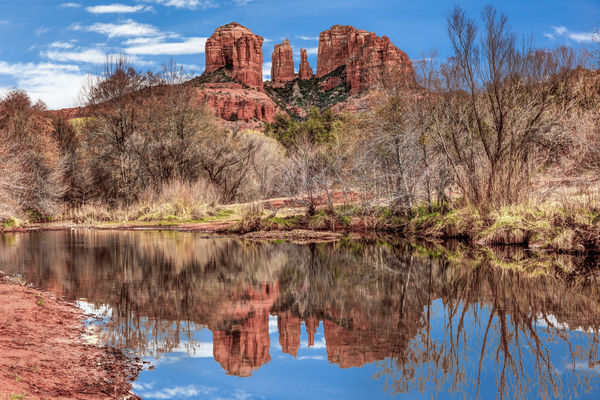
I found that WB needed to be shifted towards blue to about -8 (in Lightroom). I also found that red and orange were way too strong and I darkened and desaturated both quite a bit. The rest was just playing with light levels etc.
-
May 19, 2015 22:18:55 #
R.G. wrote:
I found that WB needed to be shifted towards blue to about -8 (in Lightroom). I also found that red and orange were way too strong and I darkened and desaturated both quite a bit. The rest was just playing with light levels etc.
-
-
Yes, this is actually (what I'm seeing now) closer to what I'm seeing on my monitor. Well done!
May 20, 2015 08:13:17 #

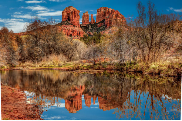
I corrected White balance in Camera raw filter Photoshop CC.
windshoppe wrote:
This one needed some pp help. I have some issues with it and would appreciate some fresh eyes and opinions, as I think I've fiddled with it for too long to be objective.

May 20, 2015 09:08:48 #
MMC wrote:
I corrected White balance in Camera raw filter Photoshop CC.
On download on my monitor this is only very slightly "cooler" than what I see on my original. We're very close. Thanks.
May 20, 2015 10:48:43 #

windshoppe wrote:
This one needed some pp help. I have some issues with it and would appreciate some fresh eyes and opinions, as I think I've fiddled with it for too long to be objective.
windshoppe,
One thing that might be bothering you is the composition of the image. The right edge of the river bank tends to cut the picture in half, forcing the eye to decide which half to pay attention to.
Try cropping off the bottom of the river water in such a way as to have a small amount of the left bank in view, and the right bank curving around into the picture and out the left side. This will provide a nice eye following curved line into the picture, allow for water reflection, and the full view of the skyline. (Maybe 1-1/2 inch up from the bottom).
Michael G
May 20, 2015 11:19:51 #

Hi Windshoppe, This is a fantastic capture. It is a very beautiful scene! I personally like vivid and contrasty images and therefore I only toned this down a little. In Lightroom wb -17 wb tone -17 highlights -100 shadows +45 white +31 Black -19 clarity -10 vibrance -21 then in HSL I lowered the saturation of red and orange (-15 and -17) and also the luminosity of red and orange (-1 and -3). And finally with the local brush did some minor dodge and burn on the forage.. I've found that sometimes when you work em too long you've got to step away for a while but then comeback with a fresh eye and hit it again. I've also found that displaying the before and after side by side helps to keep your adjustments in perspective... (the Y key will bring up the before and after screens... Keep up the great work!!
windshoppe wrote:
This one needed some pp help. I have some issues with it and would appreciate some fresh eyes and opinions, as I think I've fiddled with it for too long to be objective.
May 20, 2015 12:15:56 #
windshoppe wrote:
Yes, this is actually (what I'm seeing now) closer to what I'm seeing on my monitor. Well done!
That's a good sign. I don't know what the true colour of that kind of sandstone is so I had to guess. It's possible my WB shift to the left was a bit more than was required.
May 20, 2015 12:27:10 #
Armadillo wrote:
windshoppe, br br One thing that might be botheri... (show quote)
Thanks for looking. I'll take a look at that approach, but what I was really going for here was the reflection of the Rock, which I'd partially lose.
May 20, 2015 12:31:33 #
lloydl2 wrote:
Hi Windshoppe, This is a fantastic capture. It i... (show quote)
Thank you. Your rendition looks great on the download. You're absolutely right about working them too long. I sure did with this one. The side by side before and after is a good suggestion. I haven't done much of that and will keep it in mind in future.
May 20, 2015 12:35:56 #
R.G. wrote:
That's a good sign. I don't know what the true colour of that kind of sandstone is so I had to guess. It's possible my WB shift to the left was a bit more than was required.
You're Pretty close. The sandstone is a bit more orange/red, as is characteristic of the topography around Sedona. Lloydl12's download pretty much nails it if I can believe my monitor.
If you want to reply, then register here. Registration is free and your account is created instantly, so you can post right away.