Composition question how much to show
Mar 6, 2015 06:00:59 #
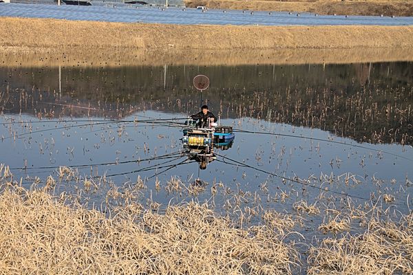
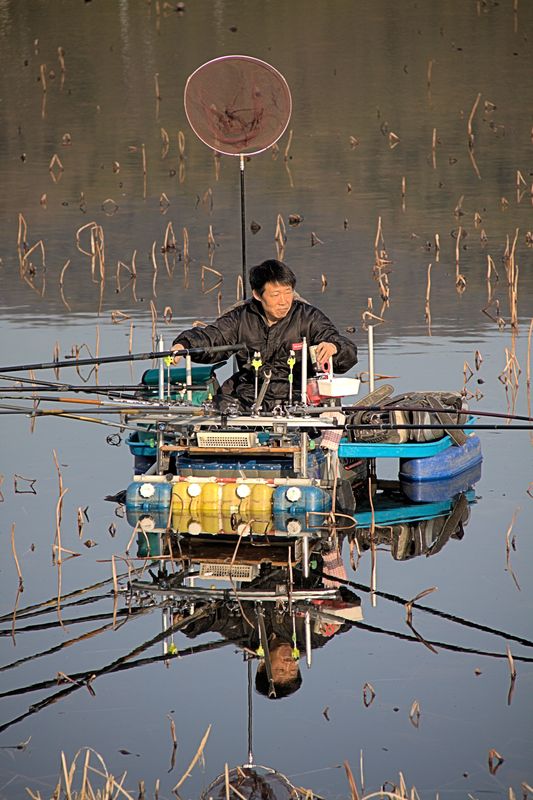
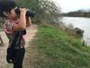
This is something I always struggle with. How much of the frame does the viewer need to understand the event? I don't always shoot this kind of thing but when I do I never know what is the right amount of foreground, background and sideground. Not judging the photo quality, what is your opinion of more area or less area?
Mar 6, 2015 06:49:31 #

I do like the cropped version much better but you have his face dead center, which is a no-no in composition. He's looking to his left so you should leave a little more space in the direction he's looking toward for the most pleasing appearance. I think I'd have left more of the reflection of the net in the shot and possibly a bit more of the poles. Hope this helps:)
Mar 6, 2015 06:52:17 #
hfb46
Loc: UK
IMO the answer lies within yourself. What story do you want to tell? If you want to show how this person is going about catching fish then I would opt for the "less" version. If, on the other hand, you want to show the area and that it is used for fishing h then I would opt for the "more" version. Just the way I see it.
Mar 6, 2015 07:38:55 #
ncshutterbug wrote:
I do like the cropped version much better but you have his face dead center, which is a no-no in composition. He's looking to his left so you should leave a little more space in the direction he's looking toward for the most pleasing appearance. I think I'd have left more of the reflection of the net in the shot and possibly a bit more of the poles. Hope this helps:)
I know the general bullseye composition is bad and these are snapsopts. I almost got run over by a truck taking them. It was not a good time or place to get the photo but the guy has such a crazy fishing rig and so many poles I couldn't pass up taking a couple of shots. I appreciate your comments and will keep that in mind if/when the opportunity comes again. There is not much I can do with the less photo, that is the way I shot it zoomed in, the other was zoomed out.
Mar 6, 2015 08:22:29 #

As hfb46 says, it's all about what you want, what interested you and excited you most, what you want to share about the scene.
One story is the fishing gear that caught your attention, so at risk of getting run over :) you would compose your image to include that, and the boat and water, for a sense of place, and try to leave out anything else that would distract, such as the blue area near top of image (which can be cropped).
A close-up of the fisherman is just a different story (no better or worse) his determination, concentration, fatigue or frustration, actually pulling in fish, etc.
Mar 6, 2015 08:33:05 #

I like the cropped version for a number of reasons. In the uncropped the pole of the fisherman's net is almost invisible against the water. The net looks like a brown circle hovering above the water. In the cropped version it is obviously a net emerging from the boat.
The central position works here because of the symmetry on both sides. I'd crop the top more so that the amount of net above the boat is the same as the amount of net in the reflection thus enhancing the overall theme of symmetry. Yes, there is a rule of thirds but it is the kind of rule designed to be broken. This is one of the photos in which the rule is meant to be broken. Nice work. Glad you avoided the truck.
The central position works here because of the symmetry on both sides. I'd crop the top more so that the amount of net above the boat is the same as the amount of net in the reflection thus enhancing the overall theme of symmetry. Yes, there is a rule of thirds but it is the kind of rule designed to be broken. This is one of the photos in which the rule is meant to be broken. Nice work. Glad you avoided the truck.
Mar 6, 2015 09:46:40 #

I like the cropped version since I think the image of the person should always be the focal point of a picture. He could have been looking at something a little more important to his left and the picture could have shown it. The overall uncropped or zoomed out shows more landscape than I would like and the man gets sort of lost. His equipment is unique and should be shown as in the cropped version. I like it.
Mar 6, 2015 13:19:52 #

Cropped version for me, you get a better feel of what is going on
Mar 6, 2015 22:24:36 #

I hear, see and read all the time - Fill your frame. If you had used landscape format with shot #2 as it is, centered vertically 1/3 of the way from the camera left edge and leaving the other 2/3 for the man to look into and showing the length of the poles, this would be a pretty good composition.
Walt
Walt
Mar 6, 2015 22:47:46 #

waegwan wrote:
This is something I always struggle with. How much of the frame does the viewer need to understand the event? I don't always shoot this kind of thing but when I do I never know what is the right amount of foreground, background and sideground. Not judging the photo quality, what is your opinion of more area or less area?
Here's how I personally would crop it... I like seeing the long poles which I consider the main point of the shot and the man being secondary... what he is doing, to me, is more important than what he looks like..... BUT, like noses, everyone has their own opinion ... that's what makes it all so interesting.
Also I see that the second picture you posted is not simply a crop of the first but appears to be a zoomed shot with the camera because the man is not in the same facing position in both pictures. And the first shot is not as clear as the second either,=.
Mar 7, 2015 09:42:59 #
In one of the rare occasions that reflection hurts you in my option. The picture is busy anyway and with the reflection it doubles it with the poles and gear.
Mar 7, 2015 10:01:23 #
Yes ncshutterbug is right the cropped pic is better never center your subject use the rules of thirds you tick- tac- toe
You want to pull people in your picture.
You want to pull people in your picture.
Mar 7, 2015 10:18:17 #

The vast majority of the answer to composition questions the answer lies in the rule of thirds. Place your fisherman on each of the 4 intersection points, left/top, right/top, right/bottom, and left/botto crop about those options, and the correct crop will jump out at you.
Good luck, please show us your final decision.
Good luck, please show us your final decision.
Mar 7, 2015 10:31:00 #
hfb46 wrote:
IMO the answer lies within yourself. What story do you want to tell? If you want to show how this person is going about catching fish then I would opt for the "less" version. If, on the other hand, you want to show the area and that it is used for fishing h then I would opt for the "more" version. Just the way I see it.
:thumbup: :thumbup: :thumbup: :thumbup:
Mar 7, 2015 12:27:26 #

I like the cropped version because it lets you know what is really happening. You are not quite sure just what the he is doing in the 1st shot, could be towing lines ??Also the brown dot is just floating in the air, can't tell it is a net. The cropped version tells a much better story.
If you want to reply, then register here. Registration is free and your account is created instantly, so you can post right away.