Cardinals in flight
Feb 5, 2015 11:43:54 #
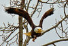
Cardinals is such a pretty bird I really like to take photos of them. I was lucky enough to get some photos of them with their wings spread. I'm going to post for them here.
C&C welcome as always.
Jim D
C&C welcome as always.
Jim D


Feb 5, 2015 12:10:40 #
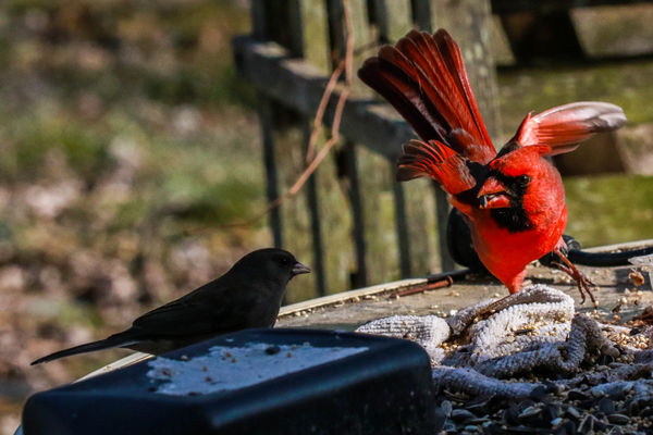
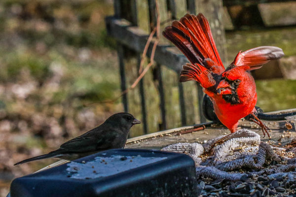
I decided to do a little PP on one of the photos. My question to you is which one of the photos do you like better. The first one is "now that's an attitude" or do you like "a big attitude" better and why. The choice is between the first and fifth photos. I wish I could've got them side-by-side but would've had to it delete everything in the middle and then repost them.
Jim D
Jim D
Feb 5, 2015 12:19:40 #
Gee, I don't know, Jim. I like them all. With your choices, I would lighten up the area around the sparrow a bunch more so as to bring out some more detail. On the 4th one, bring the highlights down a bunch so as to bring out the detail of the cardinal's wing. You can do a lot of little things to all of them in order to enhance them. Fortunately, there is major stuff that has to be done.
Tom
Tom
Feb 5, 2015 12:22:11 #

Feb 5, 2015 12:28:39 #
Feb 5, 2015 13:03:24 #
oldtool2 wrote:
Cardinals is such a pretty bird I really like to take photos of them. I was lucky enough to get some photos of them with their wings spread. I'm going to post for them here.
C&C welcome as always.
Jim D
C&C welcome as always.
Jim D
Very very nice Jim D, great series, love #2, like the view and detail. I think I like #1 better of the two, like the colors and detail of the cardinal the best, and that's the main bird to me. Well done
Feb 5, 2015 13:42:38 #
tainkc wrote:
Gee, I don't know, Jim. I like them all. With your choices, I would lighten up the area around the sparrow a bunch more so as to bring out some more detail. On the 4th one, bring the highlights down a bunch so as to bring out the detail of the cardinal's wing. You can do a lot of little things to all of them in order to enhance them. Fortunately, there is major stuff that has to be done.
Tom
Tom
Okay, you gave me a chance to play with the adjustment brush. As you can tell PP is my strong suit. I've got an awful lot to learn in that area.
Here are a few changes suggested.
Jim D


Feb 5, 2015 13:46:36 #
gregoryd45 wrote:
Very very nice Jim D, great series, love #2, like the view and detail. I think I like #1 better of the two, like the colors and detail of the cardinal the best, and that's the main bird to me. Well done
Gregory,
You're being too kind. I do appreciate it though thank you.
I have a problem with post processing, after a while I tend to go snow blind if you know what I mean. After you stare at a photo for so long intend not to see what you are looking for.
Thank you again.
Jim D
Feb 5, 2015 13:48:32 #
ebbote wrote:
Good shots Jim.
Thank you very much. I can get decent shots of any of the bird sitting at the feeders but that's not what I was trying for. It's difficult to get them flying, and I've got a lot to learn. Thank you again.
Jim D
Feb 5, 2015 13:50:19 #
JamesScott wrote:
Excellent captures - well taken.
James,
Thank you very much, I appreciate your looking and your comment. I am trying, now just get the birds to cooperate. LOL!
Jim D
Feb 5, 2015 14:19:56 #
oldtool2 wrote:
Gregory,
You're being too kind. I do appreciate it though thank you.
I have a problem with post processing, after a while I tend to go snow blind if you know what I mean. After you stare at a photo for so long intend not to see what you are looking for.
Thank you again.
Jim D
You're being too kind. I do appreciate it though thank you.
I have a problem with post processing, after a while I tend to go snow blind if you know what I mean. After you stare at a photo for so long intend not to see what you are looking for.
Thank you again.
Jim D
I know how you feel Jim D, I have a problem with PP and anything to do with a computer.
Feb 5, 2015 14:49:41 #
gregoryd45 wrote:
I know how you feel Jim D, I have a problem with PP and anything to do with a computer.
Some things on the computer I have no problem at all with. I can find the delete key with my eyes closed. I keep waiting for to wear out but I haven't managed to do it yet! LMAO!
Jim D
Feb 5, 2015 14:56:06 #
oldtool2 wrote:
Very good! You did not over do it. These type of photos are a good practice for improving your pp.Okay, you gave me a chance to play with the adjustment brush. As you can tell PP is my strong suit. I've got an awful lot to learn in that area.
Here are a few changes suggested.
Jim D
Here are a few changes suggested.
Jim D
Feb 6, 2015 09:27:42 #

oldtool2 wrote:
Cardinals is such a pretty bird I really like to take photos of them. I was lucky enough to get some photos of them with their wings spread. I'm going to post for them here.
C&C welcome as always.
Jim D
C&C welcome as always.
Jim D
Nice set...I like the first much better than the fifth...the fifth, to me, is "overcooked" with an abundance of noise as a result...
Feb 6, 2015 10:19:08 #
If you want to reply, then register here. Registration is free and your account is created instantly, so you can post right away.