World Overcomer Outreach Ministries Church
Jan 26, 2015 16:25:43 #

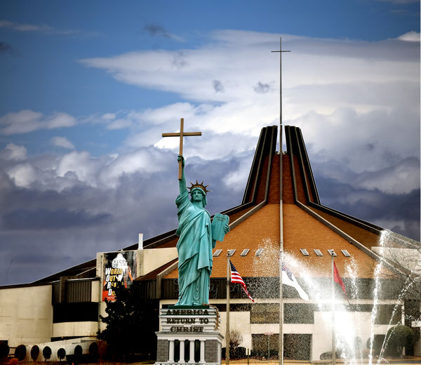
This is my revision of my "Statue of Liberation Through Christ" entry for WPC1502 "Church".
Original Topic can be found Here?
http://www.uglyhedgehog.com/t-276656-1.html
Critique please?
Original Topic can be found Here?
http://www.uglyhedgehog.com/t-276656-1.html
Critique please?
Jan 26, 2015 22:00:58 #

Well this is an improvement. Maybe a little busy, but I like that you have her breaking over the top of the roof of the church and the repeating theme of the cross. This perspective works much better in my opinion.
is that the actual sky? It seems a little off, I am not sure how though. Maybe someone with more knowledge can jump in here. Or maybe it is just me.
None the less I like this much better.
is that the actual sky? It seems a little off, I am not sure how though. Maybe someone with more knowledge can jump in here. Or maybe it is just me.
None the less I like this much better.
Jan 26, 2015 23:06:04 #

I really like the way you have framed this one up. You've made your statue the unequivocal subject of this image. Not only that, you have reinforced it (as Country's Mama has just mentioned) with the church roof and it's cross right behind it. I love the diagonal that is created by the two crosses. You have eliminated all the distractions on the ground too. Wow! I love to see this. A photographer that doesn't mind going back to get it right. Nicely done.
Jan 27, 2015 03:23:37 #
Thanks You!!
I have you Nightski, Country Mama, and others from the first critique to thank for your helpful suggestions.
I am learning a lot from the others that are willing to share there knowledge on this site. I know I have lot of room for improvement.
I have you Nightski, Country Mama, and others from the first critique to thank for your helpful suggestions.
I am learning a lot from the others that are willing to share there knowledge on this site. I know I have lot of room for improvement.
Jan 27, 2015 10:11:48 #

I feel that this picture could be improved greatly by just doing a different crop. I would do a customized crop taking out everything on the left which shows anything regarding the world outreach sign including that small white chimney. That would bring the focus to the two crosses and church.
Jan 27, 2015 11:45:38 #
Leon S wrote:
I feel that this picture could be improved greatly by just doing a different crop. I would do a customized crop taking out everything on the left which shows anything regarding the world outreach sign including that small white chimney. That would bring the focus to the two crosses and church.
I think I agree with you on this as it would then make it a vertical crop that would correspond to the two upright crosses.
Jan 27, 2015 13:13:49 #

Country's Mama wrote:
I think I agree with you on this as it would then make it a vertical crop that would correspond to the two upright crosses.
Agreed. This is essentially a vertical subject and looks better in a portrait format. I'd crop the left as already suggested and crop the right hand stream off of the fountain. That prevents the cross on the church from being dead centre and balances it a bit better.
Jan 27, 2015 19:25:28 #
Thanks Leon S, Country's Mama, Mcveed
Agreed. A different crop does make the picture less busy, but being attached to that ministry, my emotions say "It is a busy place" and I can live with that.
Thanks Guys and Gals until the next image. I am learning so much from you all.
P.S. Country's Mama the sky is real, just not on that day or place. I guess, I need to keep working on my PP skills.
Jan 28, 2015 07:14:22 #

I agree that this is a clear improvement on the original and I also agree that further improvement could be made with a different crop. But what does not work for me is the fountain, to my eye it kills the pic, no matter what crop you use. What works in the pic is the strength and intensity of the horizontal vertical and diagonal lines, the upward thrust of both crosses, a powerful and foreboding sky. These all combine to reinforce and give resonance to the message at the base of the statue, that message being what both the Church and this pic seem to be about. But the curved blurred whiteness on the right undercuts all of this. While removing the clutter at the bottom has helped in one way it has also disconnected the fountain from its base, it has lost its context. I know its a fountain but to my eye it ends up as a white patch which blurs and obscures the balance and strength of the building. So in the end, though there is a lot to like in the pic, for me the fountain is an insurmountable problem. But mine is only one opinion and I am sure many others will disagree. I hope this helps.
Peter
Peter
Jan 28, 2015 07:40:35 #

BeaverNewby wrote:
This is my revision of my "Statue of Liberation Through Christ" entry for WPC1502 "Church".
Original Topic can be found Here?
http://www.uglyhedgehog.com/t-276656-1.html
Critique please?
Original Topic can be found Here?
http://www.uglyhedgehog.com/t-276656-1.html
Critique please?
Hello BeaverNewby, this isn't a critique as such, it's more of a though as to how you could make a stronger image with a re-shoot. If you were to move left, get close to the base of the statue and shoot from a low angle, you should be able to isolate the statue and the church and get a nice juxtaposition of the two crosses. This will eliminate all of the other stuff. Having said this I will add two things.
I don't know if there is any physical reason that you can't get the shot from that angle, obstructions and such like, and that it is your shot so you may want the fountain and flags in the picture :-)
Edit: Shoot it in a vertical format.
Graham
Jan 28, 2015 12:05:34 #
Hi Conkerwood, David Graham, every body else.
Reshoot it is!! and I thought the last reshoot was perfect!!
It's never really finished, is it? Better Sky, Better Angle, more work on the PP, Better Crop. I love it.
Thanks Guys and Gals. Stay tuned for chapter 3
Reshoot it is!! and I thought the last reshoot was perfect!!
It's never really finished, is it? Better Sky, Better Angle, more work on the PP, Better Crop. I love it.
Thanks Guys and Gals. Stay tuned for chapter 3
Jan 28, 2015 12:51:37 #
If you want to reply, then register here. Registration is free and your account is created instantly, so you can post right away.