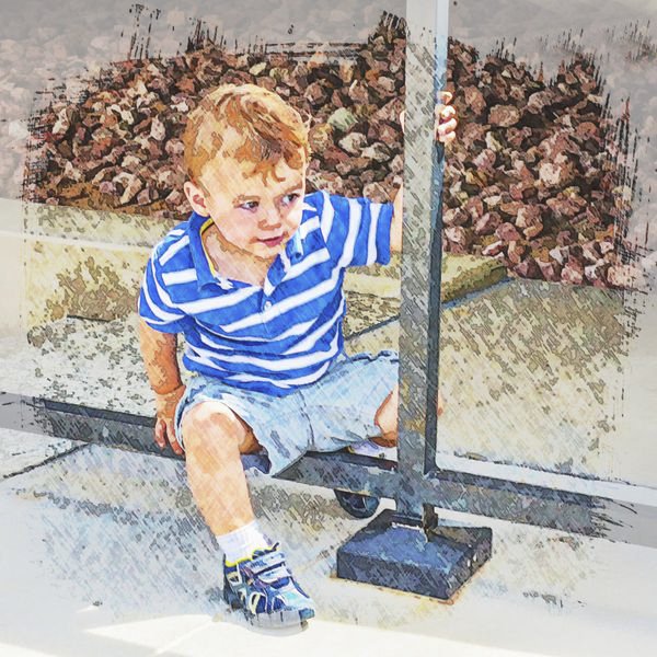
Cropping Question
Jun 24, 2015 11:51:13 #
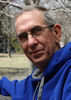
hosh
Loc: Hollywood FL
davefales wrote:
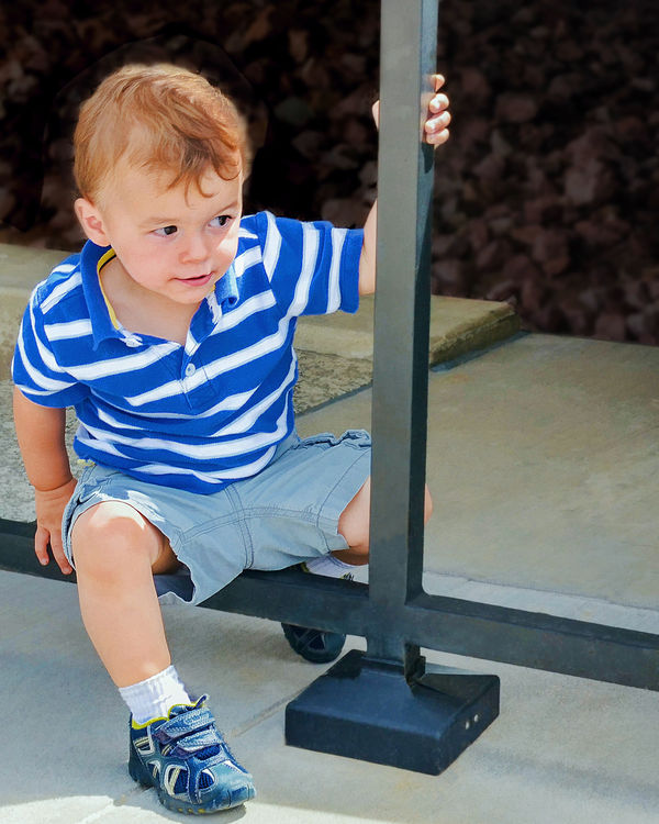
I offer this composition for comments. There are so many variables to the best way to crop this one (Rule of Thirds, Rule of Space, general impact at first view).
This is No. 4 grandson. I used Topaz Simplify lightly.
What do you think about the cropping? I have a fair amount of image space outside of the crop. Thanks in advance.
This is No. 4 grandson. I used Topaz Simplify lightly.
What do you think about the cropping? I have a fair amount of image space outside of the crop. Thanks in advance.
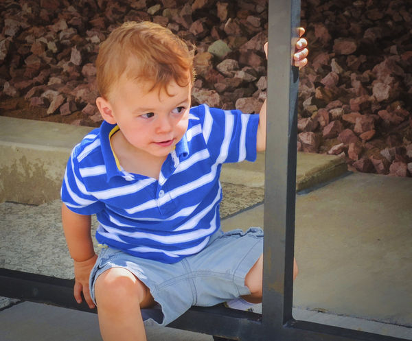
The triangle in the upper right is distracting. I would have gotten down a bit lower to take the photo, that would have helped with the background and the angle of viewing your subject.
Jun 24, 2015 15:55:18 #

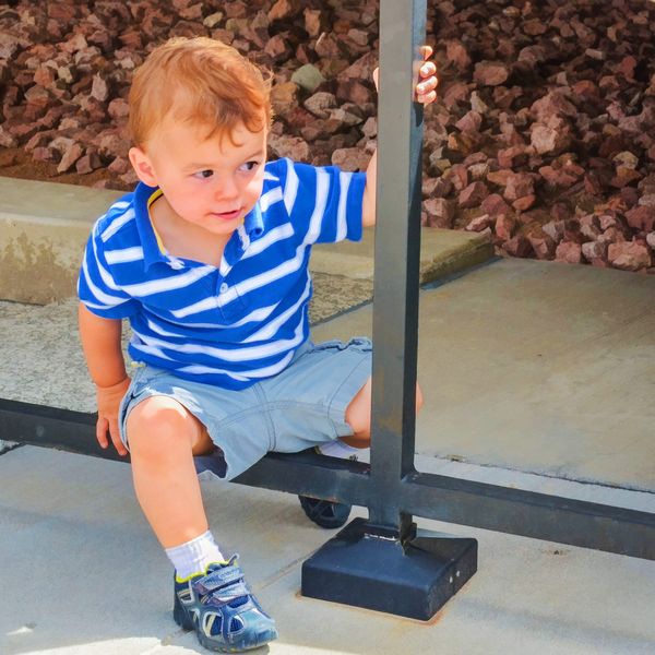
I have attached my version of my previous post and corrected the upper right corner
hosh wrote:
The triangle in the upper right is distracting. I would have gotten down a bit lower to take the photo, that would have helped with the background and the angle of viewing your subject.
Adjusted again
Jun 24, 2015 16:27:00 #
hosh
Loc: Hollywood FL
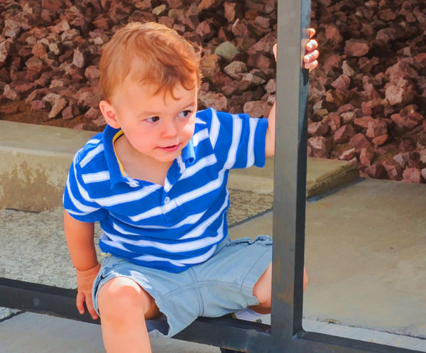
Howard5252 wrote:
How's this look? I just used the polygonal lasso> selected a small area from the left of the triangle> layer > new > layer via copy> move ,and then moved it into place. Voila.
This is really nice. I like how you adjusted it. The crop is tighter but not too tight. The triangle is gone and I like how the boy is off center with more space over towards where he is looking. Very nice. I'm just starting to do post myself so this shows how you can start with a nice image but with a little work make it even better!
Jun 24, 2015 17:03:16 #
gvarner
Loc: Central Oregon Coast
davefales wrote:
I offer this composition for comments. There are so many variables to the best way to crop this one (Rule of Thirds, Rule of Space, general impact at first view).
This is No. 4 grandson. I used Topaz Simplify lightly.
What do you think about the cropping? I have a fair amount of image space outside of the crop. Thanks in advance.
This is No. 4 grandson. I used Topaz Simplify lightly.
What do you think about the cropping? I have a fair amount of image space outside of the crop. Thanks in advance.
I wouldn't do any more than this.
Jun 30, 2015 20:59:45 #
Nice image... I'd crop it closer to the right. you want to make the boy, the unexplainable subject of your image.
Jul 1, 2015 00:03:59 #
Jul 5, 2015 06:09:41 #

Dave...The real interesting subject in this photo is your grandson. The rest of it is pretty boring. The vertical iron bar, due to the angle at which you photographed it, even appears to be crooked. The only way to save this photo is to crop around your grandson, getting rid of all the iron work. What you are left with is the logs in the background, which do work. It is possible that you will need to run your finished photo through a sharpening algorithm.

Jul 13, 2015 04:39:18 #

SteveR wrote:
Dave...The real interesting subject in this photo is your grandson. The rest of it is pretty boring. The vertical iron bar, due to the angle at which you photographed it, even appears to be crooked. The only way to save this photo is to crop around your grandson, getting rid of all the iron work.
Steve has the right idea basically. But it isn't that the rest is "boring", the problem is that it is distracting. The iron bar is essential, and how straight it is or is not has no significance at all.
There is a philosophical way to to approach this type of image, essentially with Gestault Theory, though specifics can vary. Rudolf Arnheim in 1971 wrote an essay titled Entropy and Art, which isn't exactly an easy read but has many jewels of wisdom to study. In the introduction he says:
"When nothing superfluous is included and
nothing indispensable left out, one can
understand the interrelation of the whole and
its parts, as well as the hierarchic scale of
importance and power by which some structural
features are dominant, others subordinate."
Processing this image is first a matter of deciding what has to be included as indispensable to showing the subject. The boy's environment is very much a part of the photograph, and cropping too much is detrimental.
But once it is trimmed to the essential parts, there is much that can be removed or manipulated to place it lower on "the hierarchic scale". The rocks in the background are hugely distracting, but with just a hint of their existence they serve a purpose. A lot small detail on the bars and on the sidewalk can be removed to give it a cleaner look and avoid distraction.
Then the color balance needed adjustment and saturation dropped to an appropriate level. That said, I boosted saturation of the shoe down in front, and made it slightly darker, to provide a balance to match the upper part of the image.
Oct 11, 2015 18:00:20 #
Oct 29, 2015 13:28:32 #
Very nice expression and skin tones!
Here are a few suggestions:
1) Crop based on the content - The boy is looking horizontally, so you should crop horizontally - and give him room for his line-of-sight. When you crop this image VERTICALLY, it feels like his line-of-sight is cutoff.
2) Crop to focus attention to the subject - remove all non essential content.
3) Add (Subtle) Post-Crop Vignetting - This helps to focus the viewer's eye on the subject.
(with Vignetting)
(without Vignetting)
Oct 29, 2015 23:15:08 #
If nothing else this thread is proof of the saying , "Opinions are like a--holes, everybody's got one."
Nov 9, 2015 10:08:29 #
Nov 24, 2015 16:20:27 #
I agree that more space in the direction he is looking produces more curiosity and more movement in the photo. I'd suggest cropping to his shoulder or leaving more photo on the right. Having that cute young boy in the center tends to keep my eyes focused there without moving. And I would experiment with different camera angles. Perspective changes with each angle and height. It is worth it to see which works best for the photo.
Dec 6, 2015 21:22:34 #
the area in the background is distracting.cropping tighter will help.In the future use the widest aperture .that way the background will be very soft. Works well for me.
Dec 6, 2015 21:29:04 #
Here is another thought.Blurr the area around your grandson post production.I agree that the saturation level could be lowered. Try converting it to b&w.I know you would be giving up the beautiful coloring but try sepia tone???? Love this forum.
If you want to reply, then register here. Registration is free and your account is created instantly, so you can post right away.