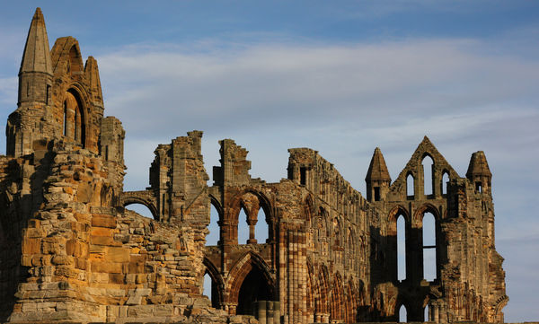
Whitby Abbey
Nov 16, 2014 04:40:14 #


Nov 16, 2014 05:16:47 #
blackthorn100 wrote:
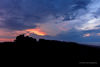
Another from my trip to Whitby
That is realy cool. Is this pp in sepia? it looks great.The only thing I would change would be the vingetting.A great shot though. :thumbup: :-D
Nov 16, 2014 05:20:50 #
Nov 16, 2014 05:21:23 #

Nov 16, 2014 05:34:01 #
blackthorn100 wrote:
Here is the original
Fantastic! :thumbup: :thumbup:
Nov 16, 2014 06:04:46 #

Nov 16, 2014 11:12:51 #
I prefer the sepia with the vignetting. It addressesand emphasizes the age and ruination moreso than the original.
Nov 16, 2014 11:41:58 #

blackthorn100 wrote:
Another from my trip to Whitby
Nice work blackthorn
Nov 16, 2014 11:42:53 #
blackthorn100 wrote:
Here is the original
Original is good your worked version is much better
Nov 17, 2014 11:54:50 #

Nice one!
Wasn't this place one of the settings for Bram Stoker's "Dracula"?
Wasn't this place one of the settings for Bram Stoker's "Dracula"?
Nov 17, 2014 14:43:44 #

I love the color original, but the sepia toned one has so much more atmosphere. It's a winner! I agree however with al davis about the vignetting which, in this photo, I find a bit distracting.
Nov 18, 2014 00:30:08 #

Nov 18, 2014 18:23:56 #

I love how the sepia toned image makes it all about the window shapes and the negative spaces. It also shows the texture in the stone, and as said before, emphasizes the age and ruination of the structure.
If you want to reply, then register here. Registration is free and your account is created instantly, so you can post right away.