Composition Help
Oct 7, 2014 10:43:29 #
Just trying to figure out the best composition. Always appreciate comments & if you would like to rework a photo, please feel free.
Thanks!
Thanks!
Oct 7, 2014 11:06:29 #

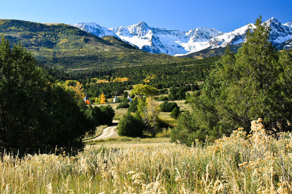
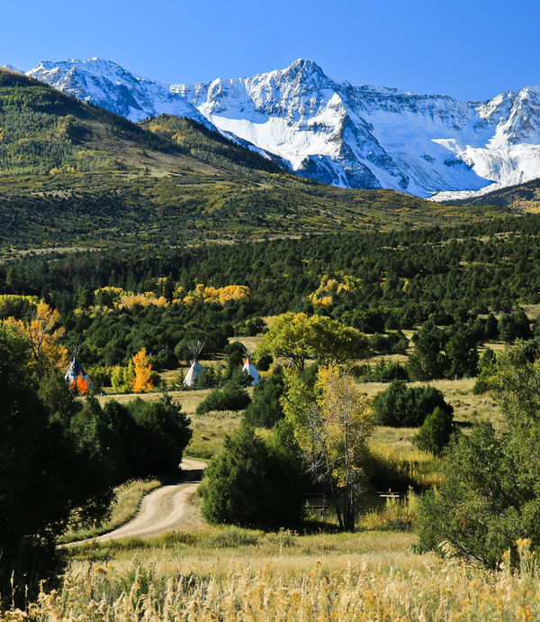
I prefer 1 and 4. I like the inclusion of the road, and I prefer the larger teepees. Between the two, it comes down to what you want from the photo and what you like yourself.
Oct 7, 2014 11:10:02 #

Photolady2014 wrote:
Just trying to figure out the best composition. Always appreciate comments & if you would like to rework a photo, please feel free.
Thanks!
Thanks!
Much closer to the Teepees would have worked better IMHO.
You need to decide on what your main subject is and feature it. Place the Teepees on a thirds line.
Alas you can't change that perspective now.
Oct 7, 2014 11:15:21 #
donrent
Loc: Punta Gorda , Fl
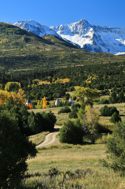
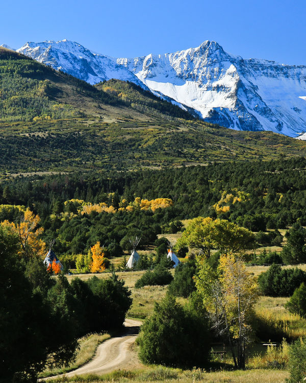
#3 is by far the better composition... going vertical seems to put all the ducks in a row (so to speak)..
Oct 7, 2014 11:34:44 #

Photolady2014 wrote:
Just trying to figure out the best composition. Always appreciate comments & if you would like to rework a photo, please feel free.
Thanks!
Thanks!
I too pick as my favorite compositions...the vertical photos :thumbup:
Oct 7, 2014 12:07:53 #
Thanks for the thoughts MtnMan. I would have liked to get closer, but private property (Ralph Lauren's Ranch) I probably would have gotten in trouble! Donrent & Carolina I think vertical is my favorite as well.
Oct 7, 2014 12:18:51 #

Photolady2014 wrote:
Just trying to figure out the best composition. Always appreciate comments & if you would like to rework a photo, please feel free.
Thanks!
Thanks!
I too think #3 is the best composition. The vertical aspect emphasizes the vastness of the area and gives height to the mountains in the background. I wonder if bringing more of the blue sky in and less of the ground would also help with the effect...i.e. man (the tee pees) lower in the picture with all of natures vastness elevating up.
Oct 7, 2014 18:31:41 #

I agree.
jaymatt wrote:
I prefer 1 and 4. I like the inclusion of the road, and I prefer the larger teepees. Between the two, it comes down to what you want from the photo and what you like yourself.
Oct 7, 2014 18:35:54 #

I also prefer #3 I like the road, the vastness and depth of the subject....It has to come down what appeals to your eye...what moves you...:) very pretty..
Oct 8, 2014 04:37:05 #

Photolady2014 wrote:
Just trying to figure out the best composition. Always appreciate comments & if you would like to rework a photo, please feel free.
Thanks!
Thanks!
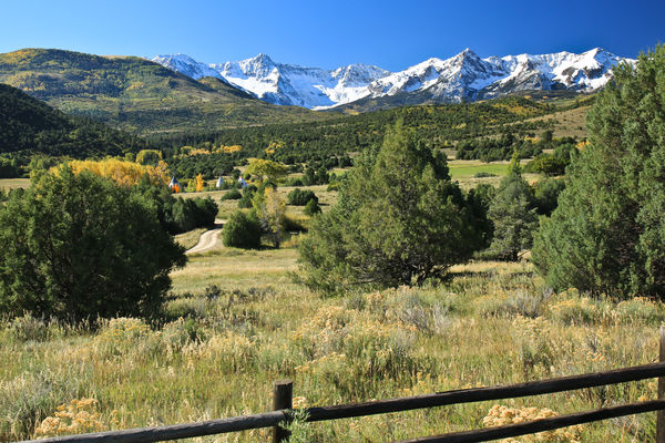
The distraction of the grass in the lower foreground in images 2 and 4 does not help. The same is less true of the fence in image 5, where it at least adds something, but is still to much of a distraction.
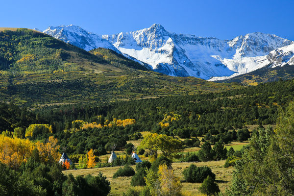
Images 1 and 3 are two different pictures! The first one is a shot of the mountains, in the context of an environment with trees and teepees in the foreground. Nice enough if that is what you like!
The third image is a shot of trees and teepees, with the rather wonderful addition of a road that makes the composition very pleasant to look at because it continuously redirects a viewers eyes to the important part of the scene. The mountains are just beautiful background. This image is a classic wall hanger. (I would crop that to a 4:5 apsect ratio, trimming only at the bottom.)
Oct 8, 2014 04:50:33 #
With the above said about the images as posted, I've notice you said it was okay to edit... And while image 3 is the one that gets notice as presented, image 4 has the same qualities if cropped to remove the distracting foreground. It also has a slightly different, and perhaps better, perspective on the road.
Oct 8, 2014 08:27:29 #
Oct 8, 2014 10:46:58 #

Oct 8, 2014 11:26:49 #
Thank you Apaflo. I do like how you cropped it and the way the road comes in in the bottom left. This is what I like about this site, getting different perspectives on photos & learning how to make better photos!
:thumbup:
:thumbup:
Oct 9, 2014 00:52:54 #

If you want to reply, then register here. Registration is free and your account is created instantly, so you can post right away.