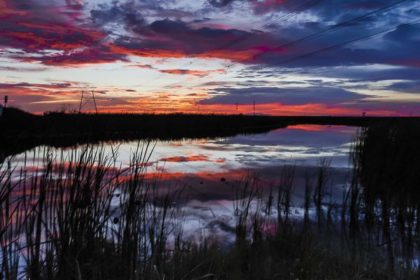
Powerline Sunset
Aug 9, 2014 14:32:08 #

Went into the glades to take star pics, but before dark we were treated to a spectacular sunset. I don't usually shoot sunsets; and I never posted one, but this wow'd me.
Aug 9, 2014 16:01:35 #
Such punchy colors and fantastic contrast!
It's nice to see a photographer who isn't afraid of very dark shadows.
It's nice to see a photographer who isn't afraid of very dark shadows.
Aug 9, 2014 16:31:08 #

photoninja1 wrote:
Went into the glades to take star pics, but before dark we were treated to a spectacular sunset. I don't usually shoot sunsets; and I never posted one, but this wow'd me.
Th blacks would not have been any blacker if you had reduced the original exposure some more. The bright portion of the sky seems overexposed.
This is really hard to judge in the field. It would be a simple matter to bracket these shots next time and pick the one where all of the sky still contains color.
Aug 9, 2014 16:37:18 #
I actually tried that and the other areas of the sky were too dark and the light area did not show any improvement.
Aug 9, 2014 17:40:54 #
photoninja1 wrote:
I actually tried that and the other areas of the sky were too dark and the light area did not show any improvement.
Every sunset is a little different. Luck has a lot to do with it.
Aug 9, 2014 17:58:45 #

Very strong colours that still look natural. My guess is you didn't do much with saturation.
Aug 9, 2014 18:19:48 #
a Beautiful sunset with an interesting foreground. Very nice. I think it works well because you have an interesting foreground. Many sunsets are just color with no real subject. This, I feel, is different.
Aug 10, 2014 06:12:47 #
photoninja1 wrote:
Went into the glades to take star pics, but before dark we were treated to a spectacular sunset. I don't usually shoot sunsets; and I never posted one, but this wow'd me.
Forgive me but I fear that you have overdone the PP somewhat.
There is posterization in the cloud color, the orange is strongly bordered in magenta exhibiting no gradient which looks most unnatural, and there is a large degree of blocking evident in the deep shadows.
This gives the image an over-processed appearance.
Perhaps consider a more subtle approach to PP which will provide the high contrast "look" and a colorful sky without taking things quite that far.
Rob.
Aug 10, 2014 14:06:25 #

I like how the water leads my eye through the image PN, but after that I have some issues with this image. The colors in the sky and reflections look over saturated and there is a very unnatural purple hue to it. I like black silhouettes on shots like this, but the grasses in the left foreground are more distracting than they are attractive.
Aug 10, 2014 14:40:41 #
Sorry you don't like the color, but it is what it was. Next time I'll take a weed wacker! :wink:
Aug 10, 2014 14:52:45 #
Aug 10, 2014 16:50:41 #
photoninja1 wrote:
Sorry you don't like the color, but it is what it was. Next time I'll take a weed wacker! :wink:
It isn't the color, it's the way that it is painted. Purple simply does not naturally occur as bold outlines around clouds. It looks very much like exaggerated saturation in PP, that's all.....
Aug 10, 2014 19:35:41 #
lighthouse
Loc: No Fixed Abode
photoninja1 wrote:
Went into the glades to take star pics, but before dark we were treated to a spectacular sunset. I don't usually shoot sunsets; and I never posted one, but this wow'd me.
The magenta border around the orange clouds looks overprocessed to me and it is not present in the reflection, only in the sky. Uneven processing.
The sky is darker than the reflection.
That is unnatural. The reflections are always darker.
I would not have taken the shot.
Powerlines ruin sunsets for me. I have seen very few that work.
The grass movement in the very foreground detracts from the image as well.
I am very fussy with my sunsets. For me a sunset hardly ever works on its own. It has to have a good foreground composition for the sky to backdrop.
I think that you have achieved that here (in spite of my misgivings about other aspects).
Aug 12, 2014 17:01:00 #
winterrose wrote:
It isn't the color, it's the way that it is painted. Purple simply does not naturally occur as bold outlines around clouds. It looks very much like exaggerated saturation in PP, that's all.....
It just hit me that your reference to painting might be referring to masking and painting in. Is that what you meant?
Aug 12, 2014 18:21:56 #
photoninja1 wrote:
It just hit me that your reference to painting might be referring to masking and painting in. Is that what you meant?
No potoninja1.
The "color" of each pixel is described, or in my terminology "painted", by the numerical value assigned by the camera system to each of the RGB channels.
Whenever you adjust color saturation, and this often occurs using any number of enhancement tools or techniques, you are assigning alternative values to the those three "colors".
If all three values are equal the result is black, white, or some shade of gray.
Any relative difference in the three values results in a bias for that particular channel and appears as a color when "painted" by the software.
The hue is painted as a linear function of those values whereas the luminosity is non-linear.
This often results in limit saturation of the leading channel and altering the hues within the transitional relationship of the various hues.
Whenever one of the three channels reaches the numerical limit, no further increase of saturation is possible.
Rob.
If you want to reply, then register here. Registration is free and your account is created instantly, so you can post right away.