Which Photo?
Aug 3, 2014 00:06:50 #
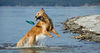
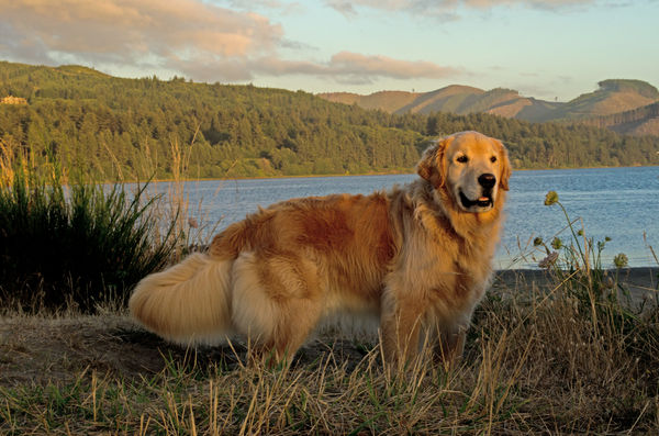
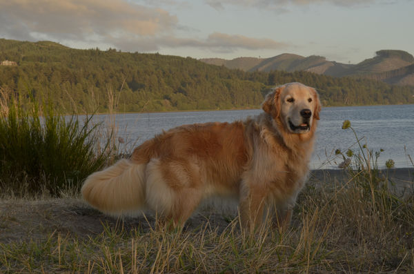
I've got this photo and I'm not quite sure which way is more pleasing. Could you scrutinize these two shots and please add any constructive criticism to help me out here. Thanks so much!
Aug 3, 2014 00:18:10 #

It's the tweaked for me! :thumbup: I think you brought out the colors in that image, where as the SOC was somewhat dull and lifeless.
Aug 3, 2014 00:21:39 #

Absolutely the first one. That beautiful dog has a wonderful glow and the sunlight kisses his face. I would even try to bring up the brightness in the grass in the foreground as well.
Aug 3, 2014 00:26:18 #

I think I would bring down the yellow, which should help out the greens a tad, and take some and bring the dogs coat into a more natural appearance. You might bring up the blue. I make these recommendations without the benefit of an none calibrated monitor at this time. So take them as you may. Nice setting and a beautiful dog.
Aug 3, 2014 01:51:41 #
Aug 3, 2014 07:01:53 #
I like the first shot the best of the two. My only concern is that the dog is smack dab in the middle of the shot. I would crop a bit from the left side of the photo so that the dog is not exactly in the center. The light is wonderful.
Aug 3, 2014 07:43:36 #
Aug 3, 2014 10:26:50 #

Aug 3, 2014 10:32:12 #
Thanks everyone. I will go back in and see how the crop looks from the left side. That will take out the problem of a very dark bush on that side of the photo.
Aug 3, 2014 10:37:59 #

Definitely the first. Try lifting the Shadows a touch to take the gloominess out of the foreground.
Aug 3, 2014 10:40:26 #
If you're very fond of this pic, try posting it in the Post Processing section. There'll be absolutely no shortage of opinions, suggestions, offered edits etc :-D .
Aug 3, 2014 11:19:00 #

Aug 3, 2014 11:31:32 #
Aug 3, 2014 11:48:36 #

Aug 3, 2014 13:25:27 #
Cattreasure wrote:
The first picture. If that was my dog, I would hang the picture on my wall.
Thanks so much!
If you want to reply, then register here. Registration is free and your account is created instantly, so you can post right away.