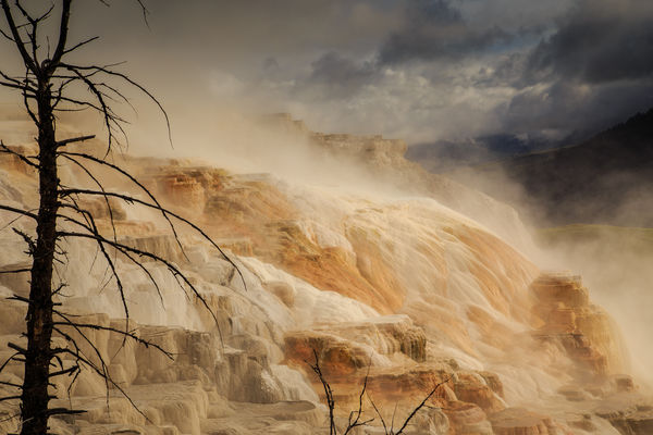
Mammoth Hot Springs
Aug 1, 2014 09:29:56 #
I was curious as to thoughts about improving this image.
f11, 1/400, ISO 200, 73mm - 6D, 24-105 f4 lens. Thanks.
f11, 1/400, ISO 200, 73mm - 6D, 24-105 f4 lens. Thanks.
Aug 1, 2014 09:34:10 #

jteee wrote:
I was curious as to thoughts about improving this image.
f11, 1/400, ISO 200, 73mm - 6D, 24-105 f4 lens. Thanks.
f11, 1/400, ISO 200, 73mm - 6D, 24-105 f4 lens. Thanks.
You might want to post it in the Post Processing forum so that people can show you what they do.
The first thing I noticed is quite a bit of chromatic aberration around the upper part of the tree. One click fix for that in Lightroom.
Otherwise mostly sharpening, contrast, clarity, and adjusting the blacks and whites to bring out the features more.
PS: I'm going by there on Sunday, after coming at it over Bear Tooth Pass. Great place!
Aug 1, 2014 09:43:56 #
MtnMan wrote:
You might want to post it in the Post Processing forum so that people can show you what they do.
The first thing I noticed is quite a bit of chromatic aberration around the upper part of the tree. One click fix for that in Lightroom.
Otherwise mostly sharpening, contrast, clarity, and adjusting the blacks and whites to bring out the features more.
PS: I'm going by there on Sunday, after coming at it over Bear Tooth Pass. Great place!
Thanks for the input, very valuable as always. Have fun in the park, pretty crowded this time of year, but just be patient. If you are out early and late it's not bad.
Aug 1, 2014 09:48:06 #
jteee wrote:
Thanks for the input, very valuable as always. Have fun in the park, pretty crowded this time of year, but just be patient. If you are out early and late it's not bad.
Yes, I usually avoid it in July and August. But my sons are headed to Sturgis and I'm riding with them to Bozeman and then circling back over Bear Tooth Pass to come through the park. (The size of the Sturgis crowd is above my tolerance level!) I noticed it is impossible to get camping reservations for the next three weeks...not used to that. I'll go on through and camp back in Idaho if I can't get in at Indian Creek. Leaving in about half an hour...as soon as two of the sons show up.
Aug 1, 2014 09:55:26 #
MtnMan wrote:
Yes, I usually avoid it in July and August. But my sons are headed to Sturgis and I'm riding with them to Bozeman and then circling back over Bear Tooth Pass to come through the park. (The size of the Sturgis crowd is above my tolerance level!) I noticed it is impossible to get camping reservations for the next three weeks...not used to that. I'll go on through and camp back in Idaho if I can't get in at Indian Creek. Leaving in about half an hour...as soon as two of the sons show up.
Should be some spectacular photo ops over the BT Pass this time of year.
Aug 1, 2014 11:32:17 #
Nice shot! Falls are too flat. Add some contrast and decrease the brightness to get some more saturation. There is some fringing around the tree but easily corrected as mentioned above.
Aug 1, 2014 12:31:35 #

jteee wrote:
I was curious as to thoughts about improving this image.
f11, 1/400, ISO 200, 73mm - 6D, 24-105 f4 lens. Thanks.
f11, 1/400, ISO 200, 73mm - 6D, 24-105 f4 lens. Thanks.
Mammoth is a magical place for photography and you got a nice set of conditions and those beautiful colors and the mist well captured. I like the way you've isolated the three layers of color in the terraces. Your photo makes me remember just what it feels like to be there. I think it could bear some brightening in the dark area on the upper right segment where the weather is doing something ominous, just so you can see it better and it doesn't pull the eye so much from the delicate rock terraces. I'm curious as to whether this is a crop, and if so what else is in there. I don't like the stray branches on the middle bottom which come up out of nothing, and I'm wondering if a little further back might have given them something to grow out of. Nice shot of an iconic location.
Aug 3, 2014 23:14:15 #
jteee wrote:
Should be some spectacular photo ops over the BT Pass this time of year.
Alas abandoned that way home today. Looked up from Bozeman and it was serious clouds. Did that last September and not again, and certainly not on my motorcycle. It also turns out one of my son's machines had a problem and I volunteered to nurse it directly home while he took mine to Sturgis.
We'll try again soon...probably after the tourist season.
Aug 4, 2014 19:24:24 #
lighthouse
Loc: No Fixed Abode
jteee wrote:
I was curious as to thoughts about improving this image.
f11, 1/400, ISO 200, 73mm - 6D, 24-105 f4 lens. Thanks.
f11, 1/400, ISO 200, 73mm - 6D, 24-105 f4 lens. Thanks.
I like this a lot jteee.
It has interest, and mood and nice colour contrasts with the grey-blue/orange interplay.
The CA needs to be dealt with.
It is not quite level, it tilts to the left a bit.
I want the overflow pools to be level - even though that would make the tree lean into the photo (not a bad thing).
The horizon of the orange/white mound against the sky - I would lighten that area of the mound and push its contrast a little.
I would lighten the blue sky area fractionally and push the contrast there as well. The steam probably prevents that though, maybe leave it as it is.
I would probably push the contrast of the whole mound just a bit - very subtle though, just for "pop", not for "in your face" contrast.
The tree branches that enter at the bottom - I would magic them away. They are clutter and add nothing.
But overall (like I said), I already like it a lot as it is.
Any changes done subtlely are going to add to that enormously.
Aug 5, 2014 09:45:17 #
lighthouse wrote:
I like this a lot jteee. br It has interest, and m... (show quote)
Thanks for the comments. I have already incorporated many that have been mentioned by you and others, and it has made a fairly noticable difference (noticable being pretty subjective). I always am fascinated by others views, those branches hadn't even entered into my thought process, but since being mentioned a couple of times, I see the distraction.
Aug 10, 2014 14:33:51 #

Upon opening this thread I thought ... wow, what an amazing image ... but then there were a couple of things that disappointed me. If I had been there I would have wanted to shoot this image without any tree or branches in the foreground. You have a nice leading line between the brighter foreground ... which is very interesting and attractive ... and the darker background mountains. I just want to see more of that line. More to the right for me please.
Aug 10, 2014 19:30:55 #
Nightski wrote:
Upon opening this thread I thought ... wow, what an amazing image ... but then there were a couple of things that disappointed me. If I had been there I would have wanted to shoot this image without any tree or branches in the foreground. You have a nice leading line between the brighter foreground ... which is very interesting and attractive ... and the darker background mountains. I just want to see more of that line. More to the right for me please.
Thanks for your review. I had actually used the tree on the left on purpose to add contrast and help frame the image. Your thought of going more right is certainly valid, if possible. I would have to revisit to see if that could be accomplished successfully (you are limited to the boardwalk for this particular spring).
If you want to reply, then register here. Registration is free and your account is created instantly, so you can post right away.